Blog Category: Online Presence for the Artist


Semester Thoughts

By Erika Goering,

I’ve been reflecting on something that was discussed earlier this semester about whether it’s more noble to focus our time and energy on making something aesthetically beautiful and refined, or making something where we essentially muck around in a fresh, steaming pile of our own newfound knowledge.

Each has their own merits. Aesthetically beautiful work has a polished feel that’s good to show off in a portfolio, and filthy experimentation leads to discovery and additional learning. Inversely, something visually pretty and refined can also be hollow and lack passion, and heavy experimental work can be unattractive and sloppy.

I’ve taken this dilemma as a challenge to get myself messy as hell, while hopefully cleaning things up aesthetically as I progress through the project. I’ve pushed myself out of my comfort zone conceptually, visually, and resourcefully. In fact, my comfort zone has been completely redefined. It’s much broader now. Because every single project this semester has been an opportunity for me to try something I’ve never done before. And it’s definitely paid off. I feel like I’m getting my money’s worth at KCAI. It’s double the education. Seriously.

Last year, my big mistake was doing what I thought everyone wanted to see so I could fit in. And while I got decent grades out of it, I didn’t feel like I got much else from it. I was just doing what I already knew, with a few new bits mixed in. Over the summer, something clicked. I decided that I was going to make the absolute most of the KCAI experience.

Every project so far this year has been an experiment. A discovery. An invention. I’ve been forcing myself to use methods and techniques that I’ve never even considered before. And I’ve learned so much, and grown so intimate with these tools… I even learned PHP, for crying out loud! I never thought I’d have the opportunity to really get submerged in it. But thanks to my Online Presence class, I did that. And it was mostly self-directed, too.

I’ve learned that my education is what I make of it. My time here could either be spent sitting back, making pretty work that I know how to do, or I can spend that extra time to experiment and play with the tools that I’ve been given. And that playing around has made me a better designer, a better student, and a better human being.

While my work this semester may or may not be of the utmost portfolio quality, it’s unquestionably paving the way for it in the future. And that, I take great comfort in.

  Filed under: KCAI, Narrative/Sound&Motion, Online Presence for the Artist, Typography3, VisLang
  Comments: Comments Off on Semester Thoughts

Website Process: Organization, Hooray!

By Erika Goering,

I’m so excited! I’m learning so much.

For the first time ever, I’m learning how use PHP includes! It’s pretty awesome to use them to their potential. Headers and footers are easier to deal with, page file sizes are a bit smaller, and everything’s WAY more organized than anything I’ve ever done before. Yay!

Yes, there’s PHP within PHP within PHP, but it’s so organized and clean… I’m so proud of it. It’s so easy to work with my code now. Super-organized.

I’ve also taken some advice on page construction and CSS organization. My CSS is easier to edit now that I know where everything is. Although it’s not as streamlined and clean as my PHP. I’m still working on that.

…But overall, I’ve discovered that this class is really whatever you want it to be. I want to get better at what I know, and learn how to do things I never would’ve had the time to learn otherwise, and that’s exactly what’s happening. I’m getting into HTML5 and PHP, which I never really had an opportunity to do before. And I’m also using this opportunity to create a visual identity for myself, which I never really thought much about before.

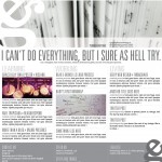
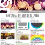
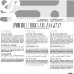
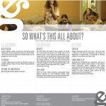
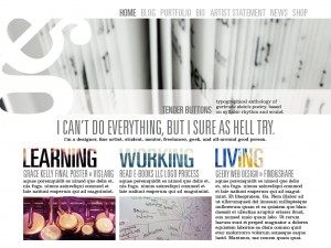
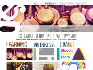
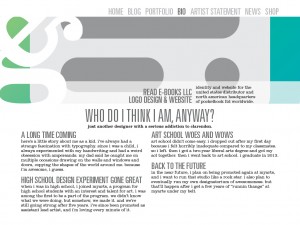
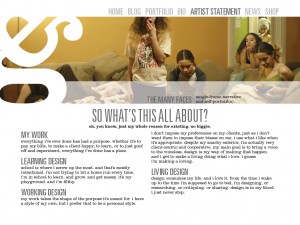
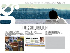
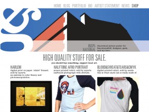
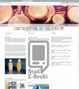
Here’s a screenshot of my new site so far:

At times, it’s been frustrating, but it’s coming along pretty well. I’m feeling pretty optimistic.

  Filed under: KCAI, Online Presence for the Artist
  Comments: Comments Off on Website Process: Organization, Hooray!


Newest Website Sketches: Now with Hierarchy!

By Erika Goering,

I’ve been working on getting my hierarchy more organized, and I’m also playing around with my shiny new copy of Clarendon Text! It’s so much better than using plain old regular Clarendon for body copy. It just feels more even and fluid. Yay!

layout
layout2
layout3
layout4
layout5
layout6

Anyway, I’m starting to code some of the HTML/PHP right now. I’m also working on integrating various WordPress plugins that have the functionality I want (like the slideshow, and the 3-blogs-on-one-page thing).

I’m doing my WordPress theme from scratch, because I really want to make it mine. And I want to practice some better ways of building a site, like doing the HTML before I do the CSS, or actually using H1. H2, H3, etc. for hierarchy.

I need to break some bad habits. And I think this is the best way to do that.

  Filed under: KCAI, Online Presence for the Artist
  Comments: Comments Off on Newest Website Sketches: Now with Hierarchy!


Some Thoughts on WordPress: More than Just a Blog.

By Erika Goering,

Since I’m starting to think about my website as more than just a blog, I’m also starting to venture outside the realm of using WordPress itself as “just” blog software. I’m starting to think of it as a content management system (and a blog as a secondary purpose). So, that’s something new. I’m thinking that, instead of my random thoughts being the main focus, I should let my work do the talking. I’m starting to feel like it’s getting good enough to speak for itself anyway.

I’m also thinking about using some HTML5/CSS3 (Ah! Scary!) in my new and improved website. For mostly the non-essential stuff like masking images into text and using crazy typefaces. That way, if non-supported browsers happen to come along, they won’t be missing anything except some pretty effects. The content will be there regardless of browser version. (But my heart belongs to Webkit. Always.)

Anywho, I’ve been thinking about how to automate everything (where pages/slideshow/whatever are updated automatically when I create a relevant post). Everything will be integrated better sitewide, instead of this half-WordPress stuff. So that’s something else.

I really want to push myself out of my HTML4/blog box. And I think violently thrusting myself into HTML5, PHP, and a non-traditional blog (or even non-blog-centric) layout is the way to go. It’s the only way I’ll learn. Because I’m to stubborn/lazy to do it at any other time.

I’m starting to gather some resources on how to build various aspects of my site. (Like the slideshow, and the masked text-image things, and the triple-blog… I’m starting to play around with @font-face and other CSS capabilities, too.) Because I want to build this whole thing from scratch. I’ve explored some options regarding how to make this all work. And I think I’ve got a doable (and I mean actually doable this semester) solution to work towards.

My main goal as far as backend functionality is to make WP do all the work. When I create a post and, say, tag it “slideshow,” I want my slideshow to automatically update with an uploaded image, the post title, and first sentence or two of the post. And when I post to my “KCAI” category, I want it to show up on my front page as my most recent post for “Learning Design.” I don’t wanna have to manually put content in a folder for the PHP gods to grab. I want the PHP gods to worship me. So there.

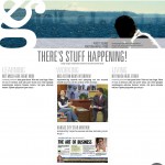
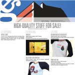
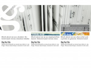
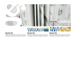
…So that’s where I’m at. Oh, and sketches too! This is what my site is gonna look like!

I’m in love with the Univers/Clarendon combo. I know, I know… Clarendon doesn’t exactly work for body copy… I’m working on getting Clarendon Text (with a web license, of course) for all my @font-face needs. Yes, I’ll have some backup font options in my CSS file. Don’t worry about that.

That’s all I’ve got for now. I’m super-excited about this project. I can’t wait to get it all done!

  Filed under: KCAI, Online Presence for the Artist
  Comments: 3


Round 2 Website Sketches

By Erika Goering,

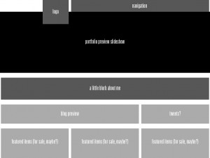
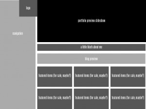
The main thing I want to do is have my portfolio be the most dominant element on the page. The large image on the top will be a slideshow of my work. Clicking on an image will take you to its page in the portfolio, where users can see more images of the project, and also process documentation and purchasing options if that’s available. (I’ve got a few things for sale at MyARTS. I’d like to make room in their inventory for my new stuff, and also promote them as a company. Because they’re awesome. Duh.)

I also want to have a single blog post for each category on the front page. That will be a sort of preview for what I’m currently doing in each area of my life as a designer. One for school, one for work, and one for everyday random design thoughts and finds.

Also, big-ass logo.


  Filed under: KCAI, Online Presence for the Artist
  Comments: Comments Off on Round 2 Website Sketches


Website Sketches

By Erika Goering,

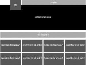
Here’s a couple of digital sketches for my website. I’m kind of getting stuck in my design, mostly because I still want to hold on to the blog thing. I’m having trouble moving my blog to a secondary importance. That’s my biggest challenge in this class so far, and I’m going to probably have a hard time getting out of that rut.

But I’m trying.

I’m having trouble filling the page with content since my blog is now in the back seat. So I’m thinking all the art I have for sale should be on display. But I also need to find other content (maybe a full artist’s statement?) to put there as a backup.

  Filed under: KCAI, Online Presence for the Artist
  Comments: Comments Off on Website Sketches


Site Outlines & Descriptions

By Erika Goering,

  • Logo is in a traditional, expected location.
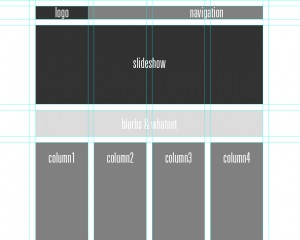
  • Slideshow showcases previous clients and work. It rotates through images automatically, but there are controls for going forward/backward in the queue.
  • Blurb has a little bit of basic info about the artist/company, while being visually attractive yet out of the way.
  • Four columns of content; each with equal dominance.
  • Navigation is linear and eye-catching (so the user knows where to go), but unobtrusive as to not interfere with the overall composition.

  •  Logo in the usual place.
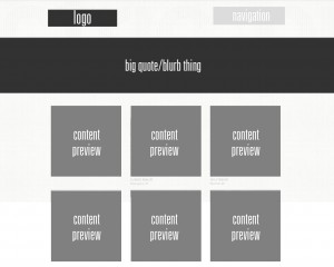
  • Big quote area gives a very quick description of who they (the company) are.
  • 3-column grid has squares for content/project previews. Clicking on one of these takes the user to the project’s page.
  • Navigation is very small, light, and quiet, so the user is drawn towards other elements. However, once the user scrolls down, a new, more bold navigation bar sticks to the top of the browser window.

  •  Logo in the usual place.
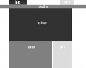
  • Search bar is a tertiary element, where attention is given only when it is needed.
  • Big image gives a feel for the company’s goals and audience.
  • Large content area is for large blocks of body text.
  • Sidebar has secondary content that supplements or complements primary content.
Here’s the key to all my shades of gray and their meaning as far as hierarchy goes:

  Filed under: KCAI, Online Presence for the Artist
  Comments: 2


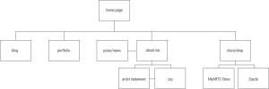
Revised Site Diagram

By Erika Goering,

I hope this makes more sense.

As of right now, I’m undecided as to what I’m going to do with my blog (separate blogs for school process and work process, or not). But we’ll weigh those options later. Right now, it’s all about the rest of the site. Especially the portfolio.

  Filed under: KCAI, Online Presence for the Artist
  Comments: Comments Off on Revised Site Diagram


Website Inspiration: Texture and Grids

By Erika Goering,

What I’m drawn to in web design is breaking the boundaries of what it means to be digital. I like texture, gradients, non-rectangular shapes, and recognizable (real-world) imagery, like coffee cups and notepads. I don’t want the web to feel cold and sterile. I want it to feel like real life.
But I also want it to be organized and structured, with a classic grid-based layout.
  • http://www.spoongraphics.co.uk/
    • This site appeals to me because it’s got a tactile quality that I appreciate in web design. As I mentioned before, I like blurring the lines between digital and analog.
  • http://koffieverkeerd.be/
    • I like coffee.
    • Actually, I like showing evidence of interaction with coffee. It adds a uniquely imperfect human element to the design. It says, “Yes, I’m addicted to caffeine because I don’t get nearly enough sleep because I’m constantly working because I’m so dedicated. So hire me.” Although, that may be a bit removed from what most people probably see as just, “Hey. I like coffee.”
  • http://www.rga.com/
    • This one doesn’t have the same textural qualities as most of the others on this list, but it does have something the others don’t; a very strong grid on a fluid layout. I resized my browser window several times, and each time, the site sprung back to a perfect grid. Even the images resized automagically. Beautiful.
    • I almost never design a site to be fixed-width. I worry that people with giant hi-res screens will feel shortchanged and people with tiny low-res screens might end up scrolling sideways. So, I usually just make it all fluid and call it a day. Everyone gets a full-screen experience.
  • http://fuelbrandinc.com/#/about
    • Subtle gradients give this site a sense of depth that I like. None of that flat, boring website stuff.
    • The background color gracefully changes as you venture into different areas of the site.
    • Subtle highlights and shadows on navigational elements give it even more depth.
    • Yay, depth!
  • http://timvandamme.com/
    • This site gives a digital home to a familiar business card format. Pretty cool idea.
    • I like the idea of bringing analog ideas into web. (I know, I said that a few times already.)
  • http://www.interexpresso.pt/
    • I love when website textures aren’t just arbitrary and “cool.” They’re best when they have conceptual meaning and linkage. This one uses a woven coffee bulk-bag texture to advertise their coffee makers. Pretty sweet.
    • I love coffee.
  • http://www.brizk.com/
    • Depth & clarity. Two wonderful things.
    • There’s a nice simplicity about this one. Monochromatic, but visually interesting compositionally. Kind of whimsical with the clouds in the background and the flight path of the bird. (At least, that’s what I interpret that to be.)
  • http://www.cutler.it/
    • I’m just REALLY drawn to this layout. I like the slideshow at the top, and the grid-based layout everywhere else.
    • The black & white, high-contrast thing is nice. It separates the sections in a very clear way. The little breaks between sections kind of stitch the pieces together.
    • The only color on the site’s home page is from the projects being showcased. That makes the website itself kind of fade into the background while the work stands out on its own.
  • http://www.thisisbrandnew.com/
    • This wall & handwritten thing is what I have in mind for a new layout for my process blog. I want to make my process blog look like it’s pinned up for a critique. Because, like much of what I’m doing, it’s just another work in progress.
  • http://forabeautifulweb.com/
    • I’m digging the floral wallpaper. Again, analog ideas brought into a digital realm.
    • Pretty elegant, organized design.
  • http://secondandpark.com/
    • Grid, grid, grid! Yay, structure!
    • I also like the slab-serif typeface here. I’m pretty sure it’s Clarendon. I loves me some Clarendon. It’s strong, yet elegant.
  • http://www.amuki.blogspot.com/
    • Fixed-width isn’t my thing, but I do enjoy the bunch of things like paper, staples, paperclips, and drawn elements.
  • http://spoutcreative.com/
    • Texture and grid. Two wonderful things together.
    • The color scheme is both fun and sophisticated. Which is great for a designer. I think it shows versatility.
  • http://www.giblette.com/
    • This site definitely conveys a specific feel. Neo-retro kind of stuff. Nostalgic, in a way. It kind of reminds me of Hammerpress.
  • http://hammerpress.net/
    • Texture and grid. Yay!
  • http://www.skialpine.com/
    • This one has a pretty sweet navigation bar. It’s got texture so nice I can almost smell it.
  • http://www.deniseandrade.com/
    • This one has a very hippie feel, which appeals to me because I’m the daughter of an old hippie. And I have dreadlocks, so… Yeah. I’m a bit of a hippie too.
    • The paper roughness and the intricate, but subtle pattern, combined with a watercolor illustration in the header makes it feel very familiar and inviting.
  • http://doejo.com/
    • Taking a totally different approach is this site, with a very structured 4-column grid and fearless use of bright colors. Web design can be soft, loud, structured, or freeform. That’s why I love it so much.
  • http://www.kiluka.ch/#/portfolio
    • Holy crap. Amazing design.
    • It looks like it’s all Flash-based, though. But that doesn’t have to be a bad thing.
    • The user experience is nice. You click and drag back & forth between projects, and it uses the intensity of your dragging motion to determine the speed and resistance of the scrolling. You can even fling it a bit if you want to. Subtle detail, but much appreciated.
  • http://www.cherokeemills.com/
    • Another paper texture site. Nice tactile feel.
  • http://www.artflavours.com/
    • Lots of different textures here. And handwritten stuff. Because it’s real-world design. On the web. But it’s real. Mind-blowing.
  • http://www.prowseed.com/
    • This site is so sexy I want to dig my fingernails into it. And nibble on it for awhile. It’s delicious.
    • The wallpaper is dimensional and elegant. And the ribbons give it an even more decorative feel, while still being clean and simple.
  • http://www.narfstuff.co.uk/
    • I love the top of this website. It’s got analog elements and a  nice use of color.
    • However, when you scroll down past the exciting part, it all fades to white. BO-RING. And no fancy footer. They missed an opportunity here.
    • The top half of the website is nice.
  • http://www.organicsupermarket.ie/
    • I rarely come across a good grassy website. This one is pretty great. I feel like I’m in the environment, standing over a plot of land. I can almost smell the grass…
  • http://adaptd.com/
    • The texture here is more subtle than I usually care for, but it’s done very tastefully.
    • The color palette is modern and classic at the same time. Pretty timeless, I think.
  • http://www.electricpulp.com/
    • This one has a navigation bar that, when you scroll away from it, a mini version of it pops down from the top and sticks with you to guide you through your journey of the site. This is definitely useful for pages with lots of scrolling.
  • http://www.friskweb.pl/
    • The footer is pretty clever.
    • The contrast between the text and the background for the rest of the page isn’t great, though.
  • http://www.designsponge.com/
    • They recently re-designed their site. Their last version was okay, but this one is pretty wonderful. Lots of photographic, analog elements all over the place. I want to pick up those ribbons and play with them.
  • http://www.carbonica.org/
    • This site makes me want to recycle. It looks very recyclable and eco-conscious, which is what they’re going for.
  • http://www.helmy-bern.cz/
    • The rough torn cardboard is a very beautiful part of this site. It provides dimension and texture, and makes the site feel real.
  • http://henryjones.us/portfolio
    • Here’s a portfolio site with a leather and wood feel. Which is perfect for a classic portfolio.
    • It sets a mood for the whole thing; sophisticated and experienced.
  • http://www.rzmota.com/
    • Bird’s-eye view of a workspace. Nice. But a bit heavy on the Apple products.
  • http://www.thebrowncorporation.com/
    • Hand-drawn on a cardboard texture. And it’s hilarious to boot.
  • http://www.ernesthemingwaycollection.com/
    • Wood, paper, and coffee. Need I say more?
What I ultimately want my website to become is something balanced between clean and textured, digital and analog, design and fine art. I want it to show every aspect of who I am as a designer, artist, and geek.

  Filed under: KCAI, Online Presence for the Artist
  Comments: Comments Off on Website Inspiration: Texture and Grids