Blog Category: Typography1


Neon: Better than Ever!

By Erika Goering,

Since yesterday, I fixed the issue with my neon photograph not extending to the edge of the page. I’ve also added some functionality so you can toggle between having the grid showing or not. The toggle function is thanks to the handy-dandy style-switcher technique used elsewhere on this site. (Hooray!)

Here’s the latest version.

Update: I replaced the tiny little neon monogram with an SVG file so it will be crisp and sexy when it’s viewed and/or printed at larger sizes. Vectors, FTW!

  Filed under: KCAI, Typography1
  Comments: Comments Off on Neon: Better than Ever!


Neon Web Revision

By Erika Goering,

I made my best layout from last time even better. I added some padding around the whole thing (and a bit of extra space at the bottom) to give it all some breathing room. I also set my properties section in a smaller size.

Really, that’s about it. But it made a big difference. See for yourself:

Before vs. After

I think it looks a lot more resolved now. The scale shift between the paragraphs and the properties really makes them each become their own separate entities. Yet since they’re both working with the underlying grid in the same way, they still have a strong relationship to each other and the rest of the composition.

I’m feeling pretty good about this.

  Filed under: KCAI, Typography1
  Comments: Comments Off on Neon Web Revision


Neon Web Compositions

By Erika Goering,

Given the choice between body text in an image and body text as actual text in a web page, I will always choose the web page. I am not shy around HTML and CSS (See this website? All me.), so I went for it. I used CSS to set the typeface (Verdana), size, and leading (known simply as “line-height” in CSS) and I used plain ol’ HTML tables for the grid layout. (Check the source code if you wanna see it. I know tables aren’t the greatest method for layouts, but it’s at least reliable.)

Here’s what I’ve done:

Stylesheet (Yeah, it’s a separate file. That’s how I roll.)

Version 1

Version 2

Version 3

Version 4

Version 5

  Filed under: KCAI, Typography1
  Comments: 2


Why Kerning is Important

By Erika Goering,

Yeah. It’s supposed to say “flicks” but it looks like… something else.

It’s what Ironic Sans calls keming.

So be careful with your kerning, kids. You could end up forming words you didn’t intend to make.

  Filed under: Find&Share, KCAI, Random, Typography1
  Comments: Comments Off on Why Kerning is Important


Find & Share: The Nitty Griddy

By Erika Goering,

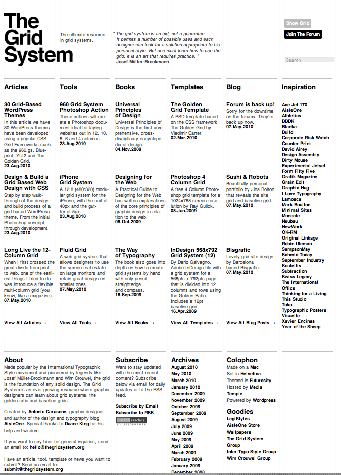
In the spirit of my shiny new WordPress blog, I thought I’d share some website/online grids with you, my lovely reader.

The appropriately named thegridsystem.org is a website that is completely dedicated to the grid structure in design. Their homepage is very minimal, focusing only on the basic elements of design to support their message of loyalty to simple, clean design. They don’t do anything flashy or trendy. Just a clear, beautiful grid. Their carefully sparse use color further emphasizes the importance of the grid (rather than color relationships or imagery). Their website even has a toggle switch where you can turn the underlying grid on or off to see the framework of their website.

TheGridSystem.org acts as a hub for information on using grids in digital design. Everything about this site is based on grids. The design, the name, the content. Even the websites that TheGridSystem links to are grid-based! They don’t mess around. That’s proof that grids aren’t confined to physical, tangible print media. Websites can look good with grids, too. In fact, I might take some cues from TheGridSystem and make my own site more grid-friendly. (At the moment, it’s very boxy but not based on any kind of grid or ratio.)

You might have to access a cached version of their site, as it went down as I was writing this post. *sigh* But when it’s back up, I suggest taking a spin for yourself. It’s a nice web experience.

theGridSystem.org

  Filed under: Find&Share, KCAI, Typography1
  Comments: Comments Off on Find & Share: The Nitty Griddy


Neon Monogram

By Erika Goering,

Here is my monogram for my project on the element neon. This symbol focuses on the stability of the element and not on the fact that it is a gas. The symbol is grounded, and the capital E acts as a weight for the symbol to rest on, reminding the viewer that neon is very stable, and is the least reactive element in the periodic table.

  Filed under: KCAI, Typography1
  Comments: 1


“Typeface”

By Erika Goering,

I saw the film “Typeface” last night. I ended up sitting near a large group of classmates who I’m sure all share the same feelings about design that I have. They even conversed about their common hatred for the Gap logo redesign. I love my classmates. They’re as snobby as I am.

“Typeface” tells the story of wood type, which is very rare and precious and rich with history. There’s something very engaging and intimate about seeing people handle these physical, tangible letterforms. They caress every curve, and connect with every beautiful flaw. That is what makes letterpress so valuable. Seeing the people in the film handle wooden letterforms with such care sends chills down my spine. They are giving the forms the respect and care they deserve. Before the informative parts of the film even developed, I knew the emotional aspects of it would hit me pretty hard. I felt very sad for the dying art of wood type. But I also felt compelled to do something about it. It was an emotional roller coaster. My feelings drifted between inspiration, amazement, sadness, and hope. The saddest parts were when I realized that wood type will probably become extinct in my lifetime. There isn’t enough appreciation for such an impractical method. Sadly, everything is cold and digital now. But it’s faster and cheaper that way.

One part of the film that stuck with me is when Professor Ichiyama explains that students who work with solely digital type don’t feel the same intense appreciation for counter space and delicate, cradle-like kerning as those who start with physical type. That’s why I appreciate all of the analog work that I have done in my Typography 1 class. I learned to appreciate serifs and brackets because I drew them by hand. I got up close and personal with the anatomy of my Bodoni capital S. There’s a little bit of me in that S. I grew to love her weight shifts and beautifully symmetrical form. It is the tangible experience with type that makes such a romantic, passionate relationship possible. Films about design and art make me feel very inspired. I even had this to say about it: (which was later re-tweeted by the “Typeface” people themselves, with an endearing comment of “!” I might add.)

  Filed under: KCAI, Typography1
  Comments: 1


Beanmaps– I mean bitmaps.

By Erika Goering,

I fixed a lot of weirdness with my letters. Giant counters, inconsistent x-height, “interesting” kerning… It was a sloppy mess. But it’s a lot better now. My x-height is now a very strict 7 beans (units) tall. And my counters in my lowercase letters are 3 beans wide. That makes everything feel more unified. And I didn’t have to change the scale of my beans and letters to make everything fit. It just works. No more hacking my way through this. I’m very pleased.
Oh, one side note. For those who are wondering, my composition is so freakishly wide because “Legume Protein” is such a wide phrase on a 4 inch tall piece of paper.
The more you know…

  Filed under: KCAI, Typography1
  Comments: Comments Off on Beanmaps– I mean bitmaps.


Neon!

By Erika Goering,

I picked quite possibly the most awesome element ever!

Heck yeah!

  Filed under: KCAI, Typography1
  Comments: Comments Off on Neon!