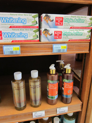
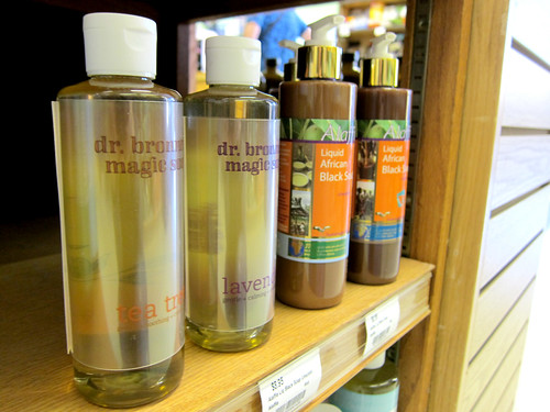
Final Packaging
By Erika Goering,
Filed under: KCAI, VisLang
Comments: Comments Off on Final Packaging
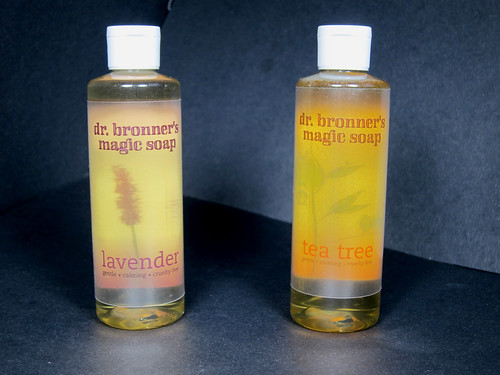
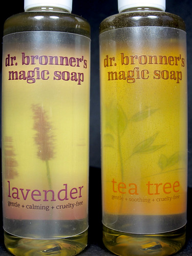
My concept:
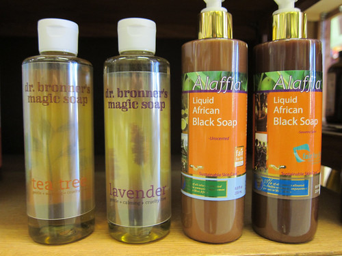
I wanted to show the organic, pure qualities of the soap while giving the customer a sense of magic (there’s magic in the name!) and comfort. I achieved this through transparency of the label and using the soap itself as a design element. Both of those things together created what Jumper called a “kind of hologram” effect. I think that’s pretty awesome.
What I learned:
I learned that the shiny & expensive Konica Bizhub c451 can’t print color on transparencies. Poop. But my old, raggedy printer at MyARTS can. And I can use that for personal stuff if I ask really nicely. So that’s awesome. I also learned that doubling up on transparencies gives the print some opacity. So I don’t have to worry about having an impossible (for my price range) white undercoat. I also learned that you can’t read text through soap in a cylindrical bottle. Light doesn’t go directly through it, so it distorts it all over the place. So using a painterly image back there was the solution to that.
Aside from technical stuff, I learned about modes of appeal, and how changing which mode you’re using can change the meaning of the product and even the audience that you’re targeting. That’s a big deal for marketing. Targeting a specific audience through psychology is friggin’ MIND CONTROL.
I have the power!