[Downing + Goering] Poetic Final
By Erika Goering,
Filed under: KCAI, Learning, Spatial Experience
Comments: Comments Off on [Downing + Goering] Poetic Final
Filed under: KCAI, Learning, Spatial Experience
Comments: Comments Off on [Downing + Goering] Poetic Final
As evidenced by my unusually fruitful number of find & share posts this semester, it’s pretty clear that the world is looking for technological solutions to Deaf/hearing language barriers.
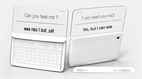
Here’s one last one that I found the other day:

It’s using the same idea I had for directionality, where two people in a conversation can easily read what is directed toward them, and the other person can do the same.

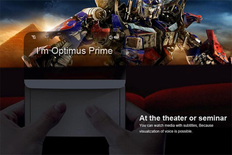
It’s even got a movie mode!
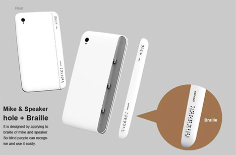
The unique thing about the Beethoven phone is that it also has functionality for blind users! There’s braille output for situations where hearing isn’t an option, but reading is okay (or if, of course, the user is both blind and deaf).

Braille for the blind!
Filed under: Degree Project, Find&Share, KCAI, Learning
Comments: Comments Off on One last Deaf Device Find & Share
We’ve started to narrow down and deepen our concept, with our Tamagotchi monument representing more than just play, but specifically the marked beginning of interactive, passive, but intensely involved play.
An article we found is much more eloquent about this idea than we are:
[…] Some of the key elements of Tamagotchi anticipated many of the most successful games in the emerging mobile and social gaming space.
[…] Tamagotchi anticipated a new paradigm, one where the gamer doesn’t so much play a game as “tend” it. Each Tamagotchi (an egg shaped keychain with an LED screen) gave the owner the experience of owning a virtual pet. The pet had to be fed, cleaned, and cared for. It was a keychain, so it was always in your pocket. None of the “gameplay” was complex, but this sense of responsibility and ownership coupled with the portability and “always on” nature of the Tamagotchi’s internal clock was a powerful draw.
[…] Tamagotchi’s basic formula – a simple mobile experience that a player engages with in several short sessions a day – is all around us. […] Gamers are relating to games in a new way. This low-impact/frequent engagement model is perfect for the mobile market, where – like Tamagotchi – games are often something used to kill time while riding the bus or waiting for food at a restaurant. Tamagotchi is primitive in terms of technology, but the fundamental relationship it establishes with the gamer is the same as many of today’s mobile blockbusters.
[…] Sometimes a cheap little plastic keychain really can change the world.
We did a little bit of research on Aki Maita, Tamagotchi’s inventor, and how she was involved in the process of developing this innovative toy.
What separates the Tamagotch (as it is known in Japan) from other electronic gadgets is the human-like demands it makes on its owners. “It is dependent on you — that’s one reason it became so popular,” the childless creator says. “I think it’s very important for humans to find joy caring for something.”
[…] Maita took Tamagotchi prototypes to the streets of Tokyo’s Shibuya district for a consumer test. She handed them out to about 200 high-school girls. “Their eyes instantly lit up,” she reports.
The Tamagotchi is more than just a plaything. It’s a part of our lives, whether we actively pursue the Tamagotchi itself or not. And that’s what we’re celebrating; the idea of interactive play that started with the Tamagotchi.
As for formal explorations, we’re definitely thinking of an interactive monument, where the pets’ health and wellbeing is dependent on people nearby. We are thinking of setting up a type of projection system, much like Keetra Dean Dixon’s “Plug-in-Play” experience. Ours will be different in that it will span the globe. Activities from the oversized pet in Tokyo will be displayed in New York. And vice-versa, perhaps. There will be more than just interaction with pets, but interaction of cultures as well. A truly inter-active experience.
Filed under: KCAI, Learning, Spatial Experience
Comments: Comments Off on Monument to Interactive Play
I’ve spent some time adding detail and depth to my video. I’ve given the personas/scenarios visibly different environments (no more bland white background!) and different colored iPhones too.
I’ve also got some views of the app/phone and watch peripheral from an angle that I didn’t use before, so that adds some visual interest to the whole thing.
I’ll have to go into After Effects soon so I can add a voiceover (and captions) to everything.
Filed under: Degree Project, KCAI, Learning
Comments: Comments Off on Week 12: Refining Presentation
Lots of great technological innovations were born in the 90s. The Pentium processor, the world wide web, and virtual pets.
As everyone knows by now, I’m an avid Tamagotchi collector. I have been since they were first released in the US in 1997. I now own over 50 pets (although I only ever raise one or two at a time). The reason why I’m so passionate about them is because their unique charm and personality brighten my everyday life. Their chirpy beeps and dancing pixelated characters give me a little bit of happiness and a break from reality when I need it the most. The amount of attention I give to my Tamagotchi determines the type of character it turns into when it grows up. It’s like raising a kid, without worrying about screwing it up permanently. If I manage to create a monster, I can just hit the reset button and try again from the beginning. Having this type of influence on an otherwise inanimate object gives me a strange sense of control, responsibility, and attachment.
The emotional attachment to virtual pets (and, more recently, artificially intelligent robots) has been officially named the Tamagotchi effect or Tamagotchi syndrome. The mere fact that a keychain-sized bundle of pixels and beeps can make such an impact on peoples’ well-being is reason for recognition.
So, Erica Downing and I are creating a monument dedicated to the warm, chirpy happiness that is the Tamagotchi and its history and influence on society.
We are planning on somehow juxtaposing a larger-than-life original 1996-model Tamagotchi with a large 2012-model one. Both will be interactive, full-featured pets that rely on the people of Tokyo for their care.
We already scoped out where this will go; on a corner of Harajuku Street in Tokyo, at the big intersection a block or two down the road from the official Tamagotchi Department store. (Go ahead and look around! It’s just begging for a Tamagotchi monument there!)
Needless to say, we’re pretty excited about doing a playful monument. We want to end this semester on a lighthearted note, with a project dedicated to play and fun.
Filed under: KCAI, Learning, Spatial Experience
Comments: Comments Off on SX Project 3: A Monument to Play
This week was all about animating my scenarios to show exactly what Relay does and how it works. It was a relief to finally be able to demonstrate how these things were moving around in my head! There’s a lot of sliding elements and a few rotations to show how the whole thing works. It’ll help even more to have context shots that show how the device works directionally and spatially between people.
Here’s what I have so far. Keep in mind, this is just a rough draft of my video. But it gets the point across for now.
Directly exporting from Keynote screwed up the timing (for example, screens should quickly transition after selecting a mode), so I think I’m going to make some minor tweaks in AfterEffects this weekend. Doing that will allow me to add a voiceover too! (I’ll be captioned, of course.)
Next steps:
Filed under: Degree Project, KCAI, Learning
Comments: Comments Off on Week 11: Relay Animation, Round 1

As good designers, we tend to unconsciously incorporate Dieter Rams’ Ten Principles of Design into our work. It’s common sense to us. Although the list is applied to design, it can be connected with so much more—such as us. Not us as designers, but us as people—contributors to society. Looking into human behavior, it’s quite funny how the idea of the principles seem to vanish in many cases. It’s as if ignoring common sense is just human nature.
Human Nature is a proposed exhibit that notes Dieter Rams’ Ten Principles of Design by showcasing the opposite meaning through people. The principles are divided throughout the area that the Artspace provides. Each principle is displayed through different environments, experiences, and people. That’s right—guests won’t have a smartphone in front of their faces at all times, nor will they be forced to read never-ending amounts of information plastered onto walls.
Human Nature uses real people as ways of learning, communication, and overall interaction. In fact,
visitors must interact with the people of the exhibit in order to determine what principle each group misrepresents.
Filed under: KCAI, Learning, Spatial Experience
Comments: Comments Off on [Goering y Schenk] project 2
Responding to the feedback from Monday, I spent some time exploring the colors and typefaces, with the intent to make everything feel more utilitarian and to give the whole thing more of a balance between masculine and feminine qualities. (The logotype was pretty darn feminine on its own, so I had to do something to offset that and make it less “cute.”)
I added a slideout menu on the side (that’s what those colored bars are), which will just slide the main menu screen on top of the current screen. That way, there’s no need for a back button of any kind (for any device; iOS or Android).
I also added the ability to scroll through movie captions, so users can go back and catch something they might have missed. This is particularly handy if the user is lipreading, and someone onscreen mumbles or covers their mouth (or is facing away from the camera, etc.).
And the peripherals have been updated to match the current style.
Next steps:
Filed under: Degree Project, KCAI, Learning
Comments: Comments Off on Week 10: Final UI Refinements
With my branding/naming adventure, I decided to replace my Sign•ify idea with the name Relay, simply because it makes more sense. As Jessi mentioned awhile ago (she was a HUGE help in naming my app), Sign•ify sounds like I’m making an app that converts speech into sign language, and not the other way around. So I dropped that idea and Relay was born.
Relay is my favorite choice because it embodies the idea of the back-and-forth nature of a conversation, as well as the act of translating back and forth between languages. Also, as the Deaf community knows, a relay service is one that involves a third party to translate/interpret telephone conversations between text and speech for Deaf or HoH people and the hearing people they talk to. My app idea is like a relay service for real life, without the extra person.
Here’s some of the directions I explored:
Gist was another favorite of mine, because there is no way to directly translate between ASL and English. Some things will inevitably be lost in translation, but the important thing is that it gets the point across. (I also toyed with the idea of referring to the gesture-based armband as the Gisture band… but that started to get a bit silly, I think.)
Lingo was another idea that had some potential. It conveyed the idea of language, obviously, but it also conveyed portability and ease (thus the arrows and the “go” part of the word). This idea wasn’t the strongest, by far, so I flip-flopped between Relay and Gist for awhile. I think Relay has the most amount of meaning of the three, so that’s what I’m going with.
Along with my new branding, I’ve changed the colors I’m using. Goodbye, trendy design colors. Hello, tasteful complementary colors!
In other news, I’ve decided to bring back the watch peripheral for a couple of reasons:
Here’s what the two peripherals look like:
Next steps:
Filed under: Degree Project, KCAI, Learning
Comments: Comments Off on Week 9: Wrapping Up the Brand & UI
Gestics is yet another concept design for an app/device like mine, complete with gesture-sensing armbands!
This thing just needs to be made already!
Filed under: Degree Project, Find&Share, KCAI, Learning
Comments: Comments Off on Yet Another Find & Share: Great Minds Think Alike