Blog Category: Find&Share


One last Deaf Device Find & Share

By Erika Goering,

As evidenced by my unusually fruitful number of find & share posts this semester, it’s pretty clear that the world is looking for technological solutions to Deaf/hearing language barriers.

Here’s one last one that I found the other day:
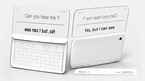
It’s using the same idea I had for directionality, where two people in a conversation can easily read what is directed toward them, and the other person can do the same.
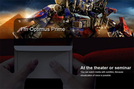
It’s even got a movie mode!

The unique thing about the Beethoven phone is that it also has functionality for blind users! There’s braille output for situations where hearing isn’t an option, but reading is okay (or if, of course, the user is both blind and deaf).
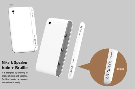
Braille for the blind!

  Filed under: Degree Project, Find&Share, KCAI, Learning
  Comments: Comments Off on One last Deaf Device Find & Share


Find & Share: More Peripherals!

By Erika Goering,

I’m getting rid of my infrared idea for the Deaf watch. Why? Because of this thing:


It’s an armband that can sense your gestures and finger movements by how your muscles flex. (We live in the future!)

Watch the demo video to see its true awesomeness.

  Filed under: Degree Project, Find&Share, KCAI, Learning
  Comments: Comments Off on Find & Share: More Peripherals!


Find & Share: Deaf Device Concepts

By Erika Goering,

Since I’m in an “anything goes” mindset with this project, I figured it’d be good to share some of the concept devices or peripherals that I’ve stumbled across. I will pull from some of these and apply it to my project in a way that works with my thesis question.

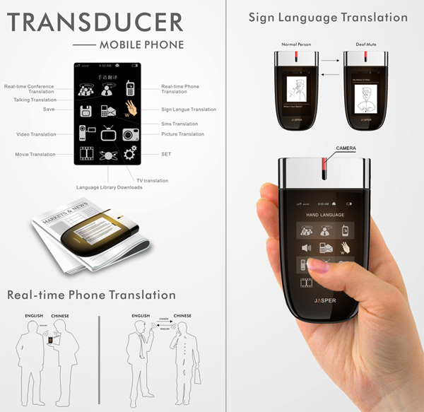
Concept phone that translates what the caller is saying:


Enable Talk Sign Language Gloves


Heads-Up Display Captions


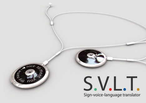
Sign/Voice Language Translator (SVLT)


One thing that was suggested the other day was a way of using gloves or rings to detect ASL and send it to translation software. I really like this idea; “smart” rings (and/or conductive fingernail polish??) that can send movement information to a translator. Maybe this, combined with an unobtrusive facial recognition camera (to capture facial expression and emotion) could be a solution. And maybe on the Spoken English-to-Deaf side, there could be a heads-up display (either external, like a Google Glass-style overlay, or internal/invisible, like a contact lens display) that displays transcribed speech.

I am starting to gravitate toward the idea of a mobile app that is supplemented by peripherals, instead of just an app by itself using default phone hardware. Making layers of technology invisible and/or well-designed is not only appealing and exciting to me as a geeky designer; it also excites me because I want to create fewer barriers (not more!) between hearing and deaf people. Using technology that can be successfully integrated or work behind-the-scenes in daily life is a very important aspect to consider. It would make all parties involved in the deaf/hearing conversation feel a lot less awkward. And I think it should be my focus.

  Filed under: Degree Project, Find&Share, KCAI, Learning
  Comments: Comments Off on Find & Share: Deaf Device Concepts


Creepy-Exciting Logistics

By Erika Goering,

I’ve gotten to the point where I’ve pretty much narrowed down what my app will be; a two-way ASL and spoken English translator, where both of these inputs (either ASL captured with a camera, or speech captured with a microphone) output to text on a mobile device (phone or tablet). Most of the things that I’ve researched as comparables have been limited: one-way, and not very useful (like converting text to ASL… Why not just type a message to the deaf/HoH person? They can read. You don’t have to try to fake your way through a language you don’t know… Ugh.).

Anyway, because I’m the type of person who likes to know if what I’m designing for is even feasible (which makes it all the more exciting for me), I searched around for some similar projects. Well, lo and behold, I found something creepy-exciting! (I actually shrieked when I saw this!)

Computer scientists in Scotland are developing technology that can translate sign language into text through a simple webcam. The technology, which has the potential to run on variety of camera-enabled digital devices, could be a big help to speech-impaired users trying to communicate, especially with members of the non-signing world.

[…]

PSLT [Portable Sign Language Translator] aims to help young learners with speech difficulties, to empower mobility- and speech-challenged users to issue commands to their appliances and devices, and to allow people with speech difficulties to customize their language settings to a variety of regional variations and personal preferences.

The creepiest (most serendipitous/coincidental) part is this (and I swear to the design gods that I had never seen this before today):

“The aim of the technology is to empower sign language users by enabling them to overcome the communication challenges they can experience, through portable technology.”

Isn’t that, like, exactly my thesis statement? I guess that means that something like this is ready to be designed!!!


  Filed under: Degree Project, Find&Share, KCAI, Learning
  Comments: Comments Off on Creepy-Exciting Logistics


The Stuff of Growth

By Erika Goering,

1: Makeup Tutorial

I’ve learned that one’s appearance as a teenage girl in high school or college is very important. However, as a jaded mid-20-something-year-old who’s been in college entirely too long, I choose to rock my dreadlocks and pseudo-professional attire in lieu of sweatpants, a messy bun, and a shit-ton of eye makeup.

That’s just how I roll (which is pretty much the point of this entire post). And my brain isn’t so bad either.

2: Theory of Multiple Intelligences

Let’s start this semester off with a personal backstory:

I’ve lived my entire life thinking I was “weird.” I was in my school district’s gifted program from 4th grade to 10th grade, so once a week I was confined to a bubble of established-but-unspoken superiority comprised entirely of pre-pubescent misfits (pretty much wedgies and pocket protectors all around, in contrast to and in result of our supposedly brilliant minds). Throughout middle school and high school, I mostly kept to myself, even while among my own similar breed of academic success.

Despite my achievements, the public school system had failed me.

Elementary school housed a completely different Erika. One that I currently strive for and long to become again. I was warm and caring, creative and uniquely myself. It was during this time in my life when I was more myself than I had ever been and probably ever will be again.

Somewhere down the line, between 4th and 10th grade, I was forced into this mold of what an ideal student was. I lost my original self, and my grades suffered. I stopped caring and I forgot how to be engaged in my own education.

I didn’t stand a chance unless I re-learned how to learn in a way that worked for me.

3: My Own Learning Style

Over the course of my life as a student (and validated by the learning style assessment we did for MX class), I somehow discovered that I’m pretty much all over the place when it comes to learning. I can do pretty well with both the abstract and concrete, but I tend to lean more towards the concrete (thus my mad skillz in standardized testing). This explains my interest and aptitude for geeky things that involve absolute answers (such as coding/programming). I’m definitely more reflective than active, which makes for some interesting dynamics between my geeky side and my artsy side. I’m very much into the philosophy of why things happen. But I also like to break things down and see how they work.

Knowing that people’s brains work differently is crucial in utilizing educational tools. Duh, y’all.

4: Education Paradigm TED Talk

Collaboration is the stuff of growth. True dat. Different types of thinkers bring unique perspectives to the table. But if we don’t nurture these perspectives, we all go bland. We get uninspired, depressed, hollow. We try to occupy our minds with distractions, regardless of the repercussions.

I think my saving grace in my high school and early college years was that I surrounded myself with people who had different traits than my own. I knew I needed some balance, and I believe that balance is what helped me succeed.

5: Paradigm Shifts of the Future

I’m expecting and anticipating some exponential growth and changes in education and technology. The trends are there.

Back in my day, the Internet was a new concept. My first computer was a gray box running Windows 3.1 (later upgraded to 3.11, I might add). Dot-matrix printer. The whole shebang.

As a child, I was fascinated with that machine. I absorbed every aspect of how that magical thing worked.

My second computer was a Compaq Presario desktop running Windows ME. (This was back when you didn’t need a shiny new device every other year. Any progress worth a damn took time. There was almost a decade between the two PCs of my childhood.) The Presario was my gateway drug to programming and design. It was on this monstrous device that I discovered HTML and Photoshop. We all know how that ended up.

I used the tools at my disposal to self-teach. Because that’s just who I am.

Fast-forward to today. I’m typing this post on a 15-inch, wafer-thin supercomputer that’s worth more than my car. To my left is an even smaller 7-inch supercomputer, with a quad-core processor and hardly any physical buttons. In my pocket is a smartphone of similar (albiet a bit outdated) capacity. I have the internet in my pocket, on my lap, and at my side. I literally have the world at my fingertips. How friggin’ cool is that?

It blows my mind every day that I’ve got cutting-edge technology at my disposal that was just a twinkle in someone’s eye a few years ago. I am learning both crucial and useless information every day at my own volition. Because it’s engaging. Maybe even habit-forming.

I can learn anything I want at anytime I want. That’s hella powerful.

As far as paradigm shifts go, we’re definitely in one.

The merging of education and technology is in itself a huge leap forward. With something as simple as the addition of tablets in the classroom, textbooks are no longer a limitation; they’re now interactive and engaging and dynamic. And this is just what we need to make learning worthwhile.

  Filed under: Find&Share, KCAI, Learning, Multimedia Experience, Read&Respond
  Comments: Comments Off on The Stuff of Growth


“Design” vs. Design

By Erika Goering,

I recently read an article on TechCrunch about user experience and what it takes to succeed in the competitive world of tailored/targeted apps. While the article specifically talks about the digital/interactive realm, this same thinking can be applied to other design problems.

Jamie described this issue last year as “skeleton vs. skin,” where the skeleton is the structural, functional side of a project, and the skin is the styling and aesthetics (and content is the guts that make it all viable in the first place). A skeleton can stand on its own if it needs to, but a pile of skin is an empty, shallow, lump. (However, a bare-bones [pun intended] design can get boring and feel naked or unfinished if left skinless.) Structure gives design a way to cater to a user’s needs without collapsing under the pressure of user interaction. A “pile of skin” may be well-groomed and sexy, but no skeleton means a lifeless experience. A skeleton and skin together provide a beautiful balance of structure and beauty, where a user can enjoy a smooth experience while having something sexy to look at.

So, let’s break it down… … Continue reading

  Filed under: Find&Share, Information Architecture, KCAI, Learning, Living, Read&Respond, User Experience
  Comments: Comments Off on “Design” vs. Design


F+S: Packaging

By Erika Goering,

Dr. Bronner’s Magic Soap – Tea Tree
 
This product uses ethos, because it’s endorsed and created by a doctor, who the soap is named after. You can totally trust that guy with your hippie hygiene needs.
I picked this soap over the others nearby because I like the color-coded packages together on the shelf. Also, the sheer absurdity of the amount of text is amusing, and it makes me wonder what they were thinking. So that’s fun.
The part of the design that speaks to me first is, of course, the massive amount of text filling the entire label. Seriously. The entire thing. It doesn’t speak to me as much as it screams to me for help.
The first thing a customer does with this package after picking it up off the shelf is quickly shove it in their shopping basket because they don’t have much time for reading a novel on a soap bottle.
The package is usually handled very quickly. All of the vital information (brand name, product name, scent/variety) is front & center. The text everywhere else is so unnecessary, most people don’t even see it as text; it’s just a texture around the sides.
Dr. Bronner’s Magic Soap stands out on the shelf because of its use of color. Each version of the Magic Soap has its own little place in the Dr. Bronner’s rainbow, so they work well together while standing out from the minimalistic soap packages nearby.
Friends’ thoughts:
  • Dr. Bronner’s Magic Soap has “SO MUCH TEXT!”
  • “I don’t even know where to start if I wanted to read all of it.”
  • “I don’t want to read it in the store. I’ll wait until I get home and use it as reading material in the bathroom.”
Smart Balance Light Buttery Spread
 
This one is totally logos. It’s full of information and facts and even has footnotes on the side to further support its claims.
I chose this over the others, not only because it’s vegan and I want to eat it, but also because it’s got some healthier-looking information on the label. (Flax is awesome.)
I was definitely drawn to the information on the package rather than the actual design of it. Because I think the design pretty well blends in with all the other margarines and butters in the aisle. The large text might also have something to do with it. It’s pretty huge.
The first thing I did when I picked up the package was actually read all of the quick facts on the side. It’s interesting stuff!
Of course, not everything is communicated on the front. It’s got the name of the product on the front, but the informative stuff is on the side.
In terms of shelf presentation, this package is pretty much your average margarine. It’s got happy primary colors and a rather light feel.
Friends’ thoughts:
  • “It’s all green and yellow. Like healthy butter.”
  • Big text, but a clean feel.
  • “Kind of trendy, new-ish look.”
Knotty Boy Locksteady Dreadlock Tropical Tightening Gel
 
I think this one is pathos, because it’s got a scene of a carefree beach, with a carefree dude, sporting his carefree locks. It feels very relaxed, but fun.
I chose this package over the others in the ethnic hair care section because it was one of the few with an actual personality. Other packages looked bland and boring, while this one looked a bit more fun. However, the package does look a bit juvenile and cartoony compared to the more mature designs of other nearby packages.
The dreadlocked dude on the front /side sticks out to me because he makes eye contact with the purchaser. Also, the use of color is unlike a lot of the other products nearby, which are mostly yellow and pink or brown. More fleshy colors, while this one is beachy and blue/green.
The first thing I did after picking up the package was sniff it because the package says it’s got lime in it. Sure enough, it smells like a limeade. On the beach.
Not everything is communicated on the front. In fact, most of the relevant information is on the sides/back (I just realized all of my products are cylindrical and they don’t really have “sides,” but oh well). The paragraph (which could’ve easily been condensed to a few bullet-points) explains how the product works and what to expect from regular use.
Friends’ Thoughts:
  • “Lots of green!”
  • “Very beachy.”
  • Dreadlock boy looks playful
  • “Party atmosphere”
  • Fun!

  Filed under: Find&Share, KCAI, VisLang
  Comments: Comments Off on F+S: Packaging