Blog Category: Find&Share


Find + Share: Rhetoric

By Erika Goering,

I’ve recently fallen in love with Milton Glaser’s work. Here’s why.

The AIDS symbol, created in 1987 (the year I was born!), is an example of multiple rhetorical tropes.

Antithesis: The juxtaposition (and combination) of the hearts and the skull intensify the negative relationship between sex and AIDS, and shows that sometimes love can lead to death, and thus makes love a scary, but even more precious feeling.

Personification: Death takes the appearance of a human skull. That’s pretty much that.

Synechdoche: The skull also represents the humans affected by AIDS.

  Filed under: Find&Share, KCAI, VisLang
  Comments: Comments Off on Find + Share: Rhetoric


DVDs & Posters

By Erika Goering,

One movie campaign that I immediately thought of was Food, Inc.


The use of visual pun (the barcode standing in as the cow’s spots) is both eye-catching and relevant to the message that food has been reduced to a product with utter (udder!! ha!) disregard to the integrity of the food itself in its natural state.

The saturated color in the image hits the viewer in the face while alluding to today’s food being hyper-saturated with artificial colors and preservatives. This DVD cover combines natural and artificial elements to create an uncomfortable feeling of being over-processed while not having a crowded composition.

I’ll be keeping these things in mind throughout this project.

  Filed under: Find&Share, ImageMaking, KCAI
  Comments: Comments Off on DVDs & Posters


Typography Inspiration: Dr. Seuss

By Erika Goering,

The symbols from On Beyond Zebra! remind me a lot of the monograms we did last semester. I find this inspirational because it shows that someone as imaginative as Dr. Seuss played with letterforms the same way I have. And it gives me a bit more hope for my own future as a creative person.

…Never mind the fact that On Beyond Zebra! is supposed to be a book for kids ages 6 to 9. They really mean to say it’s for typography students age 19 and up.

  Filed under: Find&Share, KCAI, Typography2
  Comments: Comments Off on Typography Inspiration: Dr. Seuss


Speaking of Printing… (Find & Share)

By Erika Goering,

Imagine a book about printing, made by various desktop printers from history. Printed through a chain of 4 printers representing a point in desktop printing history, each with an assigned color in the CMYK process.

What?

I know. Crazy.

Crazy-awesome.

Xavier Antin uses an array of four vintage printers to print this book. Each one prints one of the CMYK colors, then sends it through to the intake feed of the next printer in the queue. So, there are four types of technology, progressing through 100 years of history on one sheet of paper. And this happens with every page of the book. The registration of colors (or lack thereof) shows both the separation and the unity of these technologies. All of them serve the same purpose. All of them have small, convenient form factors. But the method of getting an image on paper is different for each printer. These methods include inkjet and laser printing, as well as a stencil duplicator (mimeograph) and a spirit duplicator (the ones from back in the day that made grade school worksheets smell good when they came off the press… Mmmm…. printing…).

Stair-stepping through history.

Just In Time, via BoingBoing

  Filed under: Find&Share, KCAI, Random, Typography2
  Comments: Comments Off on Speaking of Printing… (Find & Share)


Paul Rand & Stefan Bucher

By Erika Goering,

Paul Rand links art and design by their common uses of form and content. Without form, there’s no content, and without content, there’s no form.

This video is great because it illustrates what Rand is talking about by using the most basic, simple forms composed in very careful ways (much like our dot compositions from earlier in the semester). Rand says that the elements of design are the language of form, and I think that’s very true. Form doesn’t have a voice unless you give it something to talk about and a way to say it.

A blue circle is just a blue circle, until you make it sit a certain way in a frame or multiply it a thousand times and use scale changes to give a sense of depth. Then you’ve got bubbles in water. You’ve set a scene for a story.

Just like markmaking is just markmaking until you put marks together and give them context. They don’t mean anything until there’s a use for them. And that’s what design is. It’s purpose.

Stefan Bucher is a professional markmaker. He turns marks into drawings, and those drawings turn into characters. Then the characters adopt personalities of their own. He starts with a type of fractal ink blot that creates a framework for his creatures.

Both of these artists are using basic elements of art and design to create compounded elements that start to take their own shape. This is exactly what I am doing with my haiku shapes. I took marks, put them together to make compound marks, then I turned them into a flash video, with movement and dimension.

  Filed under: Find&Share, KCAI, Read&Respond, VisCom1
  Comments: Comments Off on Paul Rand & Stefan Bucher


Why Kerning is Important

By Erika Goering,

Yeah. It’s supposed to say “flicks” but it looks like… something else.

It’s what Ironic Sans calls keming.

So be careful with your kerning, kids. You could end up forming words you didn’t intend to make.

  Filed under: Find&Share, KCAI, Random, Typography1
  Comments: Comments Off on Why Kerning is Important


Scher Share

By Erika Goering,

Paula Scher is on a mission, much like I am. She is trying to convey the spirit of New York City in a similar way that I am trying to reflect Kansas City in my line studies. She emulates New York’s loud, eclectic atmosphere by creating large-scale work with bold forms and contrasting color. These works stand out in the urban metropolis by being larger than life and more eye-catching than their surroundings. On a much smaller scale, I emulate Kansas City’s diverse collection of neighborhoods by using different kinds of lines that resemble the feel of those areas.

Unlike Scher, I am not advertising anything. I am merely stating what each neighborhood is and how it feels to me. I’m much more personal with my work. I want the viewer to understand how I feel about my city. I want it to be a more intimate experience than Scher’s work. Her intentions are more public, with a much larger audience, and with a more “shout it from the rooftops” feel. My work is a quiet chat over tea compared to hers.

  Filed under: Find&Share, KCAI, VisCom1
  Comments: Comments Off on Scher Share


Find & Share: The Nitty Griddy

By Erika Goering,

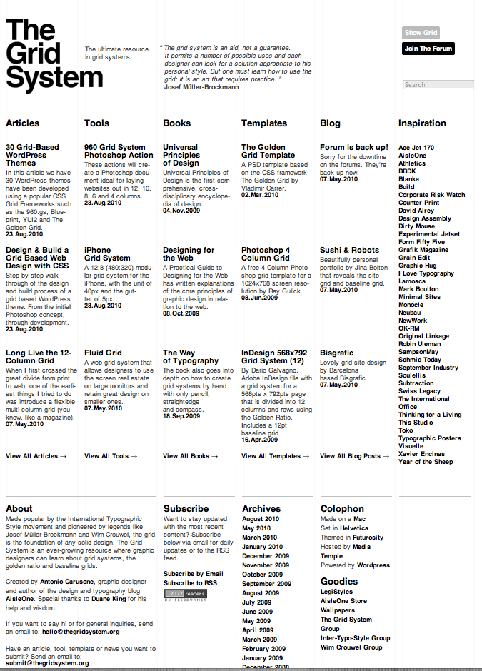
In the spirit of my shiny new WordPress blog, I thought I’d share some website/online grids with you, my lovely reader.

The appropriately named thegridsystem.org is a website that is completely dedicated to the grid structure in design. Their homepage is very minimal, focusing only on the basic elements of design to support their message of loyalty to simple, clean design. They don’t do anything flashy or trendy. Just a clear, beautiful grid. Their carefully sparse use color further emphasizes the importance of the grid (rather than color relationships or imagery). Their website even has a toggle switch where you can turn the underlying grid on or off to see the framework of their website.

TheGridSystem.org acts as a hub for information on using grids in digital design. Everything about this site is based on grids. The design, the name, the content. Even the websites that TheGridSystem links to are grid-based! They don’t mess around. That’s proof that grids aren’t confined to physical, tangible print media. Websites can look good with grids, too. In fact, I might take some cues from TheGridSystem and make my own site more grid-friendly. (At the moment, it’s very boxy but not based on any kind of grid or ratio.)

You might have to access a cached version of their site, as it went down as I was writing this post. *sigh* But when it’s back up, I suggest taking a spin for yourself. It’s a nice web experience.

theGridSystem.org

  Filed under: Find&Share, KCAI, Typography1
  Comments: Comments Off on Find & Share: The Nitty Griddy


Findin’ & Sharin’: Lines by Saul Bass

By Erika Goering,

I’ve said it before; Saul Bass was a ninja. So, naturally, I chose some of his work to show off some line studies.

Bass did a bunch of movie posters back in the day. They all had blocks and linear elements to portray the overall feeling of each film a poster represented.
Here’s what I’m talkin’ ’bout:
Random line study: varying widths of elements and space between them conveys a tense feeling of uncertainty.
Progressive: The lines have a decreasing distance in between them and converge in the center, showing movement from a starting point to a destination. (Kind of reminds me of a flushing toilet. Hahaha…) The spiral represents dizziness, which is what the word vertigo means.
Regular: Everything is the same width and seems very balanced. There is equal width from the center of the poster to the outside edges. The content is safely nestled in the innermost portion of the work.

  Filed under: Find&Share, KCAI, VisCom1
  Comments: Comments Off on Findin’ & Sharin’: Lines by Saul Bass