Blog Category: Information Architecture


Semester Reflection

By Erika Goering,

 UX

User Experience is a class I was really excited about when the semester began. And I think that enthusiasm is what made me realize how much I actually love this kind of stuff. Tailoring design to suit the needs of real people is something I’ve always been intrigued by, and I feel very fortunate to have learned so much about it.

Research was really the main thing covered in this class. The big lesson I took away from it was understanding. Not just regurgitating quantitative information, but applying it on a qualitative and conceptual level. Understanding is the key to creating good work. And that applies to any subject. It’s not just design. It’s life.

I feel like I’ve unlocked some of the secrets of design; like I’ve been given some exclusive tools for being amazing. I’m part of an elite club of designers who take actual people into consideration, and not just “getting the job done.”

User Experience has actually made me re-think my future as a designer. I came into this program with the idea that I’d end up working in for a small, local company, doing glorified desktop publishing for random clients. But now, my standards have changed, and I’m starting to take a real interest in catering to niche markets and subcultures. These unique groups of people need someone to speak for them and to them, and I want to become that someone.


IA

I’ve decided that information architecture is yet another direction I could possibly take in my life (and definitely enjoy!). I love the idea of building usable information out of raw data and content. Sculpting something practical out of something mundane is like magic. The geek in me loves to create order and hierarchy, and I love making it accessible and digestible too.

Between UX and IA, I think I’ve developed quite a design arsenal this semester. I’m getting dangerous.


T4

Typography 4 taught me how to manage a project on my own. This was my first real self-directed class, and I learned more about myself than I did about typography. I think typography was just a medium for that. The experimentation process also taught me about how a project can evolve dramatically over time and become something really refined and engaging. And it taught me to keep pushing things, even when I think I’ve pushed enough. There’s always more to do, and there’s always something better to achieve.


Overall

This semester has been the most nurturing, inspiring, and stimulating semester I’ve ever had. I’ve learned more about myself and who I want to be in these three classes than I have in my entire college career.

  Filed under: Information Architecture, KCAI, Learning, Typography4, User Experience
  Comments: Comments Off on Semester Reflection

Namasté: Back to the Beginning

By Erika Goering,

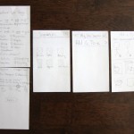
Everything about this app started as a series of iPhone-sized sketches on paper.

  Filed under: Information Architecture, KCAI, Learning
  Comments: Comments Off on Namasté: Back to the Beginning


Namasté iPhone App Progress

By Erika Goering,

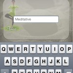
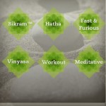
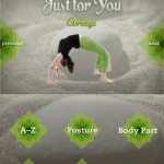
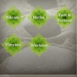
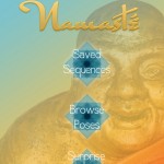
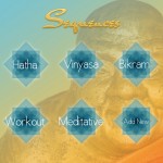
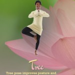
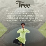
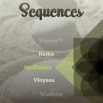
Here’s the progress I’ve made so far. Compositions have been tweaked, and every screen in the scenario exists now! Hooray!

  Filed under: Information Architecture, KCAI, Learning
  Comments: Comments Off on Namasté iPhone App Progress


Yoga App: Namasté

By Erika Goering,

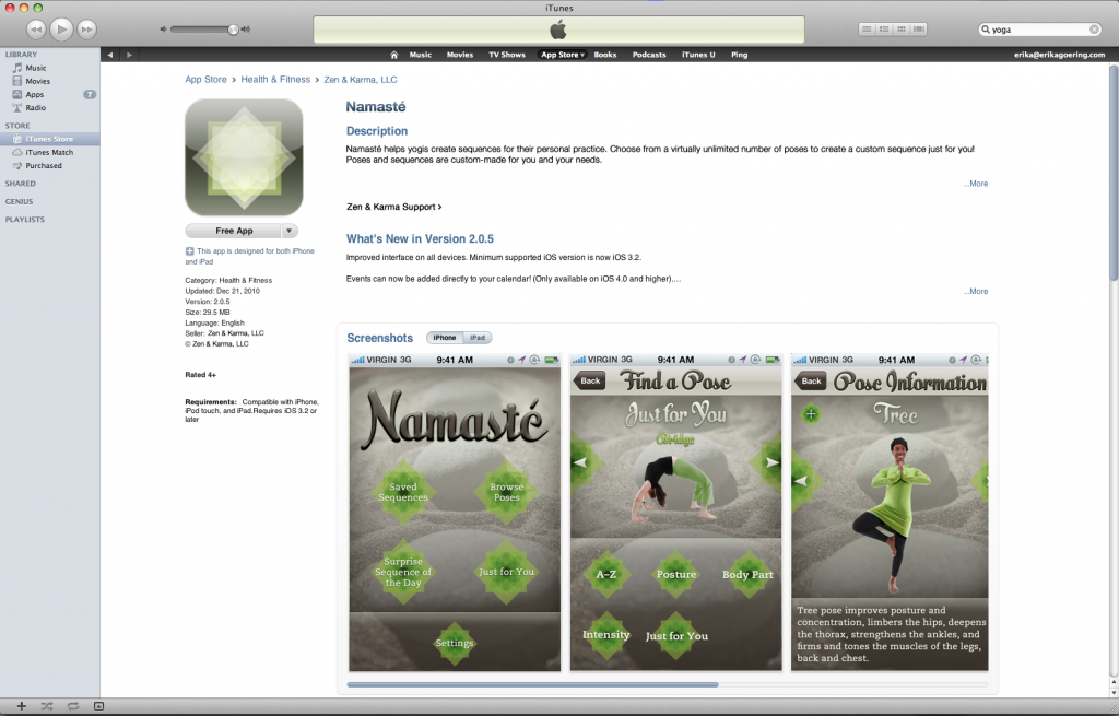
So, I’ve obviously moved forward with the zen garden theme. The scenario I’m showing is a user (Sarah, a yoga teacher) going through the app to create and save a new sequence of poses.

  Filed under: Information Architecture, KCAI, Learning
  Comments: Comments Off on Yoga App: Namasté


Yoga iPhone App Visual Directions

By Erika Goering,

  Filed under: Information Architecture, KCAI, Learning
  Comments: Comments Off on Yoga iPhone App Visual Directions


“Design” vs. Design

By Erika Goering,

I recently read an article on TechCrunch about user experience and what it takes to succeed in the competitive world of tailored/targeted apps. While the article specifically talks about the digital/interactive realm, this same thinking can be applied to other design problems.

Jamie described this issue last year as “skeleton vs. skin,” where the skeleton is the structural, functional side of a project, and the skin is the styling and aesthetics (and content is the guts that make it all viable in the first place). A skeleton can stand on its own if it needs to, but a pile of skin is an empty, shallow, lump. (However, a bare-bones [pun intended] design can get boring and feel naked or unfinished if left skinless.) Structure gives design a way to cater to a user’s needs without collapsing under the pressure of user interaction. A “pile of skin” may be well-groomed and sexy, but no skeleton means a lifeless experience. A skeleton and skin together provide a beautiful balance of structure and beauty, where a user can enjoy a smooth experience while having something sexy to look at.

So, let’s break it down… … Continue reading

  Filed under: Find&Share, Information Architecture, KCAI, Learning, Living, Read&Respond, User Experience
  Comments: Comments Off on “Design” vs. Design


Tailored/Tailorable App Ideas for Yoga Teachers

By Erika Goering,

Idea 1: Yoga Class Management app

  • allow yoga teachers to keep track of their class schedule
  • plan/manage yoga class curriculum
  • manage student subscriptions and take payments
  • timer to keep track of class duration and individual pose durations

Idea 2: Yoga Routine Planner

  • choose from different types of yoga (ashtanga, hatha, kundalini, bikram, vinyasa, etc.)
  • select poses and durations
  • save routines for later
  • create custom types of yoga (like “newbie yoga,” “fast & furious,” etc.)
  • gives the user something to follow during practice

Idea 3: Pose Corrector

  • augmented reality app recognizes when students have bad form
  • points out problem areas (like if a student’s back isn’t straight)
  • teaches anatomy and physical benefits of yoga
  • suggests modifications when traditional poses aren’t working (to either make the practice easier or more challenging)

  Filed under: Information Architecture, KCAI, Learning
  Comments: Comments Off on Tailored/Tailorable App Ideas for Yoga Teachers


Tamagotchi Collection Site is Live!

By Erika Goering,

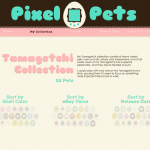
…and it can be found here.

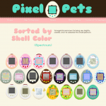
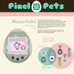
And here’s what it looks like. I think I’ve at least gotten closer to resolving the composition issue.

  Filed under: Information Architecture, KCAI, Learning
  Comments: Comments Off on Tamagotchi Collection Site is Live!