Blog Category: KCAI


Final Logo Build: Occupy KC

By Erika Goering,

My main idea behind doing this was to push myself to learn a few brand new things. I wanted to combine motion capture with 3D (all in just a few days!) and somehow make it all work out. I wanted to use 3D and motion capture to better convey the feel of having a crowd of people standing up for what they believe in.

My process: I basically started over, as far as the digital stuff goes. I recorded myself thrusting my fist in the air in a few different ways, then motion-captured all that stuff and made my vector fists follow those motions. THEN… (and here’s the crazy part) I made each animated fist a 3D object, placed them in my little After Effects world, and zoomed my imaginary camera through all of them.

Ta-da!

Pretty nifty, huh?

So here’s what I learned:

  • 3D camera stuff isn’t nearly as scary as it sounds. Totally doable, once I played around with it for awhile. (The demo we had earlier helped too. I just had to refresh my memory on exactly how to set everything up.)
  • Motion capture is tough to get perfect. Despite having a demo on it earlier, I still had some trouble getting it to work out (upside-down and sideways fists kept showing up for some reason). But it obviously ended up working out just fine after some tweaking.
  • If I set “new things to learn” goals, and I actually reach them, I feel like a pimp. Hell yeah. *happy dance* I tried all the new things I wanted to try, and I feel like a better student, a better designer, and a better person for it. Yay, college!
  • Having time to play around and discover new things is just as important as having time to do the actual project. I spent a lot of time poking around in AE and it paid off. As a side thing, I discovered how the particle generator works! Hooray! I’ll be using that beautiful tool in the future, for sure. I feel like I have a deeper, more intimate understanding of After Effects now. And that’s always good.

  Filed under: KCAI, Narrative/Sound&Motion
  Comments: Comments Off on Final Logo Build: Occupy KC

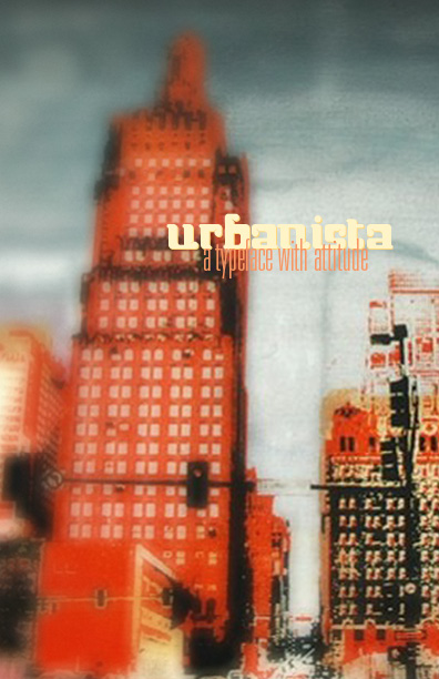
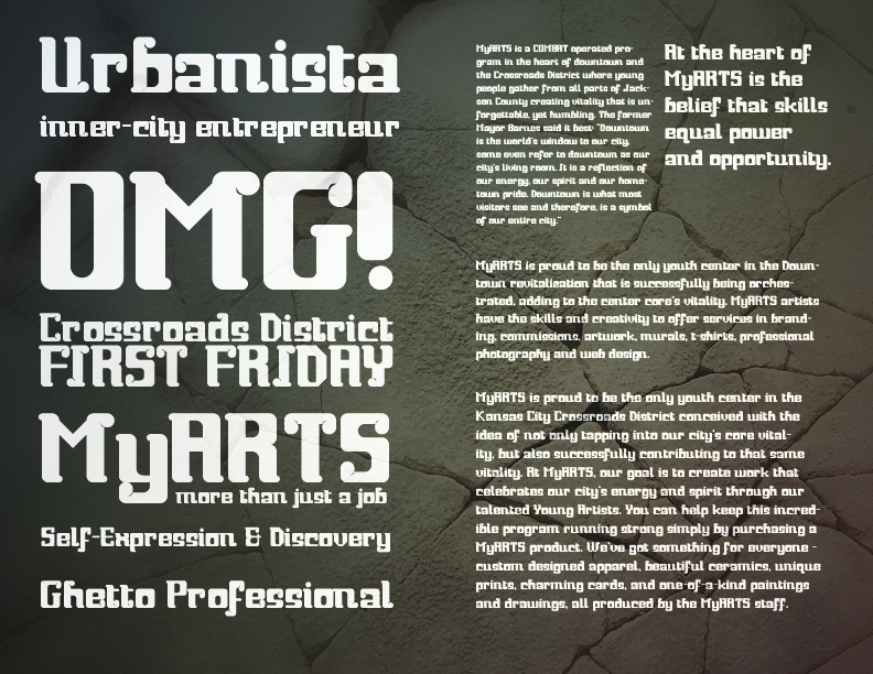
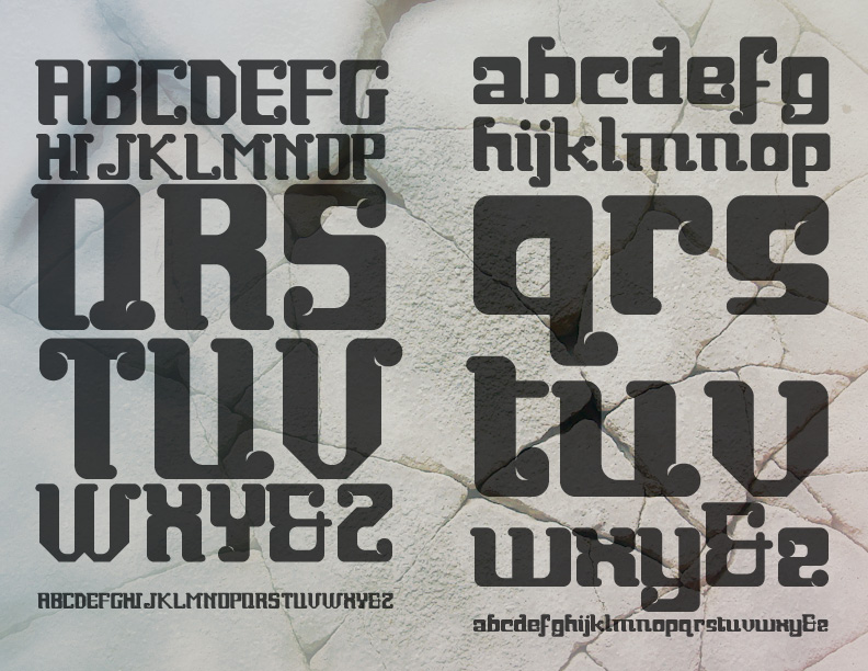
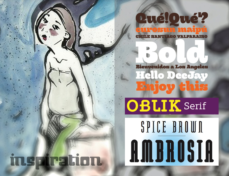
Final “Urbanista” Specimen

By Erika Goering,

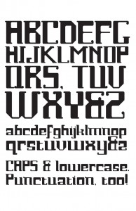
“Urbanista” Typeface

  Filed under: KCAI, Typography3
  Comments: Comments Off on Final “Urbanista” Specimen


From Sow to Supper: Final Thoughts and Presentation

By Erika Goering,

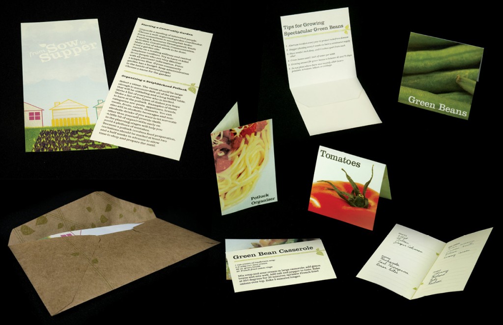
From Sow to Supper

What did we learn from this project?

We learned how to capitalize on each others strengths to maximize productivity. An example would be my fantabulous photoshop skillz, while Jumper‘s BAMF copywriting skillz and eloquent way with words made it easier to write about what we were doing in this project.

Poverty is a complex issue and there are many small nuances that must be taken into account to be sensitive to the subject and to those who are involved in it. The connotation and interpretation of words played an important role in this kind of project.

We also learned about the power of design to cause social change with the implications of what we are doing. Design is an important tool for changing the lives of many.

What would we do if we had more time to work on this project?

If we had more time with this project we would like to expand the elements that were included in the packet to also have a neighborhood watch form and a neighborhood daycare information sheet.

During our critique, it was brought up that in a project like this one it would be important to have a follow up packet that would be sent out later to reinforce the message and to also give more information that could be pertinent to community garden care and harvesting.

Lastly if we had more time we would continue to work on the imagery of the supplemental elements to gain further continuity between them. This would involve the continued mixing of vectors and photographs.

  Filed under: KCAI, VisLang
  Comments: Comments Off on From Sow to Supper: Final Thoughts and Presentation


Final Narrative Project

By Erika Goering,

I’ll be further refining my Occupy KC logo build. I just don’t feel like I spent enough time with it. And it’ll give me an opportunity to play around with some more AE stuff that I didn’t get to experiment with before. Because this is my semester for expanding my comfort zone. So, I’m making a huge effort to expand my design toolkit and pick up techniques that I never even considered before.

While I’m revisiting an old project, I’m putting myself in a situation where I’m forcing myself to try something new. Because that’s what college is all about. Duh.

  Filed under: KCAI, Narrative/Sound&Motion
  Comments: Comments Off on Final Narrative Project


History of Motion Graphics

By Erika Goering,

It’s longer than you think.

In a beautiful piece of motion design itself, this video gives a lot of insight on the long, rich history of motion graphics.

Honestly, when I think of motion graphics, I think of all of the contemporary work that’s all around us right now. I tend to forget about the past. But the history of motion graphics is filled with experimentation and discovery.

Motion graphics is all about finding new ways to bring visual information to life.

While it’s easy to forget about, motion graphics (like most any other art form) has its roots in analog media. From the innovators such as Georges Méliès to the cutting edge of firms like MK12, there has always been explorers treading the frontier of moving pictures and embracing an appreciation for and manipulation of the tangible media.

Digital media has paved the way for motion’s explosive growth. So many things now are animated and supplemented by movement. Digital media, as it tends to do, has made the art of movement both more convenient to do and more complex. But in our oversaturated world, it’s easy to forget its importance.

We are lucky to be design students in a time when such exponential growth is taking place. We get to literally watch it morph and change before our eyes. Definitions of “analog” and “digital” are blurred beyond recognition, and we are using every resource we can think of.

In the history of motion graphics, we are living in a very important and influential chapter, filled with innovation, experimentation, and rebellion. But we should always remember where we came from, and fully appreciate every step of the way.

  Filed under: KCAI, Narrative/Sound&Motion, Read&Respond
  Comments: Comments Off on History of Motion Graphics


Final Logo Build: Occupy KC

By Erika Goering,

Power to the people!

Concept (for those who haven’t heard):

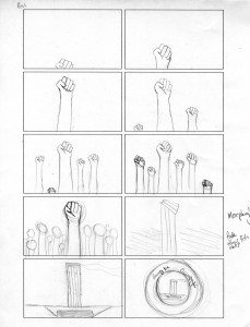
I chose the most obscure of the Occupy KC logos, using Liberty Memorial as a metaphor for the strength of the organization. Formally, I loved how similar Liberty Memorial is to a raised “power fist,” so I played up that aspect. The glowy, energy orb stuff intensifies as the crowd grows larger and more powerful.

What I Learned:

  • I learned how to enhance a brand by adding sound and motion to its identity. That’s kind of a big one.
  • I learned how to morph stuff! That was pretty painless, actually. At least it was the way I did it. I figured out a way to put points on a layer and warp those points around. So that was cool.
  • I also learned that 5 seconds of video equals about a bajillion hours of work. But that’s what happens when you’re still figuring out how to make things move in a believable way. Oh well.
  • TIME MANAGEMENT. A constant lesson.
  • And I learned some motion tracking! YAY! Although, since that was a whole in-class demo, that’s a thing that everyone learned. So that’s a given.
  • I also learned that storyboarding is super-important. I know it probably sounds silly, but it really kept me on track.
Speaking of storyboards…

  Filed under: KCAI, Narrative/Sound&Motion
  Comments: Comments Off on Final Logo Build: Occupy KC

Urbanista: The Typeface

By Erika Goering,

Round 1 of my specimen. Round umpteen of my typeface.


  Filed under: KCAI, Typography3
  Comments: Comments Off on Urbanista: The Typeface


Design Intervention: Sow to Reap

By Erika Goering,

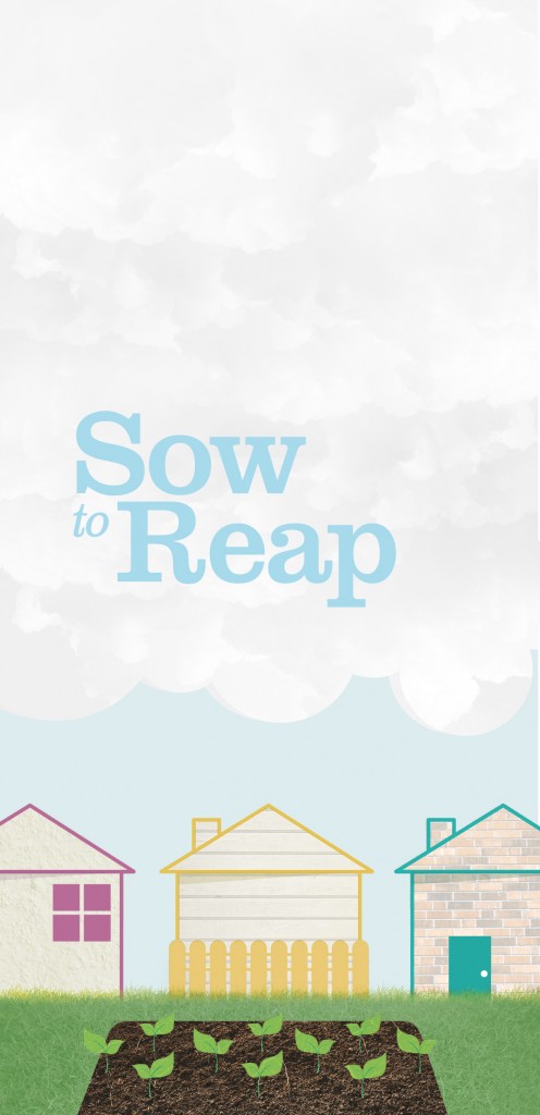
My partner and I made it our goal to target troubled neighborhoods, while not necessarily excluding anyone else.

So, we’ve got a community garden thing going on. Everyone likes gardens! The idea is that it’ll bring people in targeted neighborhoods together, and in turn, reduce crime and save money on groceries! Everyone’s happy!

We wanted to create something friendly and appealing to all ages. So we went with a vector/photographic hybrid technique. (Or, as Jamie called it, a Frankenstein method of imagemaking.)

We’re still working on our additional components, such as seed packets and recipe cards and a potluck planner. We want to take the neighborhood through the entire process of planting a garden, harvesting, cooking, and sharing the fruits of their labor.

We’re also changing the name to Sow to Supper for that reason.


  Filed under: KCAI, VisLang
  Comments: Comments Off on Design Intervention: Sow to Reap


My Typeface So Far

By Erika Goering,

Some words that my classmates used to describe my typeface include:

  • implusived
  • focused
  • boxy/geometric, but “not mechanical”
  • unexpected
  • weighty/smashed/unbalanced
Overall, I think it still conveys the feeling I wanted to show. So that’s awesome! However, it is a bit too boxy. I’m gonna play around with rounding some of my elements and start breaking some of the rules I’ve set for myself.
I still need to name the damn thing too.


  Filed under: KCAI, Typography3
  Comments: Comments Off on My Typeface So Far