Blog Category: KCAI


My Koenig Book

By Erika Goering,

(Also posted here: http://kcaitype3.blogspot.com/2011/10/erika-book.html)

My concept is to utilize a simple structure in an architectural way, inspired by Koenig’s work.

I chose a large landscape book to imitate the shape and scale of a Koenig house. The 13×13 grid reminds me of a floor plan (think square footage). The condensed sans-serifs imitate pillars and beams, and contrasty serifs provide a modern feel.

My system for page/section layout relies on an open, clean floor plan. While still very structured, there is lots of whitespace to contrast with the dense type, and the captions are modular and liberal.

I’m still working on a system for treating the photos, but I’m thinking about focusing on the framework of the houses and highlighting what gives the architecture strength.

13×13 grid, both pages of a spread


The first page of each section is “indented” by starting in the second column of the first page.


Subsequent pages in a section are filled with text, accented with an image, and supported by pillars of whitespace.


  Filed under: KCAI, Typography3
  Comments: Comments Off on My Koenig Book

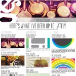
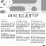
Newest Website Sketches: Now with Hierarchy!

By Erika Goering,

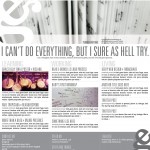
I’ve been working on getting my hierarchy more organized, and I’m also playing around with my shiny new copy of Clarendon Text! It’s so much better than using plain old regular Clarendon for body copy. It just feels more even and fluid. Yay!

layout
layout2
layout3
layout4
layout5
layout6

Anyway, I’m starting to code some of the HTML/PHP right now. I’m also working on integrating various WordPress plugins that have the functionality I want (like the slideshow, and the 3-blogs-on-one-page thing).

I’m doing my WordPress theme from scratch, because I really want to make it mine. And I want to practice some better ways of building a site, like doing the HTML before I do the CSS, or actually using H1. H2, H3, etc. for hierarchy.

I need to break some bad habits. And I think this is the best way to do that.

  Filed under: KCAI, Online Presence for the Artist
  Comments: Comments Off on Newest Website Sketches: Now with Hierarchy!


Union Station: Zooming in Forever!

By Erika Goering,

One of the things I love about interactive media is the virtually unlimited possibilities. You’re not confined to a 2D plane or a static image. There’s the potential for depth, animation, sound, and user-influenced behavior.

My partner and I have been focusing on depth and layers as our main way of categorizing information and isolating the important points from other information.

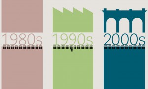
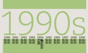
Below is an idea where the user zooms in to go deeper and see more detailed content. It literally narrows in on the events that happened during that time. The color represents the state of Union Station in each decade, where the ’80s were drab and boring, and the ’90s were a time of growth and renewed hope for Union Station. It was a fresh start. I’m still playing around with color and shapes for them and the other decades, and I’ll be introducing some texture soon, so that’ll be one of the next things I explore.

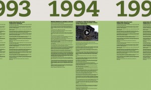
To navigate, the user would use pinch gestures to zoom in, and the content would increase in size until the text is legible and the video reaches full-screen (yay, vectors!). The user could also swipe left or right to jump between events, years, or decades, depending on how zoomed in they are.

zoomed out enough to see the adjacent decades


zoomed in to see just the ’90s.


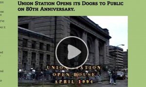
1994′s highlights include two newspaper articles and a video.


zoomed-in video closeup


  Filed under: KCAI, Narrative/Sound&Motion
  Comments: Comments Off on Union Station: Zooming in Forever!


R&R: What Should Food Look Like?

By Erika Goering,

Response to http://observersroom.designobserver.com/alexandralange/entry.html?entry=24298

I love the idea of packaging influencing and attracting certain people to use (or not use) a product. That’s one of the great things about design. We can’t read minds but we sure as hell can persuade them. That’s why I think every designer should take a few psychology classes. Get inside the human mind. Learn to manipulate it.

…But enough about that.

Food packaging in particular is a means to strategically create a very specific mood for the customer. If I use a rounded slab-serif instead of something monospaced and typewriter-esque, what does that make the customer think or feel about the product? Is one more classy than the other? Is one more friendly? Does it convey a sense of value or frugality? Does it look too posh for the audience to the point where they won’t go near it because it’s probably too expensive? Should they just stick to the yellow store-brand?

Great design can be off-putting to the wrong audience. If it looks too generic, people will see it as a lower-quality product and might walk right past it. And if it’s too fancy, the majority of the audience might just ignore it because they’ll feel it’s out of their price range.

Appealing to a wide, diverse audience is a difficult, but important task. The key is to target the majority of people without creating a mediocre, generic design. And that’s why package design requires such a tactful outlook.

And that’s my challenge for this project.

  Filed under: KCAI, Read&Respond, VisLang
  Comments: Comments Off on R&R: What Should Food Look Like?


R&R: Tropicana Redesign

By Erika Goering,

In response to this post: http://www.nytimes.com/2009/02/23/business/media/23adcol.html

While the new (2009) Tropicana package design felt clean and fresh, it did lose a lot of its personality when the familiar imagery was replaced. No one can deny that an orange with a straw in it is a pretty clever way of portraying freshness and purity.

I do applaud the redesign as an exercise/experiment in showing purity and freshness in a different way, but I think what the design gained in clarity, it lost in personality and cleverness. I think Tropicana made a gutsy move, and it definitely got people talking. But package design can be a dirty game. A well-known brand will always have devoted followers, and they don’t like change, whether it’s a good idea or not.

Yes, the design is technically successful in that it clearly shows pure, 100% orange juice. Yes, it works as a clean, fresh design. But it fails to show a sense of humanity. It fails to show a sense of warmth and trust. (I know it’s not exactly supposed to go full-on pathos, but it needs to be a whole lot less cold and sterile.)

I would’ve liked to see them work harder to keep the personality and familiarity of the brand while still keeping that clean, fresh, pure look and feel. That’s what makes a package design great, especially for such a well-known, well-respected, and well-loved product.

That’s just my two cents.

  Filed under: KCAI, Read&Respond, VisLang
  Comments: Comments Off on R&R: Tropicana Redesign


Some Thoughts on WordPress: More than Just a Blog.

By Erika Goering,

Since I’m starting to think about my website as more than just a blog, I’m also starting to venture outside the realm of using WordPress itself as “just” blog software. I’m starting to think of it as a content management system (and a blog as a secondary purpose). So, that’s something new. I’m thinking that, instead of my random thoughts being the main focus, I should let my work do the talking. I’m starting to feel like it’s getting good enough to speak for itself anyway.

I’m also thinking about using some HTML5/CSS3 (Ah! Scary!) in my new and improved website. For mostly the non-essential stuff like masking images into text and using crazy typefaces. That way, if non-supported browsers happen to come along, they won’t be missing anything except some pretty effects. The content will be there regardless of browser version. (But my heart belongs to Webkit. Always.)

Anywho, I’ve been thinking about how to automate everything (where pages/slideshow/whatever are updated automatically when I create a relevant post). Everything will be integrated better sitewide, instead of this half-WordPress stuff. So that’s something else.

I really want to push myself out of my HTML4/blog box. And I think violently thrusting myself into HTML5, PHP, and a non-traditional blog (or even non-blog-centric) layout is the way to go. It’s the only way I’ll learn. Because I’m to stubborn/lazy to do it at any other time.

I’m starting to gather some resources on how to build various aspects of my site. (Like the slideshow, and the masked text-image things, and the triple-blog… I’m starting to play around with @font-face and other CSS capabilities, too.) Because I want to build this whole thing from scratch. I’ve explored some options regarding how to make this all work. And I think I’ve got a doable (and I mean actually doable this semester) solution to work towards.

My main goal as far as backend functionality is to make WP do all the work. When I create a post and, say, tag it “slideshow,” I want my slideshow to automatically update with an uploaded image, the post title, and first sentence or two of the post. And when I post to my “KCAI” category, I want it to show up on my front page as my most recent post for “Learning Design.” I don’t wanna have to manually put content in a folder for the PHP gods to grab. I want the PHP gods to worship me. So there.

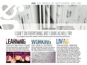
…So that’s where I’m at. Oh, and sketches too! This is what my site is gonna look like!

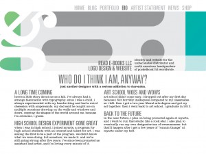
I’m in love with the Univers/Clarendon combo. I know, I know… Clarendon doesn’t exactly work for body copy… I’m working on getting Clarendon Text (with a web license, of course) for all my @font-face needs. Yes, I’ll have some backup font options in my CSS file. Don’t worry about that.

That’s all I’ve got for now. I’m super-excited about this project. I can’t wait to get it all done!

  Filed under: KCAI, Online Presence for the Artist
  Comments: 3


Package Design Inspiration

By Erika Goering,

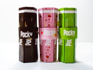
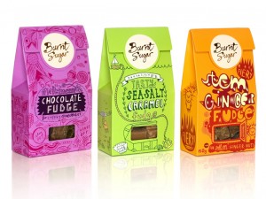
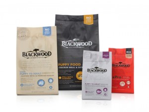
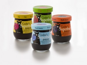
Something I’ve gotten into with package design is the idea of color and pattern and texture differentiating between multiple varieties of products within the same product line. I love it because it creates a unifying theme for all of the products in the line, while still giving each product its own personality and feel.

Also, a good thing to think about in terms of usability is using texture and pattern and lightness/darkness as a backup for color-coding, for colorblind people or black & white photographs… Or other situations where color isn’t perceivable or necessary.

I’m hoping I get to use Dr. Bronner’s Magic Soap for this project, because there’s already a color-code established. Those colors have become symbolic of what the scents are. Peppermint is blue, tea tree is orange, lavender is… lavender… Anyway, I want to play with creating textures and personalities (and even updating/tweaking the color) for those. And, as a bonus, there are similar products within that line that have completely different shapes too! Like bar soap instead of bottled, and whatnot.

Sources:

http://www.smashingmagazine.com/2008/06/02/beautiful-and-expressive-packaging-design/

http://lovelypackage.com/

http://www.packagingoftheworld.com/

  Filed under: KCAI, VisLang
  Comments: Comments Off on Package Design Inspiration


Final Grace Kelly Poster and Whatnot

By Erika Goering,

This is my final poster. The one that was chosen.

I’m still feeling like a rockstar. I can’t believe something of mine was actually chosen for a big deal like a concert! Ah!

comps7-01.jpg

… Continue reading

  Filed under: KCAI, VisLang
  Comments: Comments Off on Final Grace Kelly Poster and Whatnot


Round 2 Website Sketches

By Erika Goering,

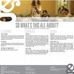
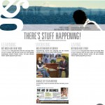
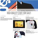
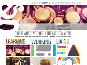
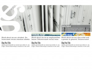
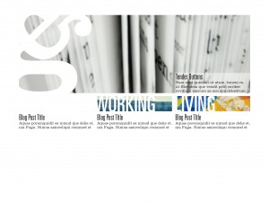
The main thing I want to do is have my portfolio be the most dominant element on the page. The large image on the top will be a slideshow of my work. Clicking on an image will take you to its page in the portfolio, where users can see more images of the project, and also process documentation and purchasing options if that’s available. (I’ve got a few things for sale at MyARTS. I’d like to make room in their inventory for my new stuff, and also promote them as a company. Because they’re awesome. Duh.)

I also want to have a single blog post for each category on the front page. That will be a sort of preview for what I’m currently doing in each area of my life as a designer. One for school, one for work, and one for everyday random design thoughts and finds.

Also, big-ass logo.


  Filed under: KCAI, Online Presence for the Artist
  Comments: Comments Off on Round 2 Website Sketches