Blog Category: KCAI


Headers and Thoughts (and Lots of Parentheses)

By Erika Goering,

These are my 3 not-so-different headers that I’m playing with right now. What’s holding me back is the fact that I’m working within the constraints of my current blog/site theme. There’s not much I feel I can do with it, so I’m getting stuck. Big time.

If I could just move my blog into another area of my site, and just redo everything (and I mean EVERYTHING) from the ground up (leaving the root of the site free for whatever I please), I’d feel very liberated (which is why I usually do a major website overhaul every couple of years anyway; to keep from getting stale). I’m actually working on some sketches for what a possible portfolio/triple-blog would look like. (I say triple-blog because I’d want a specific place for school process, a place for MyARTS/freelance process, and a place for random thoughts and design commentary/inspiration, each in their own little area, instead of the giant blob of blog that it is right now. Yuck.)

…Although, I can’t easily move things around right now without breaking all of my RSS links, permalinks, and things like that (well, poop…).

Aside from all that, I’m really digging my EG mark/logo/doodle up there. In fact, I’m thinking about making that a major element of my shiny-new blog/portfolio/thing. (Yes, Kidwell, it’s Clarendon. And it’s feminine, darn it! Just look at those sexy curves!) And the coffee stains are starting to take a more active role now. Because I’m addicted, that’s why. (You got a problem with that??)

I apologize for all of my parenthetical sidenotes. I guess I’m just in a parenthetical mood.

  Filed under: KCAI, Online Presence for the Artist
  Comments: Comments Off on Headers and Thoughts (and Lots of Parentheses)


Type Process and Self-Critique

By Erika Goering,

So, about my Gertrude Stein book…

[flickr id=”6114679002″ thumbnail=”medium” overlay=”false” size=”medium” group=”” align=”none”] [flickr id=”6114133097″ thumbnail=”medium” overlay=”false” size=”medium” group=”” align=”none”]

[flickr id=”6114135425″ thumbnail=”small” overlay=”false” size=”medium” group=”” align=”none”] [flickr id=”6114683948″ thumbnail=”small” overlay=”false” size=”medium” group=”” align=”none”] [flickr id=”6114152299″ thumbnail=”small” overlay=”false” size=”medium” group=”” align=”none”]

I started out thinking purely about rhythm and emphasizing syllables, but now, I’m starting to get a bit deeper into it. I’m still thinking about rhythm, but now I’m also overlaying words onto words (using transparency) and creating density where words feel the strongest, so that when you flip through to the next transparent/translucent page(s), the dense word still lingers as a strong presence in your mind the way it does in mine.

My ultimate goal has remained consistent; I want to express how I personally interpret the poetry. I feel it like a sort of literary jazz. Lots of syncopated rhythms, variation between soft and hard sounds, with some words drawn out longer and smoother than others.

I’m gonna push this stuff further to make the composition less subtle and more dynamic. Because it’s not subtle in my mind. It’s friggin’ THERE. Like a literary rimshot.

So, here’s some things I’m gonna play with:

  • Scale! This is a big one. I’ve got a lot of whitespace, creating a very lightweight, empty kind of feeling. But I don’t feel the poetry as being so light all the time. Some parts are light, but some parts are much heavier. I’m gonna play with weight and scale a bit more. I’m thinking the type size could grow exponentially, like the dynamic intensity of her poetry.
  • Orientation/Rotation! Some of her words feel curvy or upside-down. I can’t really describe it better than that. But they need to look like how they feel.
  • Case. Changing some really intense-feeling words to be all-caps would definitely add to the feeling of dynamism in the text. But this is not nearly as important as scale.
  • Italics. I’m thinking italicizing some more “flowy” words would accurately portray how they sound to me.
  • More organized grid structure! What I have now is just a loopy, curvy alphabet soup of poetry. No structure. Like a soggy noodle. Bleh. That needs to change.
  • Typeface change? Right now, I’ve got Officina Serif. I might change to something different. Or also use Officina Sans. I just feel like I need some more variation. It’s all kind of one-note right now. And my new school year resolution is to never be one-note and be more daring with my design work. So, yeah. Gonna do that.
So, that’s what I’ve decided to work on before Friday. And I’m starting to refine my materials too. Definitely gonna stick with layering, because it’s so important to how I feel about Stein’s work. There’s meaning in there somewhere, but it’s buried in the rhythm. …Anyway, I’m definitely gonna go buy some vellum, and maybe some other transluscent paper for more dense layers in between poems.

  Filed under: KCAI, Typography3
  Comments: Comments Off on Type Process and Self-Critique


Portfolio Contents

By Erika Goering,

Web Design:

  • ErikaGoering.com: 2010 | HTML, CSS, WordPress PHP
  • VegBlogs.com: 2009 | HTML, CSS
  • Francis Designs: 2007 | HTML, CSS
Public Art:
  • Stop (Collaboration with Davin Watne and MyARTS Youth): 2007 | 8×8′ | Inkjet print on paper
Printed Work:
  • Knowledge is Nourishment poster: 2010 | 12×18″ | Laser print on paper
  • InspiRational Lisa Strausfeld poster: 2011 | 24×36″ | Inkjet print on paper
  • Hacker//Modder magazine spreads: 2011 | 17×11″ spread, 8.5×11″ page | Laser print on paper
  • Less>More campaign book: 2011 | 11×11″ | Laser print on paper
  • 6° Could Change the World: 2011 | Approx. 27×40″ | Inkjet print on paper
Photomanipulation:
  • Untitled series of 5 playful figures: 2007 | each one is 8×10″ | Inkjet print on glossy paper, framed | SOLD
  • Paradise: 2008 | 40×20″ | Inkjet print on paper, framed | SOLD? (I think I sold it a couple years ago, but I’ll have to double-check.)
  • New York Chakra series of 7 digital collages: 2009 | 11×17″ | Inkjet print on paper, framed | Some have been sold; I’ll have to see exactly which ones those were.
  • Untitled one-frame narrative with multiple Erikas: 2010 | 4×6″ | digital print on postcard
I’m sure there are other works that will be added to this list, but for now, this is what I’m most proud of.
I’m currently working on a logo and a website that will probably make this list when it’s all finished.

  Filed under: KCAI, Online Presence for the Artist
  Comments: Comments Off on Portfolio Contents


Type Inspiration

By Erika Goering,

Serif:

This rocks my socks because it conveys how I (and a lot of designers) feel about type. It’s got a mind and body of its own. And it must be studied to fully understand its potential.


Sans-Serif:

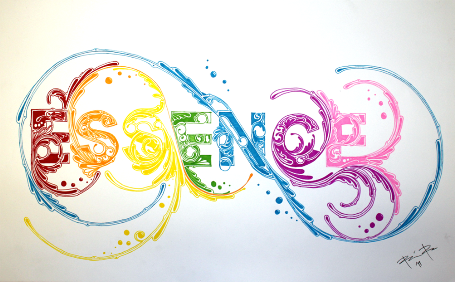
This captures the essence of the word essence. Pretty straightforward.


Hand-Rendered:

Apparently, this typeface took 4 months to complete. Pretty impressive.

Misc (I don’t know what category to put these in):


Long story short, I want the type on my website to convey a feeling and have something conceptual about it, rather than just being Clarendon for Clarendon’s sake. That’s why I’m starting to get into experimental typography. It puts type into a more tactile and personal realm.

I want to push myself out of my little typographic comfort zone this semester. And I wanna be friggin’ awesome.

  Filed under: KCAI, Online Presence for the Artist
  Comments: Comments Off on Type Inspiration


My Goals for My New Portfolio

By Erika Goering,

I want to reach people who are interested in what Kansas City has to offer, while showing off my mad HTML/CSS skills. I want my portfolio to be proof that I can create an atmosphere with the web. I want people to know that I have some serious love for my digital tools.

I want to express my versatility and my passion for good design, and show off my interest in learning new things (my portfolio is kind of all over the place).

I’m thinking about organizing my work by where/why they were made. A section for school, a section for work, and a section that’s more personal.

  Filed under: KCAI, Online Presence for the Artist
  Comments: Comments Off on My Goals for My New Portfolio


Bio: About Me and My Work

By Erika Goering,

About Me:

Learning Design
My goal at the moment is to take in all I can as a graphic design junior at KCAI. Before KCAI, I was mostly self-taught, and I’m slowly realizing that I taught myself some bad habits. Every class I take gives me a bit more power as a designer. I feel like I’ve finally got some of the “insider exclusives” of design in my toolbox now. It’s not just putting cool-looking stuff on a page anymore. It’s cool-looking stuff with purpose and meaning.

Working Design
I work at MyARTS, Metropolitan Youth Arts & Technology for Students. It’s an after-school program for artistic and creative high school students. In 2006, I started out as part of the first group of unpaid apprentices, and over the years, I’ve moved up the ladder and now make a living from it. I’m an Assistant Lead Artist, who runs the whole studio with the Head Lead Artist. I mentor/teach high school students everything I know (sometimes at the same time that I’m learning it myself), and it’s been a blast so far. If you want to know more about my time at MyARTS, I’ve finally started a section of my blog for it.

Living Design
My life is 24/7 design. From the time I wake up to the time I go to bed, and even in my dreams, I am designing. Like any designer, I have likes and dislikes, I fall in love with certain typefaces (Bodoni, anyone?), and I have a deep hatred for Comic Sans and rainbow gradients. To legitimize my designer-ness, I belong to AIGA and the Freelancers’ Union. I hope to make some connections and partnerships with other designers in Kansas City, and help make this city more beautiful, one design at a time.

About My Work:

School Work
My work at school is my strongest. I get lots of feedback from my classmates before a project is finished. Most of the work I do right now is from school. It’s my top priority until I graduate.

MyARTS Work
Almost everything I do at MyARTS is client-driven. Whether that means client-influenced or client-controlled, I do what they want. That used to mean that my work was verbatim what they told me they wanted. I was just a means of getting there. Now, I inject my design knowledge into every client-based project. If they try to control it too much, I remind them what my job is. I’m there to DESIGN. I’m there to make decisions about the best fate for a project. I’m no longer afraid to brag about my abilities and take control of a project.

Freelance and Personal Work
My freelance and personal work is where I have the most freedom. I’m my own boss, and I can do whatever feels right. I don’t have to answer to anyone but a client. And the ones who choose freelancers are usually laid back enough to accept and trust my creative decisions.

My work overall doesn’t really have a particular style. It really is determined by the content and the purpose. It can range from quiet and reserved to elaborate and textured, to powerful and dramatic. My portfolio is currently undergoing an overhaul, where I purge my old work and showcase my new work.

I used to feel that these three worlds should remain separate, but as I grow as a designer and as a person, these categories are starting to absorb each other. My new knowledge is spilling over into every area of my work.

  Filed under: KCAI, Online Presence for the Artist
  Comments: Comments Off on Bio: About Me and My Work


Just a Thought…

By Erika Goering,

For those who don’t know, we’re working with Gertrude Stein’s poetry in Type3 and Narrative in Sound & Motion.

Gertrude Stein’s poems are based on sounds and rhythms and tones, rather than meaning. The meaning is very loose, if existent at all. Reading her work, I find myself rocking back & forth and tapping my foot in a syncopated rhythm to the words. It’s literary jazz.

…And we’re doing jazz posters in Visual Language.

Coincidence? I think not.

  Filed under: KCAI, Narrative/Sound&Motion, Random, Typography3, VisLang
  Comments: Comments Off on Just a Thought…


Find + Share: Rhetoric

By Erika Goering,

I’ve recently fallen in love with Milton Glaser’s work. Here’s why.

The AIDS symbol, created in 1987 (the year I was born!), is an example of multiple rhetorical tropes.

Antithesis: The juxtaposition (and combination) of the hearts and the skull intensify the negative relationship between sex and AIDS, and shows that sometimes love can lead to death, and thus makes love a scary, but even more precious feeling.

Personification: Death takes the appearance of a human skull. That’s pretty much that.

Synechdoche: The skull also represents the humans affected by AIDS.

  Filed under: Find&Share, KCAI, VisLang
  Comments: Comments Off on Find + Share: Rhetoric


Kinetic Type

By Erika Goering,

What’s more appropriate than a kinetic type video about language? Although this post is technically for Narrative in Sound & Motion, it makes sense to also tag it for Type3, because it’s about the appreciation of language and using the meaning of the text to influence the typography.

The most intriguing thing about this one is that I started to notice all the very deliberate curves and turns the blocks of type were making. Then, as I suspected, it zoomed out to show a word made of words. Hooray!

…And then I found this one. Also regarding the degradation of language. But done with a lot more expressive type. Varied typefaces, weights, and sizes make this one quite a bit more interesting than the other one.

  Filed under: KCAI, Narrative/Sound&Motion, Typography3
  Comments: Comments Off on Kinetic Type


Grace Kelly

By Erika Goering,

From my group’s presentation:

Grace Kelly

Grace Kelly is a 19-year-old saxophone player and vocalist with the talent and experience of a seasoned veteran. Her mother guided her to jazz music at a very young age.

Her vast list of musical influences includes Charlie Parker, Miles Davis, Duke Ellington, and Ella Fitzgerald, and spans a variety of genres.

She has released 7 albums, won several awards, and has played with numerous big names, such as Wynton Marsalis, Harry Connick Jr., and Esperanza Spalding, to name a few. She is touring to promote her new album, Man with the Hat, where she collaborates with 80-year-old Phil Woods.

Grace Kelly is still finding her own signature style, and she has been experimenting with a more unique sound on her recent album, Grace.

Her Role with the Band

Grace Kelly makes an effort to learn many different instruments, including learning bass and drums, in order to help compose her songs.

This is important for her skills as a band leader, as her touring band members have solo careers of their own.

She plays different saxophones, and feels that they each give her a different voice to express and to bless others.

In addition to playing multiple instruments, she also sings, with a sultry tone similar to that of her alto sax.

Every note she plays is controlled and deliberate, which leads to a more reserved sound. Overall, her music has a familiar feel, reminiscent of smoky jazz clubs and dim lights.

Mood Board

Grace Kelly’s youth and femininity influence our mood board’s color palette with youthful, yet deep purples and pinks, flowing into more sophisticated and mature golds and warm hues. The board shows movement from a traditional jazz scene to an increasingly experimental future, as well as showing her own ongoing growth as a performer and musician, finding her own individual voice as she grows older.

The sunset-inspired colors are also influenced by the fact that Grace Kelly is a rising star in the jazz community and a maturing, contemporary artist who embraces current culture.

The patterns, textures, and points of light illustrate her emerging style and refined technique, while showing a syncopated, uniquely jazzy rhythm.

[flickr id=”6086407392″ thumbnail=”medium” overlay=”true” size=”medium” group=”” align=”none”]


  Filed under: KCAI, VisLang
  Comments: Comments Off on Grace Kelly