Blog Category: KCAI


New School Year, New Designer

By Erika Goering,

I had a breakthrough over the summer.

Backstory: For those who don’t know (or just haven’t heard about it enough yet), I’m an assistant mentor for high school students at an after-school art program called MyARTS (where I used to be a mentored high school student myself). So, in addition to taking classes at KCAI, I’m also learning from a MyARTS mentor (and on-the-job experience from various client jobs), and in turn, mentoring/teaching the high school kids who are also part of the program. Pretty sweet gig.

So, as I learn from various sources about how to be an awesome designer, I’m teaching everything I know to these high school students. So, everything I do at school, I immediately try to apply it to whatever we’re working on at MyARTS. It helps me solidify what I’ve just learned, and kind of validate myself as an artist and designer too.

Since the curriculum at MyARTS is very open, I have a lot of freedom if something comes up and I want to have a whole day dedicated to it. Best job ever.

So, anyway, over the summer, our studio did its yearly turnover, where I lose my older kids because they’re leaving for college, and the new freshmen haven’t come into the program yet. So there’s a short time where I have a nearly empty studio and I’m just working on client jobs and random other boring things like inventory until I can get some more people in my studio. During that time, I talked with my supervisor/mentor about starting a “real” graphic design curriculum for the apprentices who are visiting each studio before they are officially hired. I used everything I learned my sophomore year to create a more structured, logical series of exercises (as many as I can fit in a 3-hour slot) and, I put it to the test when the first apprentice came through my studio.

I set up 3 mini-projects (that should take about an hour each); one for Photoshop, one for Illustrator, and one for InDesign. The Photoshop project is an exercise in basic photomanipulation and super-simple typography (finding the right typeface for a mood conveyed in a photo). The Illustrator project teaches how to use the scanner, how to trace an image with the pen tool, and how various other tools work together to create a simple vector illustration. We then take that illustration into InDesign and use it (along with more typography) to create a business card for the student! Hooray!

This little 3-hour curriculum was a pretty awesome success. (Although I’m starting to think I need to incorporate Photoshop better into the business card project…)

But that’s not even the best part. My newfound leadership and ability to apply what I’m learning in college to a high-school-age group is starting to seriously boost my confidence. Yay!

As a result, I’m not holding back, and I’m starting to also create a more structured design process for our young designers.

We just happened to get a new client job at the end of the summer. We need to design a logo for an e-book reader company. With previous jobs, we would have a chat with the client about what they wanted, and then run over to the computers and start cranking out whatever came to mind. We came up with crap most of the time.

So now, applying what I’ve learned in school about developing ideas (which is something I continue to struggle with), I decided that we needed to have critiques every couple of days to see how things were going. That went okay, but it still left us stuck. So, today, I ended up making them do some serious idea-developing, and we came up with some pretty cool outside-the-box stuff. IT’S REALLY WORKING! The project is starting to go where it needs to.

So, back to the point. The big breakthrough was that my brain started to make connections about applying what I’ve learned to the real world. AND IT’S WORKING! And my new faith in myself is starting to translate into my schoolwork (the little bit that I’ve done this first week of school). I’m not so shy and intimidated anymore now.

I’m very excited about my future in design.

  Filed under: KCAI, MyARTS, Working
  Comments: Comments Off on New School Year, New Designer


Final Magazine

By Erika Goering,

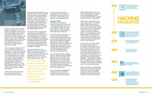
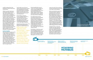
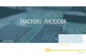
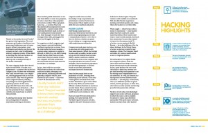
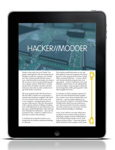
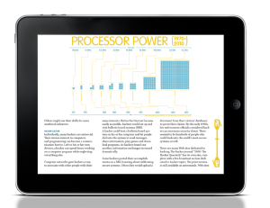
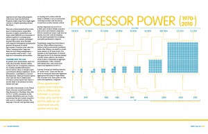
The changes from the previous version to the final were just tweaks to some detailed areas. Awkward rag, caption placement, and things like that. I’m very happy with how this project progressed. I feel like something clicked on in the typographical part of my brain, and everything just made sense.

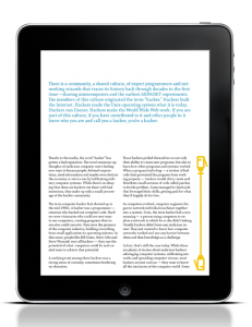
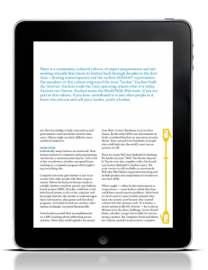
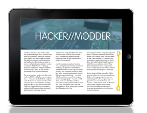
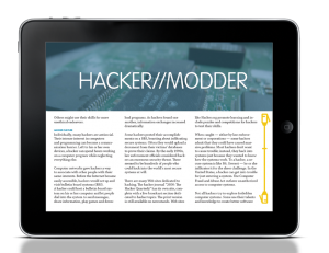
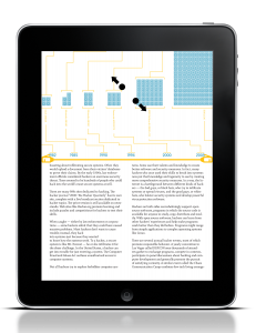
Here’s what the magazine looks like on the iPad:

Hacker//Modder Presentation
  Filed under: KCAI, Typography2
  Comments: Comments Off on Final Magazine


The Missing Link: VisCom Process

By Erika Goering,

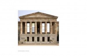
It just occurred to me that I forgot to post the middle step between my first and last versions of my Smithsonian book.

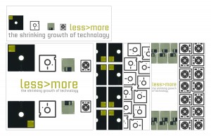
The critique went pretty well. We decided that the yellowish/goldish/almost greenish color wasn’t right for the work, and that it should change to something bolder and easier to see from far away. Thus the “BSoD blue” that I used in the final version.
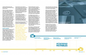
We also agreed that the whole system looked a bit softspoken, with all the whitespace and light colors. And the type was a little awkward in some places. So I fixed my type and made it all feel stronger in my last round.

  Filed under: KCAI, VisCom2
  Comments: Comments Off on The Missing Link: VisCom Process


Final 6 Degrees DVD and Poster

By Erika Goering,

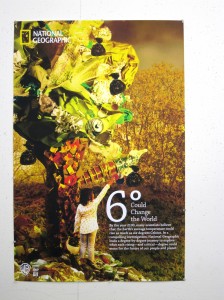
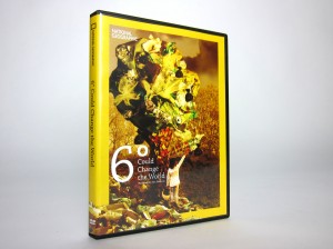
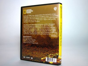
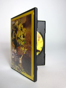
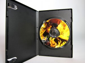
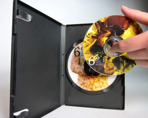
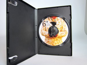
Here are the final products for the National Geographic project.

The tree made of trash symbolizes the condition the world will be in if humans don’t change their ways. The world will deteriorate and the atmosphere will become alien. This will become the norm for future generations.

We can’t just dump all of our environmental problems on future generations. We need to make the change ourselves.


  Filed under: ImageMaking, KCAI
  Comments: Comments Off on Final 6 Degrees DVD and Poster


Final “Less>More” book

By Erika Goering,

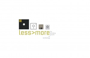
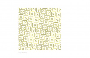
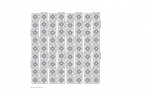
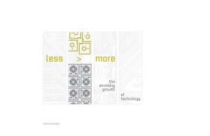
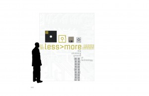
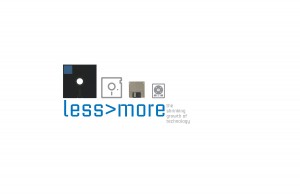
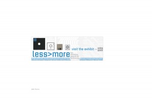
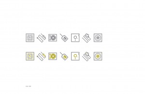
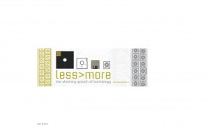
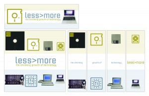
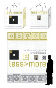
This is the final version of my Less>More book. There was a last-minute color change, inspired by the Blue Screen of Death. While average users are usually afraid of the BSoD, hackers take it as a challenge.

The blue is a bolder, more pronounced color that reminds me of a hacker’s determination.

…That, and the gold-green color just wasn’t working out.


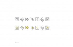
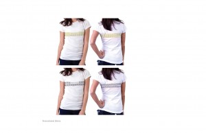
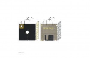
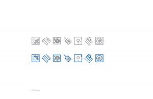
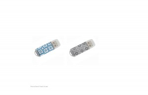
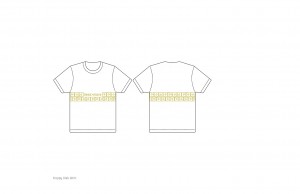
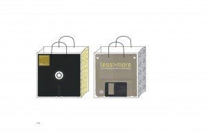
As you may notice, I added a flash drive to my set of promotional items. I felt that it would be an appropriate item to offer in a gift shop for an exhibit about hackers.

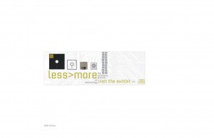
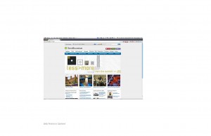
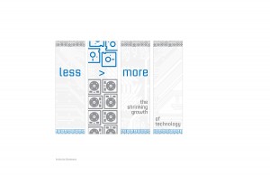
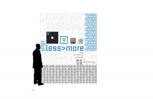
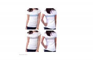
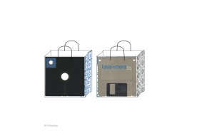
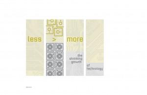
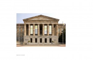
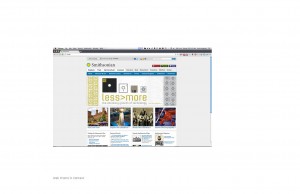
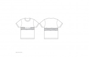
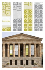
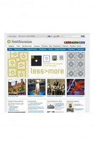
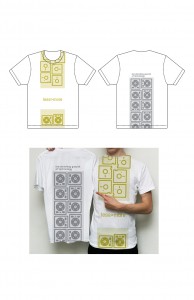
I also updated my page order to take the viewer through the museum experience. First they get introduced to the idea of it, then they see it online. Then they visit the museum, where they see the banners from the parking lot. When they walk inside, they see the wall design. Then before they leave, they go to the gift shop, purchase a shirt and a flash drive, then take it home in their gift bag.

  Filed under: KCAI, VisCom2
  Comments: Comments Off on Final “Less>More” book


Magazine Layout Revision

By Erika Goering,

In this round, I’ve added captions to my photos, and tried to fix my rag. Although I think I might’ve overdone the rag, though. Too much variation between lines, I think. The rag just feels stiff and robotic to me, which, come to think of it, might be a good thing, considering my topic. We’ll see how it goes over. But I think for the reader’s sake, maybe it should be more fluid and relaxed to be a bit easier on the eyes.

Or then again, I could be over thinking it, as I sometimes do.

Here’s how it all looks as of now. Keep in mind it looks better printed than on the screen. Must be those pesky serifs cramping my style. Or just the fact that pixels suck sometimes.

  Filed under: KCAI, Typography2
  Comments: Comments Off on Magazine Layout Revision


“Less>More” Book: Round 1

By Erika Goering,

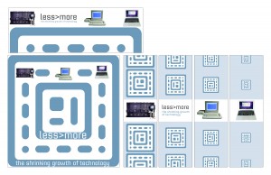
I’ve made some improvements to my series of “Less>More” designs. And I made a book out of ’em!

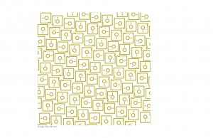
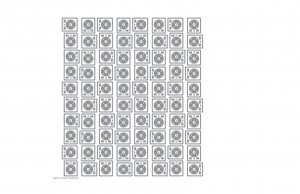
Despite all of my different media having the same colors and imagery, my designs from last class didn’t feel very unified. I think I’ve made some good progress on that aspect since then.

My wall and web promo are okay, but they need more of the visual interest that my banners have. So I’m gonna work on that.

But until then, here’s what I’ve got so far:

  Filed under: KCAI, VisCom2
  Comments: Comments Off on “Less>More” Book: Round 1


iPad Magazines: Now with Landscape Mode!

By Erika Goering,

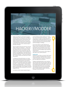
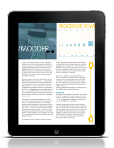
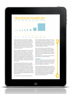
Here’s the next round of iPad mockups. I’m showing all of the user interaction I can think of right now. If I come up with anything else, I’ll be sure to add it later.

Here, the user would be swiping the top half over to see more information in the next frame:


Swiping text  up to read another page (notice the scrollbar indicator thingy changes to let you know where you are in the document):


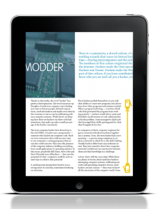
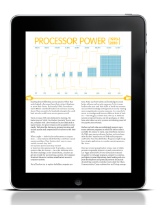
Something I noticed when I was playing with the class iPad was that the orientation of the device influenced the number of columns in the layout. So I decided to show mine doing the same thing. My layout switches from two-column to 3-column when you switch from portrait to landscape.

Scrolling through pages of text:


Pinch & zoom makes image frame larger, and it can even take over the entire screen to make viewing images and infographics easier.

  Filed under: KCAI, Typography2
  Comments: Comments Off on iPad Magazines: Now with Landscape Mode!


“Less > More” Process

By Erika Goering,


My process for this project has gone a little something like this:

Pretty-ish with no substance -> ugly substance -> better-looking substance


My goal is to achieve full substance/sexiness potential. Hopefully, I can get there in the next round.

  Filed under: KCAI, VisCom2
  Comments: Comments Off on “Less > More” Process


iPad Magazine!

By Erika Goering,

Idea #1: Scrollbar/indicator on the right side of the screen, which scrolls through the article text separately from the images on top. The user would scroll through pages of the article by swiping the text up or down, and scroll through the images by swiping the image area left or right. I left some room on the side of my infographic for a reason. This would be where a popup window would show up when the user clicks in an active area of the infographic. Supplemental information for the selected area of the infographic would show up in that area. For example, if a user tapped the name of a processor, more information about that processor would come up in the space to the right of the infographic.


Idea #2: Scrollbar/indicator is the separator between the image and text, and shows where the user is in the slideshow (as opposed to the top example, which indicates where the user is in the article). The user can zoom in on the images or infographics by using the pinch gesture. This allows the user to clearly see the details of the infographics and images, without zooming in on the article body text.


While I’m still here editing this post, here’s the verdict from my critique:

I should use the proportions from the second layout idea (where infographics/images take up half the screen), but keep the vertical scrollbar of the top group. This will keep my infographics large enough to read. And I’ll also keep the functionality of the top group. That makes the whole experience more interesting to the user.

Also, I need to make my text bigger. What I thought was pretty big is actually not. Darn technology messing with my type size.

  Filed under: KCAI, Typography2
  Comments: Comments Off on iPad Magazine!