Blog Category: KCAI


Digital Pictograms

By Erika Goering,

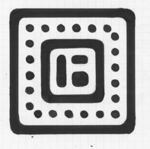
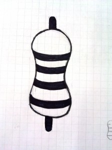
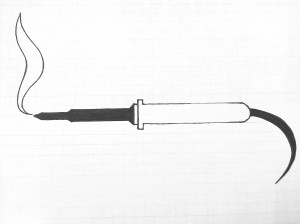
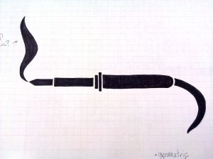
Here are my latest revisions. They’re digital now! No more Sharpie fumes! (Aww, man…)

I went ahead and digitized all of them (instead of just the required 2/3) because I wanted to get feedback on every single one before I move forward. I feel better about their future that way.


All of them in a neat little row together:


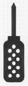
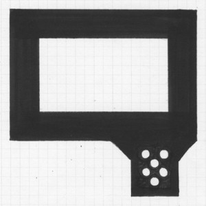
My rules: There are no sharp angles, except where absolutely necessary (like where the screwdriver bit meets the body, or where the soldering iron outlet prongs attach, where rounded angles wouldn’t be appropriate). I also keep a very specific set of units to build from.

These are all of the shapes I used. I didn’t use the pen tool at all, because my shapes are so geometric. I wanted them to be mathematically perfect, so I used geometric shapes and put them together. (And I “pathfinder’d” all the rounded negative space away.)

From left to right, going down, they are:

Corner-rounding piece (for thick outline only) | negative space corner rounder (for the inside corners of the outlines. This shape is never seen as positive space. Ever.)

Round unit (for single dots and rounding line ends) | quarter circle (used only for the soldering iron smoke)

Square unit (the width and height of one unit. This piece makes up all the main outlines. I used this the most, obviously.) | Triangle tip (for soldering iron and screwdriver tips)


…And that’s about it. I’ll be working on the inevitable revisions soon. But so far, so good. Hooray!

  Filed under: KCAI, VisCom2
  Comments: Comments Off on Digital Pictograms


Pictogram Revisions

By Erika Goering,

Here are the 12 I’m thinking about using. (I had 13, but that little guy got killed off pretty early. Poor guy…)

Grid with dot pattern:

Grid, curvilinear:

We’ve decided to move forward with the curvilinear one with a few tweaks. Everything will be more squared so each icon will take up the same amount of vertical and horizontal space.

  Filed under: KCAI, VisCom2
  Comments: Comments Off on Pictogram Revisions


Pictogram Process

By Erika Goering,

My previous round of pictogram sketches were varied and diverse. This was necessary to establish a successful direction and move forward with it.

Here’s those guys:

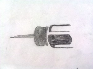
Resistors: organic and curvilinear

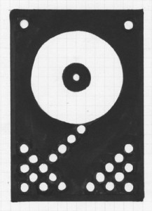
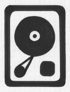
Hard drive: based on a grid, mixture of curvilinear (disk platter, screws) and rectilinear (case and read head thingy)

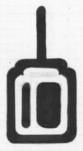
Soldering irons: partial fill and fragmented
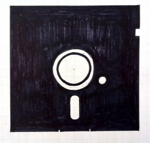
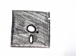
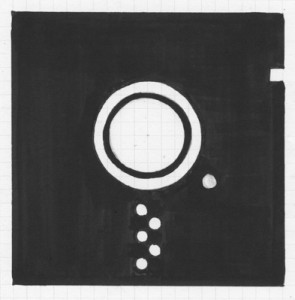
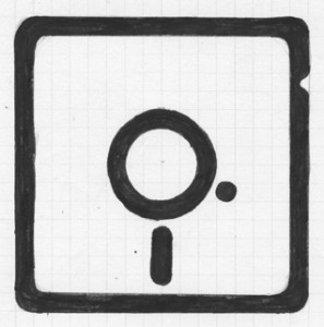
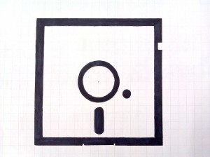
floppy disks: sketchy and grid (playing with positive and negative space.

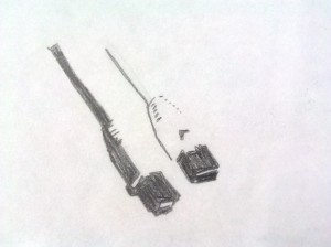
ethernet cables and screwdriver: complex figure/ground

  Filed under: KCAI, VisCom2
  Comments: Comments Off on Pictogram Process


R&R: Pictograms

By Erika Goering,

Pictograms are supposed to be simple forms that give the viewer a sense of understanding. The pictogram directly represents an object, action, or emotion. The way the image is presented (with framing, positive/negative space, and composition) should give viewers all the information they need to come to a conclusion about the graphic. Does the image make them feel happy? Determined? Hopeless?

A good pictogram can make a person understand, with absolute clarity, a complete concept. A bad pictogram will leave the viewer confused and/or unaffected.

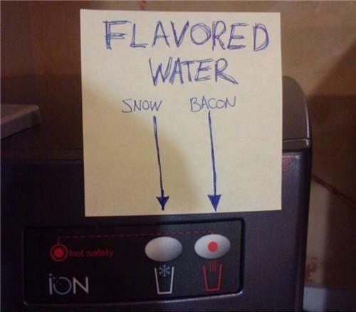
The water icons above are bad pictograms, because they rely too much on color to illustrate heat, and cliche symbols to represent hot and cold, which leads to a humorous conclusion by the viewer.

The Olympic pictograms have changed over the years, but they’ve always tried to be simple, cohesive shapes that transcend natural language. (The whole point of a pictogram is that there’s nothing to read; it’s universal for everyone.) The most successful Olympic pictograms have been the ones that have functional clarity and pleasing shapes. We, as viewers, can determine what the pictograms mean, and relate to their human forms. The less successful Olympic pictograms have vague meaning and overly-abstracted/overly-stylized human forms.

Good. Dynamic and illustrative without being complex. There’s a good sense of motion here without needing “motion lines” or anything ornamental. Simplified to its essential parts.

  Filed under: KCAI, Read&Respond, VisCom2
  Comments: Comments Off on R&R: Pictograms


Typography Inspiration: Dr. Seuss

By Erika Goering,

The symbols from On Beyond Zebra! remind me a lot of the monograms we did last semester. I find this inspirational because it shows that someone as imaginative as Dr. Seuss played with letterforms the same way I have. And it gives me a bit more hope for my own future as a creative person.

…Never mind the fact that On Beyond Zebra! is supposed to be a book for kids ages 6 to 9. They really mean to say it’s for typography students age 19 and up.

  Filed under: Find&Share, KCAI, Typography2
  Comments: Comments Off on Typography Inspiration: Dr. Seuss


Final book: Inner Workings

By Erika Goering,

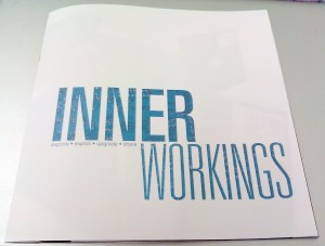
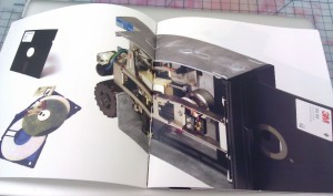
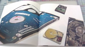
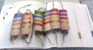
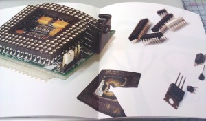
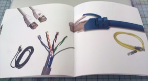
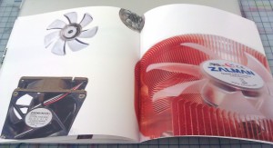
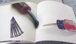
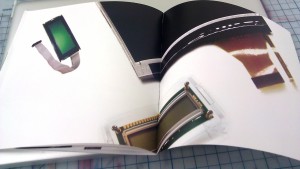
I originally started with “hacker,” but because it’s hard to photograph software (as it’s all abstract, virtual information or, more physically, a bunch of disks), I ended up going for the hardware version for more variety in images: a hardware modder. Hardware modders believe in the same things software hackers do: to find and exploit vulnerabilities or insufficiencies in technology and take advantage of them in order to make them more useful. The most common hardware modders will perform a simple upgrade, such as adding more RAM to a computer or cleaning a fan, or taking apart a computer to repair or replace a broken part. And that’s why I show broken parts in my book. More hardcore modders might change the shape of a computer or device or add extra parts and functionality just for fun. This can be done with things like modchips. Because of the nature of their modifications, hardware modders are very familiar with tools such as screwdrivers and soldering irons. Hardware modders are also experienced with the inner workings of electronics, and they sometimes build devices from scratch, with circuit boards, displays, and other necessary hardware. Experienced hardware modders sometimes share their work with the hacker/modder communities on the internet, to both show off their skills and to suggest that other people try what they did.

  Filed under: KCAI, VisCom2
  Comments: Comments Off on Final book: Inner Workings


Quotes about design vs. technology

By Erika Goering,

Technology over technique produces emotionless design. — Daniel Mall

You can’t do better design with a computer, but you can speed up your work enormously. — Wim Crouwel

Technical skill is mastery of complexity, while creativity is mastery of simplicity. — Christopher Zeeman

I chose these quotes because they reflect something I’m learning by being at KCAI. Before KCAI, I honestly thought that graphic design was something that people did almost exclusively on a computer. (After all, that’s what I was doing at my job back then.) Analog was old-school. People didn’t do that anymore. (Boy, was I wrong…)

But I now realize design is something that happens conceptually. It’s not tied to any specific medium or tool. And the computer is just that; a tool. As is my Xacto knife. It’s just another way to get something done. It’s the idea and the communication of that idea that really counts. Not how fast my computer is. (Even if it does have a buttery-smooth i7 processor.)

Just because a person is good with computers and design software doesn’t mean they’re good with design. (Photoshop filters, FTW!!!) …Which brings me to my tagline for this project:

Graphic design is not a keyboard & mouse.

I want this tagline to keep people grounded. Just because you own a pirated version of Photoshop doesn’t mean you know how to express an idea.

I feel like I’m fighting the war on bad design.

I hope I’m winning.

  Filed under: KCAI, Typography2
  Comments: Comments Off on Quotes about design vs. technology


Jimi Hendrix poster in progress

By Erika Goering,

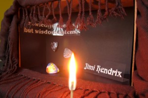
The quote says “Knowledge speaks, but wisdom listens.”

I need to reshoot for a multitude of reasons:

  • transparencies are shiny (darn reflection!)
  • fire is hard to photograph
  • placement of the quote is hard to read with the curtain/scarf in the way.
  • maybe I need to add some more stuff? Like a microphone or something? Or a pill bottle?

  Filed under: ImageMaking, KCAI
  Comments: 1


Compare & Contrast: Dan Mall & Erika Goering

By Erika Goering,

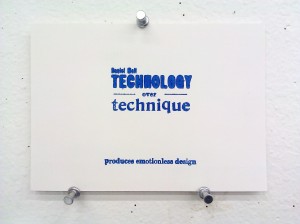
I’ve recently stumbled upon the original slideshow in which Dan Mall states that technology over technique produces emotionless design. (Slide 13 is where that happens.)

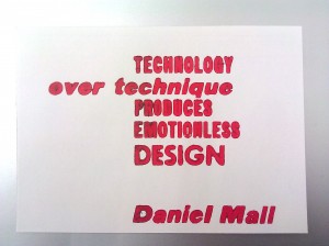
And for comparison, here’s what I did with his quote (this is before I ever saw his slideshow, by the way):

What struck me as interesting is that we each approached the communication and composition of this statement in a completely different way. The hierarchy has a totally different feel from one composition to the next. In my blue composition, I have “technology over technique” as an eye-catching, “I wonder what this is about” kind of moment, with “produces emotionless design” as a quiet, passive, cautionary message at the bottom. My red composition aims (but ultimately fails, because of an insufficient hierarchy) to send a message of “technology produces emotionless design” before elaborating that it’s in contrast to technique. Daniel Mall has the hierarchy set up so that “emotionless design” is the large, menacing warning in all-caps, with “technology over technique” as the explanation.

It’s amazing how different typographical hierarchy can show different aspects and dimensions of the same statement.

Design is awesome.

  Filed under: KCAI, Random, Typography2
  Comments: Comments Off on Compare & Contrast: Dan Mall & Erika Goering


Gathering Artifacts: R&R

By Erika Goering,

Response to How Does the Smithsonian Collect Artifacts?

An artifact is meant to be like a time machine. It can transport you to a place and time where the object would be experienced. An artifact gives you insight to the type of people who might use the object. So, an artifact is not just the object itself, but how it was used and who used it. A good artifact should provide a full sense of history. A sense of environment.

That is what I’m trying to do with my hardware modder book, Inner Workings. It shows hardware and tools that such a person would use. It also showcases broken and disassembled hardware to evoke the sense of curiosity that hardware modders have toward technology.

  Filed under: KCAI, Read&Respond, VisCom2
  Comments: Comments Off on Gathering Artifacts: R&R