Blog Category: KCAI


Making the Invisible Visible: Read & Response

By Erika Goering,

Response to Making the Invisible Visible:

The point of planning when doing a project is so that you can create a design based on a concept that is closely tied to the client’s needs. Sounds simple enough, right? Well, it tends to be something that a lot of designers and committees overlook.

When you have a client who needs a job done, the first thing you should do is address that need with a strong concept/solution. Then, keeping that solution in mind, come up with a pleasing design to contain and convey that solution. I realize this all sounds very abstract. But as someone who has worked with needy clients before, I know that you could have the prettiest design in the world, but if the client doesn’t feel it fits their needs, your sketches get sent to the shredder.

Projects start with a theme. Find out how to identify the project’s purpose and focus on that throughout the project. That will ensure that the project won’t end up being something totally unrelated to the original objective.

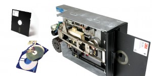
This fits in well with my book on hardware modders. The first part of the project was interrupted by an uncertainty of theme. Was I targeting hackers? Geeks? What was I doing? Once I finally settled on hardware modders, things started happening more easily. I started focusing on the things that make hardware modders specifically different from software hackers and general computer geeks. Well, hardware, for one. But also tools that are specific to computer repairs and upgrades, like soldering irons, screwdrivers, and broken computer parts.

Establishing a theme is probably the most important aspect of design. Because if you keep in mind where you’re going, the design will naturally follow.

  Filed under: KCAI, Read&Respond, VisCom2
  Comments: Comments Off on Making the Invisible Visible: Read & Response

Lupton: Linearity vs. Spatial Arrangement

By Erika Goering,

Response to Thinking with Type:
Linearity is something that happens when text is presented in a straight line, such as a news ticker or a banner. There’s no dimension to it, therefore it’s not as engaging as something more spatial. For example, a PowerPoint presentation is linear because, one frame after another, you’re given a little bit of information that is drawn out over time. It doesn’t give the viewer much in the way of interaction, though. And that’s why it’s so boring.

Spatial arrangement of text gives the viewer something to interact with. The viewer is more engaged and interested, because there’s something deeper than just one layer of information. This is seen often in the internet (think blogs or news sites with tags and categories, or searchable keywords). The internet is so engaging because information is being utilized in such a way that is specifically meant to be user-friendly.

With online typography and information distribution, content has become more accessible and legible. Technology has not killed typography; it has actually helped it evolve. Type has grown to become more fluid and flexible to accomodate the content and the user/viewer, as opposed to more concrete and static printed text.

The density of information that is happening now has encouraged interaction and intimacy among people and ideas. The transfer and transmission of information is so important. Typography helps it stay coherent and cohesive.

  Filed under: KCAI, Read&Respond, Typography2
  Comments: Comments Off on Lupton: Linearity vs. Spatial Arrangement


Hardware Modder Spreads

By Erika Goering,

This is what things  are looking like so far:

Floppy disks & drive

Hard drives

Solder and soldering irons

Resistors

Chips

Ethernet cords/wires

Fans

Screwdrivers & a screw

LCD displays (that’s like saying ATM machine, by the way.)

  Filed under: KCAI, VisCom2
  Comments: Comments Off on Hardware Modder Spreads


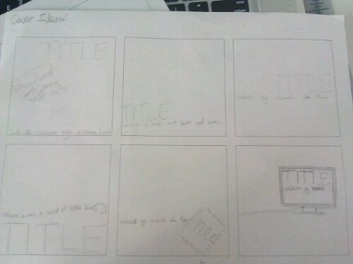
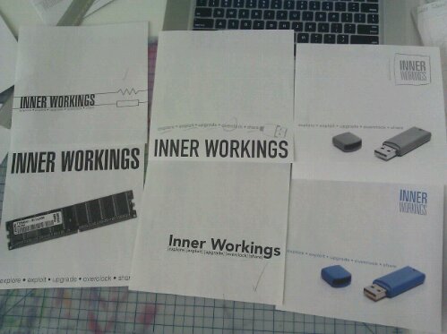
Hardware Modder Cover Process

By Erika Goering,

Here’s how my cover process has gone so far:

image

image

  Filed under: KCAI, VisCom2
  Comments: Comments Off on Hardware Modder Cover Process


Read & Respond: Experimental Typography

By Erika Goering,

Experimental typography is an interesting kind of work, where letterforms and words become more than just a way to communicate. They become the communication themselves. I know that’s kind of hard to understand, but so is the webpage I just read. So bear with me, here.

Experiments and processes go hand-in-hand. They both result in a final outcome that leaves the designer more enlightened than before. In the process of experimentation, there is a goal to reach and a method to be explored. Experimental typography isn’t experimental once it’s finished. Because any finished work is no longer an experiment. Got it? Good.

Experiments are meant to be for gaining experience and knowledge about a topic. And the person performing the experiment gains the most knowledge from it, on a very intimate level. This is why it’s important for me to play around with typography and see how things work together when I’m starting a project. I’m experimenting. And I’m learning. And that’s what process is for.

  Filed under: KCAI, Read&Respond, Typography2
  Comments: Comments Off on Read & Respond: Experimental Typography


Symbol, Index, Icon

By Erika Goering,

In the right order. Haha.

Microphone. To symbolize my need to be heard and my ability to amplify ideas as a designer.

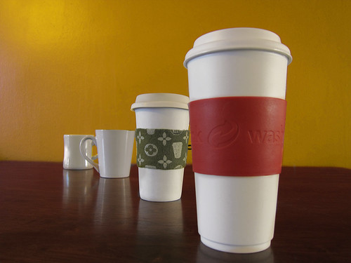
My various coffee Cups. Because of my growing addiction.

Apparently I make this face all the time. Because I'm perpetually confused.

  Filed under: ImageMaking, KCAI
  Comments: Comments Off on Symbol, Index, Icon


James Marshall Hendrix (1942-1970)

By Erika Goering,

It took me awhile to settle on a person to choose for my next Imagemaking project. But I finally narrowed it down to Jimi Hendrix. I admire his creativity and innovative nature. I especially like his unconventional (at the time) use of different effects to create a musical environment.

I chose him partially because we share a few things in common. We’re both multiracial, left-handed, and creative.

He lived a pretty crazy life, which ended tragically from a drug overdose. I sometimes wonder what the world would be like if he was still around. Music would probably be a lot different, as his techniques and styles would evolve throughout the decades…

As I do more research and discover more about him, I’m sure it will lead to some interesting discoveries. I’m looking forward to it.

  Filed under: ImageMaking, KCAI
  Comments: Comments Off on James Marshall Hendrix (1942-1970)


7 Type Explorations

By Erika Goering,

If there’s one thing I like about letterforms, it’s their inherent sexiness. So many lovely shapes and personalities in letterforms. I loves me some letters, yo.

So this exploration of experimental typography was a lot of fun. I got to step away from actual words and just focus on these beautiful shapes in relation to other beautiful shapes.

Anomaly

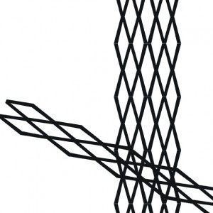
Concentration

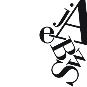
Direction

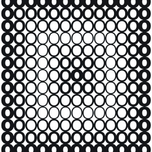
Gradation

Repetition

Space

Texture

  Filed under: KCAI, Typography2
  Comments: 1


Letterpress Adventures 2: The Return of the Letterpress

By Erika Goering,

In the last episode, we chronicled our journey through the depths of the letterpress dungeon and told tales of our quest for the letter n and our encounter with a deceptive p masquerading as a q.

Things have calmed down since then. I got my cards printed without much fuss, and there is peace in the kingdom.

Behold, the artifacts of the letterpress adventure:

  Filed under: KCAI, Typography2
  Comments: 1


Speaking of Printing… (Find & Share)

By Erika Goering,

Imagine a book about printing, made by various desktop printers from history. Printed through a chain of 4 printers representing a point in desktop printing history, each with an assigned color in the CMYK process.

What?

I know. Crazy.

Crazy-awesome.

Xavier Antin uses an array of four vintage printers to print this book. Each one prints one of the CMYK colors, then sends it through to the intake feed of the next printer in the queue. So, there are four types of technology, progressing through 100 years of history on one sheet of paper. And this happens with every page of the book. The registration of colors (or lack thereof) shows both the separation and the unity of these technologies. All of them serve the same purpose. All of them have small, convenient form factors. But the method of getting an image on paper is different for each printer. These methods include inkjet and laser printing, as well as a stencil duplicator (mimeograph) and a spirit duplicator (the ones from back in the day that made grade school worksheets smell good when they came off the press… Mmmm…. printing…).

Stair-stepping through history.

Just In Time, via BoingBoing

  Filed under: Find&Share, KCAI, Random, Typography2
  Comments: Comments Off on Speaking of Printing… (Find & Share)