Blog Category: KCAI


Findin’ & Sharin’: Lines by Saul Bass

By Erika Goering,

I’ve said it before; Saul Bass was a ninja. So, naturally, I chose some of his work to show off some line studies.

Bass did a bunch of movie posters back in the day. They all had blocks and linear elements to portray the overall feeling of each film a poster represented.
Here’s what I’m talkin’ ’bout:
Random line study: varying widths of elements and space between them conveys a tense feeling of uncertainty.
Progressive: The lines have a decreasing distance in between them and converge in the center, showing movement from a starting point to a destination. (Kind of reminds me of a flushing toilet. Hahaha…) The spiral represents dizziness, which is what the word vertigo means.
Regular: Everything is the same width and seems very balanced. There is equal width from the center of the poster to the outside edges. The content is safely nestled in the innermost portion of the work.

  Filed under: Find&Share, KCAI, VisCom1
  Comments: Comments Off on Findin’ & Sharin’: Lines by Saul Bass


Line Studies in the Real World

By Erika Goering,

Yesterday, I wandered around my neighborhood for my first attempt of finding groups of lines that resemble my line studies from VisCom.

Here’s what I got so far:

I’m feeling pretty good about this project.

  Filed under: KCAI, VisCom1
  Comments: Comments Off on Line Studies in the Real World


Neon!

By Erika Goering,

I picked quite possibly the most awesome element ever!

Heck yeah!

  Filed under: KCAI, Typography1
  Comments: Comments Off on Neon!


Bitmaps, Hooray!

By Erika Goering,

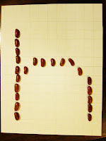
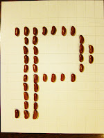
This was really fun!
However, I had a problem with the beans rolling around on my paper. I need to figure out a way to keep them stuck to the page when I’m constructing my letters. Double-sided tape, perhaps?

  Filed under: KCAI, Typography1
  Comments: Comments Off on Bitmaps, Hooray!


“Helvetica”

By Erika Goering,

Some of my thoughts on the Helvetica film:

I’ve seen Helvetica a few times before, and every time I see it and hear the people talk about it, something inside me sparks and lights up. I love this stuff. It’s how I know I’m meant to do graphic design.

I especially like when a couple of people in the film state that Helvetica is “like air.” It’s always around us. It’s such a neutral typeface, open to interpretation. People insert their own context into it. That is what makes it such an important typeface. It’s very accessible.

However, with it becoming a default typeface, it invites amateurs to slap it on a page and call it typography. That ain’t gonna look pretty. But I like to think of Helvetica as a gateway typeface. Amateurs cling to it for its ease of use and readability, but if they truly love what they’re doing, they start to branch out and try new things with different typefaces.

  Filed under: KCAI, Typography1
  Comments: Comments Off on “Helvetica”


Pantone vs. CMYK

By Erika Goering,

Converting between colors is tricky. RGB and CMYK never quite match up, and Pantone is a whole different concept. At least CMYK does get close to Pantone. That’s because they’re both subtractive color. Converting from subtractive color to another kind of subtractive color is easier than trying to flip between additive and subtractive. If I was using an RGB file, this would’ve bee much worse.

  Filed under: ColorForm, KCAI
  Comments: Comments Off on Pantone vs. CMYK


Color Star: Now With Pantone!

By Erika Goering,

Here’s my color star with the addition of Pantone colors. I’m starting to get the hang of this Pantone thing. The number system is starting to make sense.

  Filed under: ColorForm, KCAI
  Comments: Comments Off on Color Star: Now With Pantone!


2 Minute Drill: Color & Emotion

By Erika Goering,

Here’s what I think of these colors:

Red 186:
  • Passion
    • fire
    • love
  • Fruit punch
    • happiness
    • nostalgia

Orange 1585:
  • spicy
  • energetic

Yellow 116:
  • Happy
  • Sunny
  • Playful

Brown-Green: 438
  • adventurous
    • grassy
    • dirty
    • muddy
    • fun

Blue 2747:
  • smooth
  • calm
  • watery
    • fluid

Chartreuse 584:
  • party
    • playful
    • fun

Violet 267:
  • authority
  • royalty

Gray 425:
  • gloomy
  • cloudy
  • bland
  • boring
  • sad

White:
  • clean
  • sterile

Black:

  • sophisticated
  • daring
  • bold

  Filed under: ColorForm, KCAI
  Comments: Comments Off on 2 Minute Drill: Color & Emotion


Color & Emotion

By Erika Goering,

This project was pretty fun. I always wanted to name colors. In fact, I’ve done this kind of thing before in the past. On ColourLovers.com, I created a few palettes relating to my life (mostly food, really…), and I chose colors that had names that were relevant to my themes. (Because it’s fun, that’s why.)

Here’s my best ones:

Colors inspired by my neapolitan birthday cake from a couple years ago. All the colors have flavor names. (Vanilla cream, vanilla slice, strawberries & cream, chocolate cake, and chocolate tombstone.)

Coffee colors and flavor names. Because coffee keeps me alive. Yes, I have an addiction problem. So what?

Anyway, I love merging verbal language and color. They go together like a form of hybrid poetry. Illustrative color names add a layer of meaning that accentuates the meaning of the color itself.

  Filed under: ColorForm, KCAI
  Comments: Comments Off on Color & Emotion