Blog Category: KCAI


Find & Share: Deaf Device Concepts

By Erika Goering,

Since I’m in an “anything goes” mindset with this project, I figured it’d be good to share some of the concept devices or peripherals that I’ve stumbled across. I will pull from some of these and apply it to my project in a way that works with my thesis question.

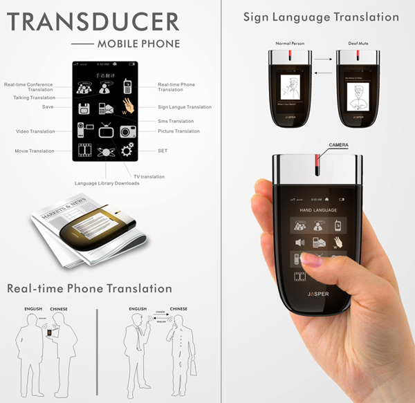
Concept phone that translates what the caller is saying:
 

Enable Talk Sign Language Gloves


Heads-Up Display Captions


Sign/Voice Language Translator (SVLT)
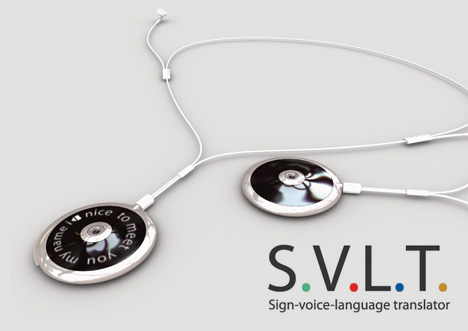
 

One thing that was suggested the other day was a way of using gloves or rings to detect ASL and send it to translation software. I really like this idea; “smart” rings (and/or conductive fingernail polish??) that can send movement information to a translator. Maybe this, combined with an unobtrusive facial recognition camera (to capture facial expression and emotion) could be a solution. And maybe on the Spoken English-to-Deaf side, there could be a heads-up display (either external, like a Google Glass-style overlay, or internal/invisible, like a contact lens display) that displays transcribed speech.

I am starting to gravitate toward the idea of a mobile app that is supplemented by peripherals, instead of just an app by itself using default phone hardware. Making layers of technology invisible and/or well-designed is not only appealing and exciting to me as a geeky designer; it also excites me because I want to create fewer barriers (not more!) between hearing and deaf people. Using technology that can be successfully integrated or work behind-the-scenes in daily life is a very important aspect to consider. It would make all parties involved in the deaf/hearing conversation feel a lot less awkward. And I think it should be my focus.

  Filed under: Degree Project, Find&Share, KCAI, Learning
  Comments: Comments Off on Find & Share: Deaf Device Concepts

Week 3: Sketches and Presentation

By Erika Goering,

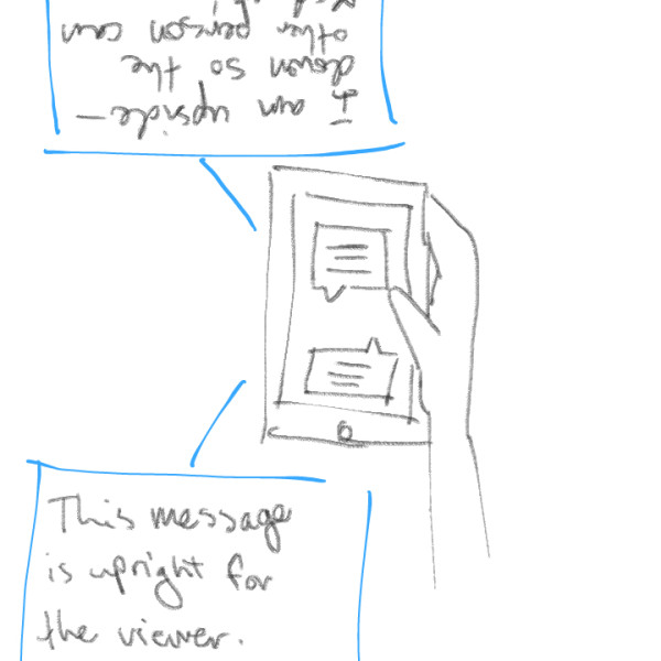
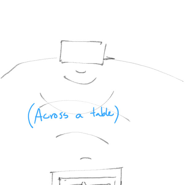
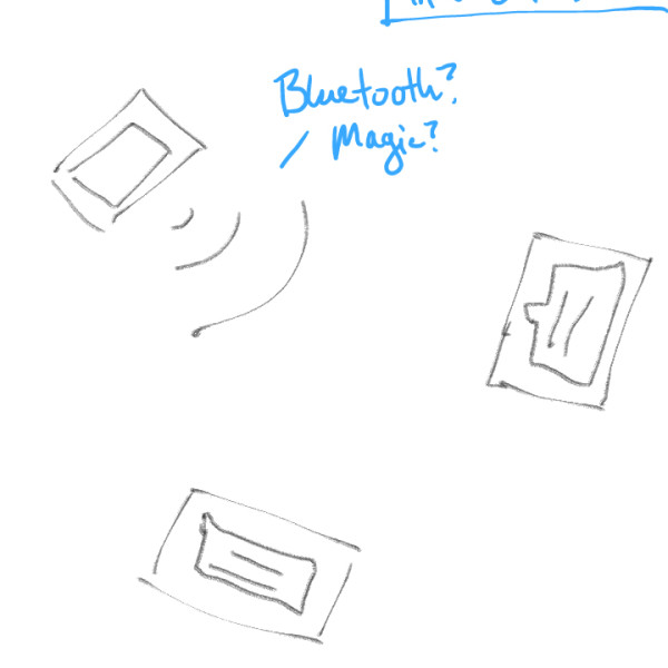
I summed up my previous couple of weeks’ progress in the form of a presentation. Some feedback I received includes:

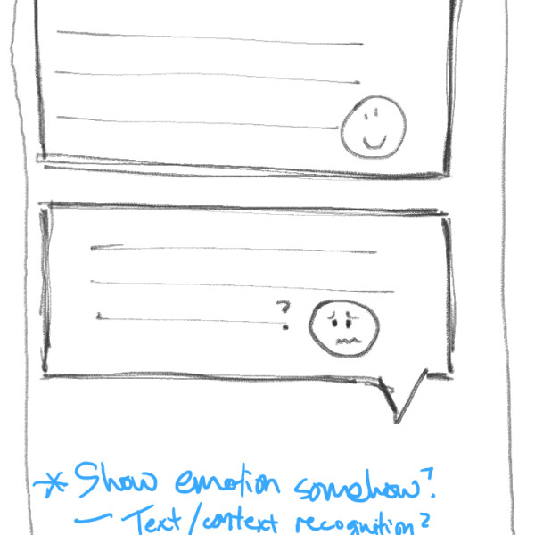
  • Be careful about turning this project into a cold, sterile, pragmatic, primarily geeky endeavor. Remember that these are people I am designing for. (On of my solutions to this is to make conveying emotion and inflection a priority in the UI.)
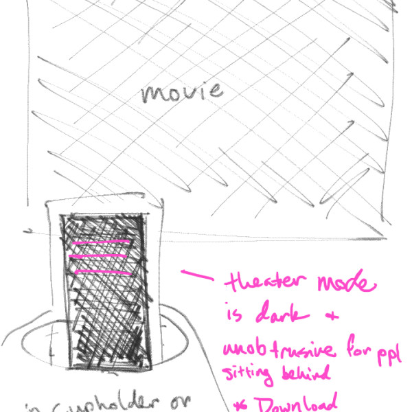
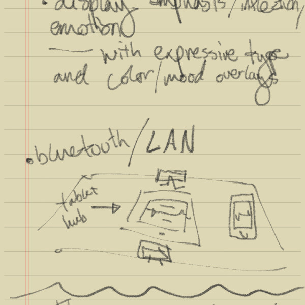
  • Maybe instead of the phone/tablet-based solution seen in the sketches below, I should pursue a different type of technology, such as an ASL-detecting peripheral (hello, MX!). However, the biggest problem there would be the same issue with just plain texting; aspects of natural language, such as emotion and inflection are lost, not in translation, but in the capturing of the content. So maybe I find a way to capture facial expression too?
  • Show emotion, emphasis, and subtext formally, through various “designery” things, such as expressive typography, color/gradients in the messages themselves, or icons/emoticons.


Next steps:

  • Sketch some possible visual UX/UI directions for the app as a whole.
  • Develop scenarios for each aspect of the app.
  • In-depth sketches/wireframes of each scenario (a few directions).


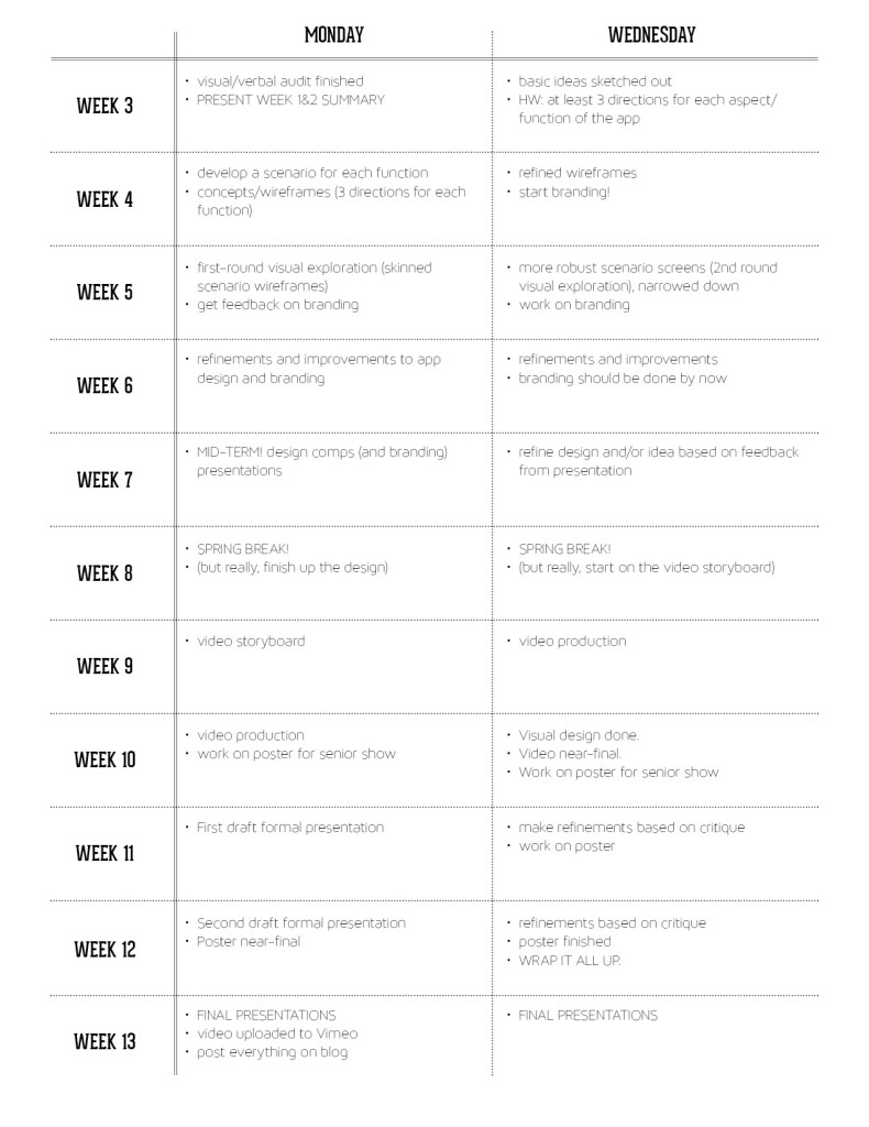
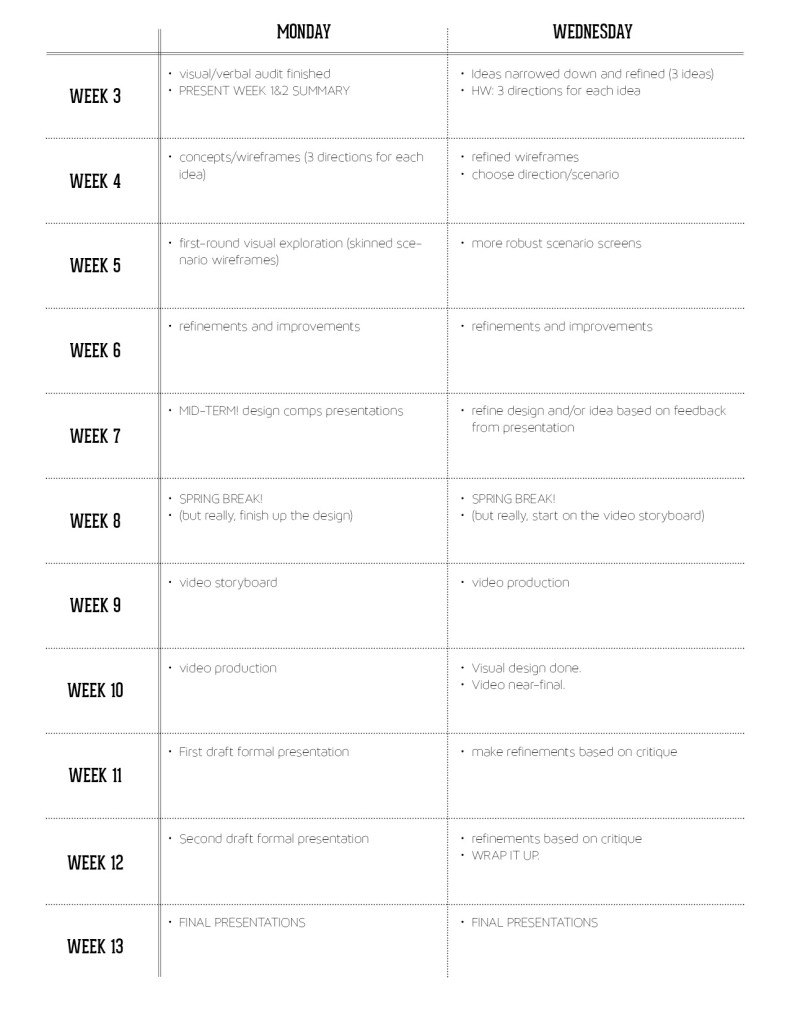
And here’s an updated schedule/timeline for this project:

timeline2

  Filed under: Degree Project, KCAI, Learning
  Comments: Comments Off on Week 3: Sketches and Presentation


Creepy-Exciting Logistics

By Erika Goering,

I’ve gotten to the point where I’ve pretty much narrowed down what my app will be; a two-way ASL and spoken English translator, where both of these inputs (either ASL captured with a camera, or speech captured with a microphone) output to text on a mobile device (phone or tablet). Most of the things that I’ve researched as comparables have been limited: one-way, and not very useful (like converting text to ASL… Why not just type a message to the deaf/HoH person? They can read. You don’t have to try to fake your way through a language you don’t know… Ugh.).

Anyway, because I’m the type of person who likes to know if what I’m designing for is even feasible (which makes it all the more exciting for me), I searched around for some similar projects. Well, lo and behold, I found something creepy-exciting! (I actually shrieked when I saw this!)

Computer scientists in Scotland are developing technology that can translate sign language into text through a simple webcam. The technology, which has the potential to run on variety of camera-enabled digital devices, could be a big help to speech-impaired users trying to communicate, especially with members of the non-signing world.

[…]

PSLT [Portable Sign Language Translator] aims to help young learners with speech difficulties, to empower mobility- and speech-challenged users to issue commands to their appliances and devices, and to allow people with speech difficulties to customize their language settings to a variety of regional variations and personal preferences.

The creepiest (most serendipitous/coincidental) part is this (and I swear to the design gods that I had never seen this before today):

“The aim of the technology is to empower sign language users by enabling them to overcome the communication challenges they can experience, through portable technology.”

Isn’t that, like, exactly my thesis statement? I guess that means that something like this is ready to be designed!!!


  Filed under: Degree Project, Find&Share, KCAI, Learning
  Comments: Comments Off on Creepy-Exciting Logistics


Map, Concept, and Integrating Technology

By Erika Goering,


Jessie Ren and I have made quite a bit of progress since last week.

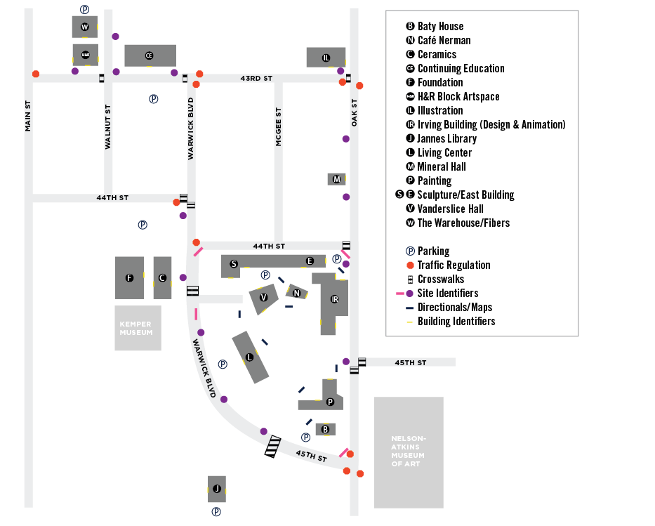
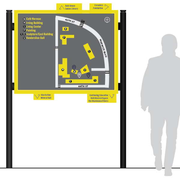
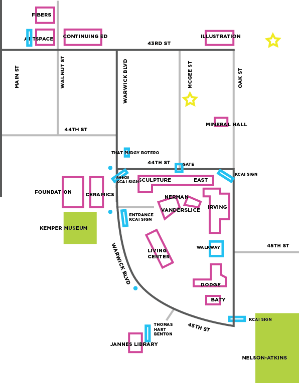
We’ve updated our map to be easier to read and easier to use for our mockups.

map-01We’ve been developing an icon set for our wayfinding system. Icons will be used for identifying places within the context of the map, and for wayfinding elements in the space itself.

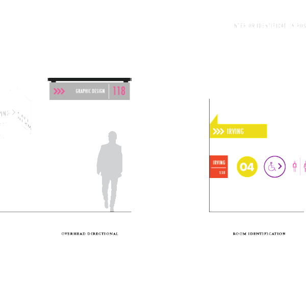
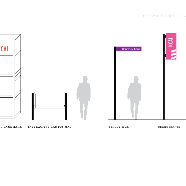
We started to mock up some signage ideas too. We want to juxtapose the history of KCAI with the idea of KCAI’s pioneering and bold nature.

We’ve also been discussing the possibility of integrating technology into the wayfinding experience. Interactive maps would display dynamic content, such as campus alerts, event information, and even a walk-time calculator that shows how how long it takes to get to a certain place on campus (this is helpful for students or visitors who need to make a trek to another part of campus in a short amount of time).

This is an example of the walk-time thing:

The point of using technology in the wayfinding experience is to further push the idea of juxtaposing the old/historic characteristics of KCAI with the progressive and innovative nature of the students here.

We really want to utilize dimensionality in a way that neither of us have ever thought about before (hooray for branching out!). We want to make wayfinding elements like directionals flow around corners and utilize how people walk along hallways and forked paths. We want to take advantage of how people use the space to provide solutions to common wayfinding problems.

  Filed under: KCAI, Learning, Spatial Experience
  Comments: Comments Off on Map, Concept, and Integrating Technology


Week 2: Verbal Audit, Visual Audit, Personas, and Timeline

By Erika Goering,

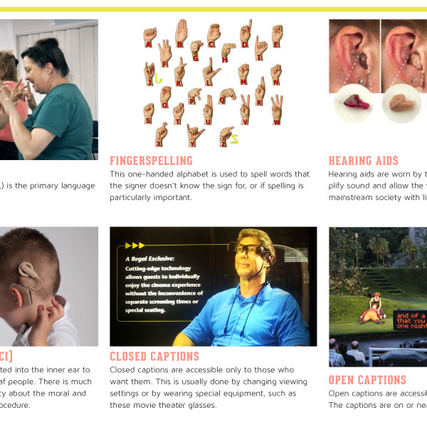
Over the weekend, I went to the movies with my hard-of-hearing (HoH) friend. Since the theater has changed their caption policy, we could no longer view open-captioned films. This change was actually more convenient for us, because it meant we were no longer limited to specific and rare showtimes. However, instead of simply buying a movie ticket for the open-captioned screening, we had to wait at the front desk to acquire a pair of special closed-captioned glasses (which my friend tells me she’s had a problem with before). The glasses have to be programmed for each movie in the theater, so the glasses display the captions for the correct movie (because of this, we had to get to the theater a bit early to make sure it was all set up). However, captions don’t appear for previews, so if there’s a problem with the device, you don’t notice until the movie has already started. In a previous visit to the movie theater, my friend experienced exactly this, and had to walk out to the front desk to complain and get it fixed while missing the first few minutes of her movie.

The point of this story is to bring to light the issue that the Deaf community faces; being an afterthought. Many companies and businesses adhere to ADA guidelines for people with obvious physical disabilities, but deaf and HoH people are often overlooked or their accommodations are half-assed. The thing with the movie caption glasses is such a clunky process, and reveals a fine line between convenience and annoyance. And it crosses that line all the time.

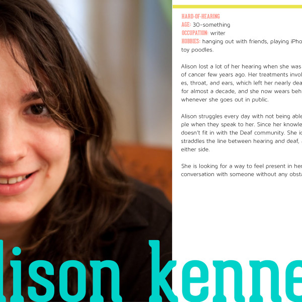
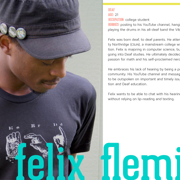
Deeply inspired by this experience, I later went full-force on my personas and visual/verbal audit. I felt like it needed to be done before I could move forward with designing a solution. The users of this project are those who feel marginalized or isolated on a regular basis.


To add to all this, here is my timeline for the next 10 weeks. I’ll be adding more items as things start to progress and get more specific. My goal is to not only design an app (luckily, only for one size), but to also do a demo video or some sort of walkthrough video showcasing the app as well.

timeline

  Filed under: Degree Project, KCAI, Learning
  Comments: 1


Wayfinding Concepting

By Erika Goering,

We quickly delved into the process of marking site identifiers, but also generally getting a feel for the campus as a whole. We began to think about the unique aspects of the school and how to translate that in the signage. Words like energetic, insightful, innovative, non-traditional, creative, and unique were all found in KCAI’s identity guide. To us, all these words signified one thing:

KCAI is Eclectic.

From the architecture on campus to the students and departments who make up our school, KCAI like Kansas City, enjoys the juxtaposition of the modern and the historical, the simple and the ornate, the natural and the artificial. It’s really a beautiful collage of history, diversely transformed, if you ask us. So our concepts came from this inspiration.
  • concept 1: Materials (History)
    • Much of the architecture found at KCAI is a mixture of original styles and modern renovations. No building is the same, and each has a unique history.
    • juxtaposing the natural wood against the modern industrial steel
    • nodding to the hand by using “hand rendered” typography


  • concept 2: People (Innovation)
    • The students innovate and keep the school relevant
    • dense architectural landscape, a lot of beautiful details means a nice juxtaposition of minimalist style signage application
    • bright pops of color that symbolize the four schools within KCAI
    • updated futura typeface


  • concept 3: Representing each department as parts as a whole (unification)
    • using materials and techniques specific to each department to produce a system for the entire school
    • unifying the system as a whole


some quick site identification

As we continued to study the KCAI, we also searched for “unconventional” signage to draw inspiration from. Way finding inspiration below:


  Filed under: KCAI, Learning, Spatial Experience
  Comments: Comments Off on Wayfinding Concepting


About My Future: Career Goals

By Erika Goering,

I’ve always been excited by technology. I have a tendency to take gadgets apart and see how they work (I void warranties on a regular basis). This curiosity, combined with my interest in the expressiveness and visceral nature of art, ultimately led to my passion for design. Design, to me, is about the layers between form and function, and my passion lies where form and function merge.

Naturally, I want to work in a geeky environment, where designers and developers work closely together and sometimes overlap. My dream job would be to work as a designer and developer of mobile apps, web apps, and other interactive, experiential (and experimental!) media. I want to focus on users’ needs and desires, while indulging in every aspect of the process, from research to concept to design to production.

I’m moving toward that goal by interning at PixelNation, where they design and build websites. They’re a tiny business, but they’re multi-talented, passionate, and effective.

In addition to that, my previous six years of experience as a designer-of-all-trades at MyARTS, along with a few freelancing gigs, has prepared me for handling any genre of design strategy. Having those abilities under my belt gives me a unique perspective and advantage.

As for choosing where to set up shop, I must say that I love Kansas City. I grew up here. Every time I think about leaving, something happens that makes me want to stay. At the moment, one big thing keeping me here is that we have become a hot spot for tech-related and design-conscious entrepreneurs and startups. The Silicon Prairie is growing, and I’m glad to be a part of it.

That being said, I would love to get out of the midwest and be from Kansas City (and not in it) for once. For example, I love the culture and feel of the Pacific Northwest. Seattle’s a great city with a great energy. (Vegan-friendly too!) I’d also like to live on the other side of the country, in NYC. I feel a certain spark of passion and inspiration whenever I’m there. I really just want to be where the action is. That’s where the possibilities are, in my opinion.

  Filed under: KCAI, Learning, Professional Practice
  Comments: Comments Off on About My Future: Career Goals


Inspiration, Research, and Obervations

By Erika Goering,

Inspiration:

  • Vocre Translate: I love the idea of the translated messages being displayed in opposite directions for each user facing opposite ends of the device. This is, of course, limited to only spoken language with a text output.
  • Swype Keyboard: Typing is gesture-based, predictive, super-fast, and error-proof. This allows for effective and efficient communication. Swype is on this list because it revolutionized typing on devices and changed the way users think about communicating on a mobile device.
  • The Noun Project: Their goal is very similar to mine, in that they want to create an entire visual vocabulary to act as a universal language that transcends cultural barriers.


Web Research:


Observations I’ve Already Made:

One of my best friends is hard-of-hearing (very much so, I might add), and spending some time observing how she handles everyday situations is fascinating and disheartening at the same time. While she can hear most mid-range sounds, she is completely deaf to higher-pitched, higher-frequency sounds like sirens, spoken consonants, cell phones, and most television sounds (which she tells me are picked up differently in her hearing aids than real-life sounds). Something as simple as ordering a drink at Starbucks can be an uphill battle for her. She can communicate her order just fine, but understanding a barista’s questions like, “do you want whipped cream?” is always met with a reply of “I’m hard of hearing; can you repeat that?” or a questioning look in my direction (since we’re close friends, she’s used to my speech patterns, and I will sometimes throw some ASL in if possible to make things easier, although we’re both a bit rusty in our practice of it).

Some things that stood out in this experience:

  • Hearing people mumble a lot and speak very quickly. We don’t realize that we do it, but it can be impossible for a hard-of-hearing person to understand, especially in a noisy environment or when someone isn’t directly facing the recipient. Inversely, I noticed that when I talk to my hard-of-hearing friend, I make up for this by enunciating clearly and speaking at a very conscious speed.
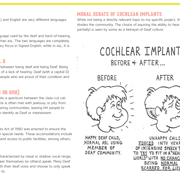
  • Not everyone who is deaf (note the lowercase d) or hard-of-hearing knows ASL fluently. Even if a hearing person can communicate in this way, it might be of little help.
  • Everyday errands and “small talk” are a struggle. When you can’t understand the person talking to you, you feel isolated and even alienated from mainstream culture.
  • Texting and emailing have helped bridge the language gap immensely. It might seem trite, but texting is a great step forward and a powerful tool of mobile communication.


Other People to Talk to and Observe:

  • Kansas School for the Deaf: Aren’t we lucky to have a Deaf school in Olathe? (Fun fact: Olathe ASL seems to be its own dialect. Pretty cool, huh?)
  • Deaf Cultural Center: Also in Olathe, and also a good resource to have access to.
  • Deaf Expression interpreters: It’d be interesting to see what kinds of obstacles they have noticed in communication between ASL and English.
  • Message board members: It would be good to get some perspectives from people outside of the KC/Olathe area.
  • People I already know. For awhile I took an ASL “class” from an interpreter/advocate. He’d be a great person to talk to. Also, one of his best friends is completely deaf since birth (unlike my close friend who is hard-of-hearing for only the past decade or so) and a member of Olathe’s large Deaf community (also unlike my close friend). My brother-in-law minored in ASL, and I’m sure he’d have some interesting perspectives as well.


  Filed under: Degree Project, KCAI, Learning
  Comments: Comments Off on Inspiration, Research, and Obervations


Problem, Solutions, and Next Steps

By Erika Goering,

Problem: There is a language barrier between spoken English and American Sign Language (ASL). We need a conversational solution for when the use of interpreters, writing, and texting aren’t available, effective, or efficient enough for the situation.

Possible solutions:

  • A mobile app that, on the Deaf side, uses a set of nouns, verbs, emotions, and gestures that can be assembled into sentences quickly by the Deaf user. It would output through text on the device’s screen or text-to-speech software through the device’s speakers to “translate” to the hearing recipient. On the hearing/speaking side, it would have “live captions”, turning spoken language into text, and inflections and mood into a UI change or icons (or some other way of depicting emotional changes, possibly through typography) on the screen.
  • A kind of messenger app that strictly uses an icon-based system, without relying on text/verbal language. This would be a kind of universal language between users, eliminating the need for translation, instead of facilitating it. Like texting, but with a non-verbal vocabulary (because ASL and English aren’t directly translatable).


Perhaps the most exciting thing I’ve discovered so far is that nothing quite like what I have in mind exists at the moment (a two-way tool specifically designed to replace or supplement interpreters, lip-reading, writing things down, or even translation itself). In addition to overcoming language barriers between ASL and spoken English, I also want to find a way to maintain nonverbal elements of communication, like emotion/expression, subtext, inflection, etc. These are very important elements of both spoken English and ASL, but they are used/manifested in very different ways that may not translate as easily as basic verbal language does. My ultimate goal is to lose as little as possible in the translation between (or replacement of) these two methods of communication and to make communication easier.


Next Steps:

  • Verbal and visual audit. I’ve already done a little bit of this, but I need to organize what I’ve already got and explore a bit more as well. I’ll be talking with some interpreters and members of the Deaf community soon.
  • Communication model. This will show exactly where and how communication between hearing and non-hearing people breaks down and give insight into how it can be remedied.
  • Process timeline. I need to plot out a manageable way of making all this stuff happen.

  Filed under: Degree Project, KCAI, Learning
  Comments: Comments Off on Problem, Solutions, and Next Steps