Blog Category: KCAI


Social Dissent and Graphic Propaganda

By Erika Goering,

One of the reasons why I love graphic design is because we have the ability to voice our opinions through our unique means of communicating. We are experts at representing a concept with something visual or usable.

Dissent is the force that drives this intense visual design. When people disagree, their opinions intensify. This tension can be great for design, and even greater for progress. Having that deep desire to change something in society is what perpetuates progress and improvement.

Protest graphics and propaganda media are really strong ways to make an opinion known. Sometimes so strong, in fact, that people become highly offended or agitated. Hitting people in the gut, so to speak, is a very effective way to make a memorable impression.

Specifically, the Constructivist movement gave striking visuals to a strong point of view. The relationship between Constructivism and political/social awareness was a symbiotic one; messages became stronger as visuals became more intense. And creating & using symbols for groups of people gave designers visual elements to represent the people they focused on.

But have we become desensitized to the bold, striking visuals of propaganda posters and Constructivism? Our culture is becoming increasingly louder, more intense, bigger. We’ve begun occupying the digital space, where we can now target who we want to speak to, as well as how.

Guerilla marketing and grassroots efforts can take us back to those roots of propaganda posters and small-scale activism. But extending that to a digital, online space can potentially be the happy medium between mass media and highly targeted awareness. And with the Internet, our natural human persistence is even stronger because of our ability to post in multiple places and “go viral.”

  Filed under: KCAI, Learning, Read&Respond, Visual Advocacy
  Comments: Comments Off on Social Dissent and Graphic Propaganda


Communities

By Erika Goering,

Humans are social beings. We’re hard-wired to lean on each other and form alliances.

I belong to several groups, and the dynamics are all very different.

My studiomates are our own little micro-community of friends. We do more than just get along. We have this unspoken bond, and we genuinely care about each other.

My local vegetarian/vegan group is much larger, and much less personal. I feel like we are obligated to socialize because of our location (KC), shared ethical beliefs and similar diets.

I feel like the size and circumstances of a group definitely affects how people feel about it and interact with it. Groups are more effective when people care. They are even more effective when there are similarities between the people involved.

The strongest and largest communities somehow evolve into subcultures, and individual personal convictions become less important. Those groups are vastly different from small niche communities, and their dynamics are less like ripples and more like waves. Larger groups make more of an impact, but the subtleties can be lost. And smaller groups are incredibly varied and full of personality.

  Filed under: KCAI, Learning, Multimedia Experience
  Comments: Comments Off on Communities


The Stuff of Growth

By Erika Goering,

1: Makeup Tutorial

I’ve learned that one’s appearance as a teenage girl in high school or college is very important. However, as a jaded mid-20-something-year-old who’s been in college entirely too long, I choose to rock my dreadlocks and pseudo-professional attire in lieu of sweatpants, a messy bun, and a shit-ton of eye makeup.

That’s just how I roll (which is pretty much the point of this entire post). And my brain isn’t so bad either.

2: Theory of Multiple Intelligences

Let’s start this semester off with a personal backstory:

I’ve lived my entire life thinking I was “weird.” I was in my school district’s gifted program from 4th grade to 10th grade, so once a week I was confined to a bubble of established-but-unspoken superiority comprised entirely of pre-pubescent misfits (pretty much wedgies and pocket protectors all around, in contrast to and in result of our supposedly brilliant minds). Throughout middle school and high school, I mostly kept to myself, even while among my own similar breed of academic success.

Despite my achievements, the public school system had failed me.

Elementary school housed a completely different Erika. One that I currently strive for and long to become again. I was warm and caring, creative and uniquely myself. It was during this time in my life when I was more myself than I had ever been and probably ever will be again.

Somewhere down the line, between 4th and 10th grade, I was forced into this mold of what an ideal student was. I lost my original self, and my grades suffered. I stopped caring and I forgot how to be engaged in my own education.

I didn’t stand a chance unless I re-learned how to learn in a way that worked for me.

3: My Own Learning Style

Over the course of my life as a student (and validated by the learning style assessment we did for MX class), I somehow discovered that I’m pretty much all over the place when it comes to learning. I can do pretty well with both the abstract and concrete, but I tend to lean more towards the concrete (thus my mad skillz in standardized testing). This explains my interest and aptitude for geeky things that involve absolute answers (such as coding/programming). I’m definitely more reflective than active, which makes for some interesting dynamics between my geeky side and my artsy side. I’m very much into the philosophy of why things happen. But I also like to break things down and see how they work.

Knowing that people’s brains work differently is crucial in utilizing educational tools. Duh, y’all.

4: Education Paradigm TED Talk

Collaboration is the stuff of growth. True dat. Different types of thinkers bring unique perspectives to the table. But if we don’t nurture these perspectives, we all go bland. We get uninspired, depressed, hollow. We try to occupy our minds with distractions, regardless of the repercussions.

I think my saving grace in my high school and early college years was that I surrounded myself with people who had different traits than my own. I knew I needed some balance, and I believe that balance is what helped me succeed.

5: Paradigm Shifts of the Future

I’m expecting and anticipating some exponential growth and changes in education and technology. The trends are there.

Back in my day, the Internet was a new concept. My first computer was a gray box running Windows 3.1 (later upgraded to 3.11, I might add). Dot-matrix printer. The whole shebang.

As a child, I was fascinated with that machine. I absorbed every aspect of how that magical thing worked.

My second computer was a Compaq Presario desktop running Windows ME. (This was back when you didn’t need a shiny new device every other year. Any progress worth a damn took time. There was almost a decade between the two PCs of my childhood.) The Presario was my gateway drug to programming and design. It was on this monstrous device that I discovered HTML and Photoshop. We all know how that ended up.

I used the tools at my disposal to self-teach. Because that’s just who I am.

Fast-forward to today. I’m typing this post on a 15-inch, wafer-thin supercomputer that’s worth more than my car. To my left is an even smaller 7-inch supercomputer, with a quad-core processor and hardly any physical buttons. In my pocket is a smartphone of similar (albiet a bit outdated) capacity. I have the internet in my pocket, on my lap, and at my side. I literally have the world at my fingertips. How friggin’ cool is that?

It blows my mind every day that I’ve got cutting-edge technology at my disposal that was just a twinkle in someone’s eye a few years ago. I am learning both crucial and useless information every day at my own volition. Because it’s engaging. Maybe even habit-forming.

I can learn anything I want at anytime I want. That’s hella powerful.

As far as paradigm shifts go, we’re definitely in one.

The merging of education and technology is in itself a huge leap forward. With something as simple as the addition of tablets in the classroom, textbooks are no longer a limitation; they’re now interactive and engaging and dynamic. And this is just what we need to make learning worthwhile.

  Filed under: Find&Share, KCAI, Learning, Multimedia Experience, Read&Respond
  Comments: Comments Off on The Stuff of Growth


Two Approaches to Social Design: Focused Advocacy & the Big Picture

By Erika Goering,

Response to Good Citizenship and Design Thinking: A Useful Myth

The  main points made in the two readings were very different. One leaned heavily to the belief in focused, perhaps even biased design. The other was all about looking at a design problem as a component of a larger issue. Both of these strategies have legitimate importance, and I think it’s always wise to keep an open mind about which approach is the one to take for a particular project.

I will emphasize that it should be on a per-project basis and not a one-size-fits-all approach.

Social design and visual advocacy, as with any topic in design, is a highly varied and variable subject, and should be handled with care and consideration specific to the project’s own needs.

There is a time and a place to present your own focused set of values to a client or project. Concentrating on your own beliefs and values works very well when you have a vested interest in your design and its circumstances. Inversely, “big picture” problem solving is a good way to reach outside of a niche and find/address the other working parts of the social machine.

These two readings are hard and soft, subjective and objective, local and global, respectively. And there’s a legitimate purpose for each in their own realms.

Objectivity doesn’t mean soulless or distant. There will always be a piece of you in what you design.

  Filed under: KCAI, Learning, Read&Respond, Visual Advocacy
  Comments: Comments Off on Two Approaches to Social Design: Focused Advocacy & the Big Picture


ADAA Submissions

By Erika Goering,

So far, I’ve entered Tword and Pixel Pets.  Two web-based projects. I’m also considering doing a bunch more.

I’m still getting used to this whole “entering award contests” thing, so I’m a bit nervous. But I think it’ll be okay.


Tword

Twordplay.com

Tword is a class project for Typography 4 at the Kansas City Art Institute.

Tweets from a shared twitter account are displayed and animated as a typographical experiment in communication and context.

The twitter account is shared among my Graphic Design Department classmates at the Kansas City Art Institute, and is a record of things that have been overheard in the studio.

This experiement was built with PHP, jQuery, AJAX, HTML5, and CSS3.

Tword is a Twitter-based typography experiment demonstrating what happens to tweets when they are removed from their original context and re-contextualized in a new environment. Specific keywords are styled and animated to stand out from the rest of their parent tweets, giving the user a feeling of eavesdropping on a conversation.


Pixel Pets

erikagoering.com/tamagotchi-collection/

Pixel Pets was an Information Architecture collection project at the Kansas City Art Institute. Pets are organized and sorted by their characteristics, and presented in an informative website.

This is an information architecture project based on my personal collection of virtual pets. I organize and sort them in multiple ways, with infographs representing various characteristics of my collection.

This was an opportunity to see what was possible with the Adobe Muse beta (sadly, Muse isn’t available as a product in the selection box).
I used Muse (beta) to build the site, Illustrator for all of the graphic elements (virtual pet illustrations, infographics, and the background tile and lace pattern), and Photoshop for some of the animations of the pets on the screens.

  Filed under: KCAI, Learning, User Experience
  Comments: Comments Off on ADAA Submissions


Semester Reflection

By Erika Goering,

 UX

User Experience is a class I was really excited about when the semester began. And I think that enthusiasm is what made me realize how much I actually love this kind of stuff. Tailoring design to suit the needs of real people is something I’ve always been intrigued by, and I feel very fortunate to have learned so much about it.

Research was really the main thing covered in this class. The big lesson I took away from it was understanding. Not just regurgitating quantitative information, but applying it on a qualitative and conceptual level. Understanding is the key to creating good work. And that applies to any subject. It’s not just design. It’s life.

I feel like I’ve unlocked some of the secrets of design; like I’ve been given some exclusive tools for being amazing. I’m part of an elite club of designers who take actual people into consideration, and not just “getting the job done.”

User Experience has actually made me re-think my future as a designer. I came into this program with the idea that I’d end up working in for a small, local company, doing glorified desktop publishing for random clients. But now, my standards have changed, and I’m starting to take a real interest in catering to niche markets and subcultures. These unique groups of people need someone to speak for them and to them, and I want to become that someone.


IA

I’ve decided that information architecture is yet another direction I could possibly take in my life (and definitely enjoy!). I love the idea of building usable information out of raw data and content. Sculpting something practical out of something mundane is like magic. The geek in me loves to create order and hierarchy, and I love making it accessible and digestible too.

Between UX and IA, I think I’ve developed quite a design arsenal this semester. I’m getting dangerous.


T4

Typography 4 taught me how to manage a project on my own. This was my first real self-directed class, and I learned more about myself than I did about typography. I think typography was just a medium for that. The experimentation process also taught me about how a project can evolve dramatically over time and become something really refined and engaging. And it taught me to keep pushing things, even when I think I’ve pushed enough. There’s always more to do, and there’s always something better to achieve.


Overall

This semester has been the most nurturing, inspiring, and stimulating semester I’ve ever had. I’ve learned more about myself and who I want to be in these three classes than I have in my entire college career.

  Filed under: Information Architecture, KCAI, Learning, Typography4, User Experience
  Comments: Comments Off on Semester Reflection


Namasté: Back to the Beginning

By Erika Goering,

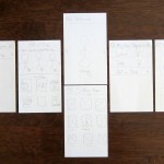
Everything about this app started as a series of iPhone-sized sketches on paper.

  Filed under: Information Architecture, KCAI, Learning
  Comments: Comments Off on Namasté: Back to the Beginning