Blog Category: KCAI


Twitter Process

By Erika Goering,

I’ve spent some time refining every aspect of my Twitter experiment.

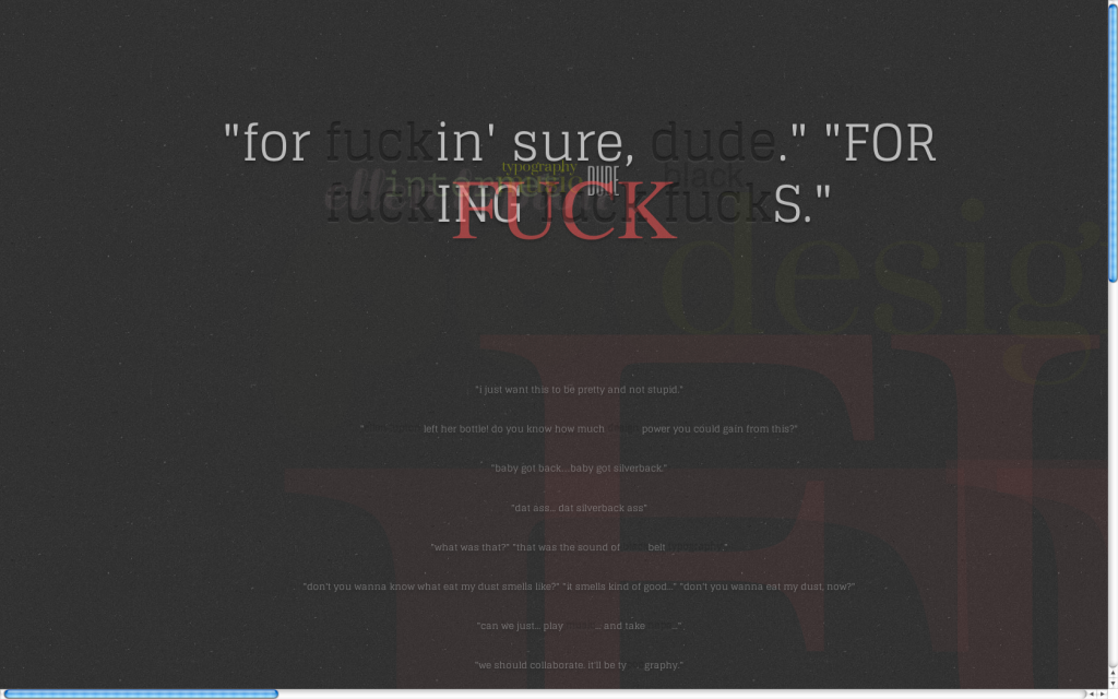
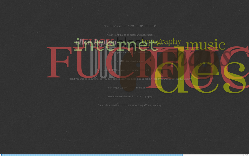
I’ve refined the aesthetics and readability by increasing the contrast between the background and the tweets. I’ve added a subtle drop shadow to the “inactive” and “flyout” words, while the “impressions” now have an embossed effect.

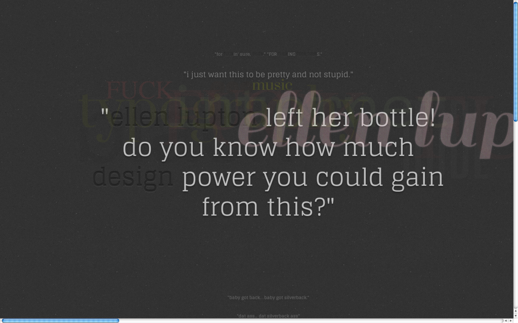
One of the more recent tweets has more keywords, and therefore has more flyouts. This caused some legibility issues because the flyouts were pretty opaque. Once the flying keywords get close enough to the user, they tend to block everything behind them. Kind of a problem if you want to actually read something.

…So I made the keywords become more transluscent when they get closer to the user. This not only helps with usability, but it also gives emphasis to one keyword at a time, to help with hierarchy and provide some rhythm and structure.

In the way of technical things, I came across a problem where multiple-word phrases (like “that’s what she said” and “ellen lupton”) were breaking to multiple lines when they flew in closer. I fixed that, so now those phrases are staying on one line while they’re moving around.

I’m working on getting the tweets (not the whole page!) to auto-refresh when there’s a new tweet. I know this involves my page saying hello to Twitter’s XML file to see if there’s something new, and then refreshing if that’s indeed the case. I just don’t quite know how to do that yet. But I’m working on it. I tried to get a crude reload button (I know, I know. Not automatic.) working yesterday, but this happened:

I’ve learned that this is because of the same-origin policy. But I’m pretty confident that I can find a workaround somewhere and apply that to my page. So that will hopefully be resolved very soon.

Next steps:

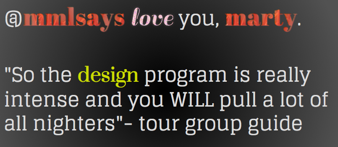
I plan to continue the ongoing process of adding/formatting  keywords to my CSS/PHP files. (For example, Ellen Lupton wasn’t even a keyword until this past weekend, and I made her glittery because she’s awesome and we love her.) My method of adding keywords just sort of happens when I spot a word that I’ve seen a few times before. Nothing too “designery,” but I do what I can.

I will try to fix the same-origin policy thing.  I need those tweets to reload.

So that’s where I stand right now. I’m gonna keep on moving forward, and awesomeness will ensue.

  Filed under: KCAI, Learning, Typography4
  Comments: Comments Off on Twitter Process

Turning Data in to Information

By Erika Goering,

Response to Wurman reading.

One thing that we all have to deal with, now more than ever, is the over-saturation of data. We can easily get immersed in it, without ever gaining any actual useful information from it.

It’s our jobs as designers (and information architects) to take those sloppy chunks of data and sculpt them into usable information. We need to build some sort of structure from it all and organize things into some sort of logical order.

I’ve thought about equating this issue to the obesity epidemic. People are getting plenty to eat, but actual nutrition is horrible. There’s plenty of stuff, but little actual substance. The way to fix this is to find an appealing and efficient way of acquiring adequate nutrition.

This is how I look at information architecture. We have plenty to pull from; we just need to figure out how to bring out the good stuff. We can do that by organizing data into categories and spectrums and using that to structure our communication of information. A large determining factor of how something is organized is how we as designers want that information to be understood. If I want to show a time-based set of data, then I’d better make a timeline of some sort. Or I could find another common aspect of that data and use that as the means of organizing it.

Being an information architect is about creating structures to hold data. Those structures then turn that data into information. And that’s what we’re here to learn.

  Filed under: Information Architecture, KCAI, Learning, Read&Respond
  Comments: Comments Off on Turning Data in to Information


Twitter Type: CSS3 Sources

By Erika Goering,

One of the main things I’m doing with CSS is masking images into the keyword text and using Google Web Fonts instead of the now deceased @font-face.

• Images in Text Demo

Google Web Fonts


Here’s what I’ve done so far with the two things.

The glittery “love” text is actually animated! The glitter sparkles! Hooray! I’m pretty excited about what CSS3 can do. At the moment, I’m still working on keyword styles. I’ll be tackling full-on tweet animations soon.

  Filed under: KCAI, Learning, Typography4
  Comments: Comments Off on Twitter Type: CSS3 Sources


Twitter Type: PHP Sources and Process

By Erika Goering,

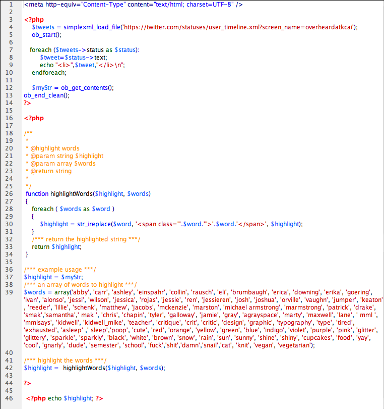
Here’s all of the sources I’ve used to get some basic code for all the stuff I’m doing. I haven’t used any of this code verbatim, because what I’m doing is very specific. But I’ve managed to make it all work together, which I think is pretty darn cool.

• Parsing XML with PHP
• Highlighting Keywords
• The Holy Grail: Making these two things work together! Making a Function’s Output a Variable for Another Function (what kind of sorcery is this?!)

Here’s what my PHP code looks like right now (I’m always adding more keywords when they come to me, but it should be pretty much finished):


The next thing I do will be figuring out jQuery animations and some CSS3 styling. That’s gonna be the fun part.

  Filed under: KCAI, Learning, Typography4
  Comments: Comments Off on Twitter Type: PHP Sources and Process


Typography Experiment: Back to Basics

By Erika Goering,

So, I’ve abandoned Flash and ActionScript for something more versatile. HTML5, PHP, jQuery, and CSS3.

Since I’m not terribly comfortable with any of these things, it’s pretty perfect as a learning experience. And as an experiment, I have no real expectations of how it “should” end up, because I have no real grasp on what I can do with it yet. As far as I know, anything is possible and anything can happen. So that’s what I’m shooting for. Endless possibilities.

I’m also totally open to future applications of this technology. What if I project this onto a large touch-responsive surface? What if there’s an element of augmented reality? What about a mobile app? Everything’s wide open. And incredibly exciting.

As far as actual production goes, the hardest part these past couple of days has been making an RSS feed’s output work with keyword highlighting. I followed many differing tutorials, pulled things from each of them, and modified them to the best of my ability, and I finally got it to work on a basic level last night. I have the feed working, and keyword highlighting is working for the most part (partial or compound words like sleep vs asleep are still causing me some technical problems, but I’m sure I can get that figured out in the next week).

The next steps are to create keyword-specific styles (like, say, Josh is purple with a rubik’s cube pattern or animation, or Patrick is all-caps and condensed). This is the easy part. It’s pure CSS. Maybe some Javascript. Not a huge deal. The fun part will be conducting a survey among my classmates to determine exactly what everyone’s names should look like. They’ll choose for themselves and for everyone else. Whatever consensus we come to will be what ultimately styles the type.

The hard part will be animating everything. That’s where jQuery comes in. I have never touched the stuff before. So this is an adventure for me. I have no clue what I’m doing, and it’s pretty liberating to have that kind of uncertainty and freedom. I know that I want tweets to move depending on their keywords, so that’s a place to start for now.

  Filed under: KCAI, Learning, Typography4
  Comments: Comments Off on Typography Experiment: Back to Basics


Yoga Teachers

By Erika Goering,

Yoga teachers are an essential part of the yoga community. They provide guidance, motivation, and inspiration to aspiring and veteran yogis. They impart valuable knowledge and wisdom through their yoga classes. Their extensive experience with yogis of all backgrounds and proficiencies gives them the tools they need to create customized sessions and cater to the individual needs of their students.

Yoga teachers have lots of responsibilities to maintain, whether it’s teaching a class or running an entire studio. Like anyone else, they must balance their work life and their personal life effectively to keep stress to a minimum. They live by the eight limbs of yoga, striving for inner peace, compassion, and enlightenment. A yoga teacher’s life is full of fun, challenges, and rewards.

  Filed under: KCAI, Learning, User Experience
  Comments: Comments Off on Yoga Teachers