Blog Category: Typography3


Brand Your Meat with Moveable Type!

By Erika Goering,

This will satisfy my letterpress/bbq needs. Metal type and food are together at last! http://www.thinkgeek.com/homeoffice/kitchen/e91e/

Despite my vegan status, I’m seriously considering ordering one of these to brand my veggie burgers, sandwiches, and other foods that need some typographic love.

  Filed under: KCAI, Random, Typography3
  Comments: Comments Off on Brand Your Meat with Moveable Type!
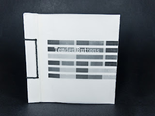

Type Process and Self-Critique

By Erika Goering,

So, about my Gertrude Stein book…

[flickr id=”6114679002″ thumbnail=”medium” overlay=”false” size=”medium” group=”” align=”none”] [flickr id=”6114133097″ thumbnail=”medium” overlay=”false” size=”medium” group=”” align=”none”]

[flickr id=”6114135425″ thumbnail=”small” overlay=”false” size=”medium” group=”” align=”none”] [flickr id=”6114683948″ thumbnail=”small” overlay=”false” size=”medium” group=”” align=”none”] [flickr id=”6114152299″ thumbnail=”small” overlay=”false” size=”medium” group=”” align=”none”]

I started out thinking purely about rhythm and emphasizing syllables, but now, I’m starting to get a bit deeper into it. I’m still thinking about rhythm, but now I’m also overlaying words onto words (using transparency) and creating density where words feel the strongest, so that when you flip through to the next transparent/translucent page(s), the dense word still lingers as a strong presence in your mind the way it does in mine.

My ultimate goal has remained consistent; I want to express how I personally interpret the poetry. I feel it like a sort of literary jazz. Lots of syncopated rhythms, variation between soft and hard sounds, with some words drawn out longer and smoother than others.

I’m gonna push this stuff further to make the composition less subtle and more dynamic. Because it’s not subtle in my mind. It’s friggin’ THERE. Like a literary rimshot.

So, here’s some things I’m gonna play with:

  • Scale! This is a big one. I’ve got a lot of whitespace, creating a very lightweight, empty kind of feeling. But I don’t feel the poetry as being so light all the time. Some parts are light, but some parts are much heavier. I’m gonna play with weight and scale a bit more. I’m thinking the type size could grow exponentially, like the dynamic intensity of her poetry.
  • Orientation/Rotation! Some of her words feel curvy or upside-down. I can’t really describe it better than that. But they need to look like how they feel.
  • Case. Changing some really intense-feeling words to be all-caps would definitely add to the feeling of dynamism in the text. But this is not nearly as important as scale.
  • Italics. I’m thinking italicizing some more “flowy” words would accurately portray how they sound to me.
  • More organized grid structure! What I have now is just a loopy, curvy alphabet soup of poetry. No structure. Like a soggy noodle. Bleh. That needs to change.
  • Typeface change? Right now, I’ve got Officina Serif. I might change to something different. Or also use Officina Sans. I just feel like I need some more variation. It’s all kind of one-note right now. And my new school year resolution is to never be one-note and be more daring with my design work. So, yeah. Gonna do that.
So, that’s what I’ve decided to work on before Friday. And I’m starting to refine my materials too. Definitely gonna stick with layering, because it’s so important to how I feel about Stein’s work. There’s meaning in there somewhere, but it’s buried in the rhythm. …Anyway, I’m definitely gonna go buy some vellum, and maybe some other transluscent paper for more dense layers in between poems.

  Filed under: KCAI, Typography3
  Comments: Comments Off on Type Process and Self-Critique


Just a Thought…

By Erika Goering,

For those who don’t know, we’re working with Gertrude Stein’s poetry in Type3 and Narrative in Sound & Motion.

Gertrude Stein’s poems are based on sounds and rhythms and tones, rather than meaning. The meaning is very loose, if existent at all. Reading her work, I find myself rocking back & forth and tapping my foot in a syncopated rhythm to the words. It’s literary jazz.

…And we’re doing jazz posters in Visual Language.

Coincidence? I think not.

  Filed under: KCAI, Narrative/Sound&Motion, Random, Typography3, VisLang
  Comments: Comments Off on Just a Thought…


Kinetic Type

By Erika Goering,

What’s more appropriate than a kinetic type video about language? Although this post is technically for Narrative in Sound & Motion, it makes sense to also tag it for Type3, because it’s about the appreciation of language and using the meaning of the text to influence the typography.

The most intriguing thing about this one is that I started to notice all the very deliberate curves and turns the blocks of type were making. Then, as I suspected, it zoomed out to show a word made of words. Hooray!

…And then I found this one. Also regarding the degradation of language. But done with a lot more expressive type. Varied typefaces, weights, and sizes make this one quite a bit more interesting than the other one.

  Filed under: KCAI, Narrative/Sound&Motion, Typography3
  Comments: Comments Off on Kinetic Type