Blog Category: User Experience


ADAA Submissions

By Erika Goering,

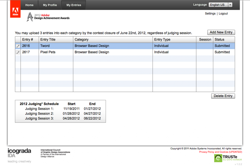
So far, I’ve entered Tword and Pixel Pets.  Two web-based projects. I’m also considering doing a bunch more.

I’m still getting used to this whole “entering award contests” thing, so I’m a bit nervous. But I think it’ll be okay.


Tword

Twordplay.com

Tword is a class project for Typography 4 at the Kansas City Art Institute.

Tweets from a shared twitter account are displayed and animated as a typographical experiment in communication and context.

The twitter account is shared among my Graphic Design Department classmates at the Kansas City Art Institute, and is a record of things that have been overheard in the studio.

This experiement was built with PHP, jQuery, AJAX, HTML5, and CSS3.

Tword is a Twitter-based typography experiment demonstrating what happens to tweets when they are removed from their original context and re-contextualized in a new environment. Specific keywords are styled and animated to stand out from the rest of their parent tweets, giving the user a feeling of eavesdropping on a conversation.


Pixel Pets

erikagoering.com/tamagotchi-collection/

Pixel Pets was an Information Architecture collection project at the Kansas City Art Institute. Pets are organized and sorted by their characteristics, and presented in an informative website.

This is an information architecture project based on my personal collection of virtual pets. I organize and sort them in multiple ways, with infographs representing various characteristics of my collection.

This was an opportunity to see what was possible with the Adobe Muse beta (sadly, Muse isn’t available as a product in the selection box).
I used Muse (beta) to build the site, Illustrator for all of the graphic elements (virtual pet illustrations, infographics, and the background tile and lace pattern), and Photoshop for some of the animations of the pets on the screens.

  Filed under: KCAI, Learning, User Experience
  Comments: Comments Off on ADAA Submissions

Semester Reflection

By Erika Goering,

 UX

User Experience is a class I was really excited about when the semester began. And I think that enthusiasm is what made me realize how much I actually love this kind of stuff. Tailoring design to suit the needs of real people is something I’ve always been intrigued by, and I feel very fortunate to have learned so much about it.

Research was really the main thing covered in this class. The big lesson I took away from it was understanding. Not just regurgitating quantitative information, but applying it on a qualitative and conceptual level. Understanding is the key to creating good work. And that applies to any subject. It’s not just design. It’s life.

I feel like I’ve unlocked some of the secrets of design; like I’ve been given some exclusive tools for being amazing. I’m part of an elite club of designers who take actual people into consideration, and not just “getting the job done.”

User Experience has actually made me re-think my future as a designer. I came into this program with the idea that I’d end up working in for a small, local company, doing glorified desktop publishing for random clients. But now, my standards have changed, and I’m starting to take a real interest in catering to niche markets and subcultures. These unique groups of people need someone to speak for them and to them, and I want to become that someone.


IA

I’ve decided that information architecture is yet another direction I could possibly take in my life (and definitely enjoy!). I love the idea of building usable information out of raw data and content. Sculpting something practical out of something mundane is like magic. The geek in me loves to create order and hierarchy, and I love making it accessible and digestible too.

Between UX and IA, I think I’ve developed quite a design arsenal this semester. I’m getting dangerous.


T4

Typography 4 taught me how to manage a project on my own. This was my first real self-directed class, and I learned more about myself than I did about typography. I think typography was just a medium for that. The experimentation process also taught me about how a project can evolve dramatically over time and become something really refined and engaging. And it taught me to keep pushing things, even when I think I’ve pushed enough. There’s always more to do, and there’s always something better to achieve.


Overall

This semester has been the most nurturing, inspiring, and stimulating semester I’ve ever had. I’ve learned more about myself and who I want to be in these three classes than I have in my entire college career.

  Filed under: Information Architecture, KCAI, Learning, Typography4, User Experience
  Comments: Comments Off on Semester Reflection


Nelson-Atkins User Testing Day

By Erika Goering,

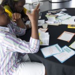
The family I was paired with was an energetic bunch of people, to say the least. I worked with a brother/sister pair and their mother. They were so much fun!

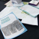
The kids loved my map and coloring cards, and they even fought over who found the sculptures first and would get its coloring card. (Luckily, I had two copies, so they each got one, although that didn’t really stop them from fighting. Haha.)

My kids were older (around 8-9), so their map skills were pretty darn good. They actually used the map as a navigation tool, instead of leaving it to their mom to figure out. They followed the map well, and they found every sculpture they needed to find! Hooray!

Coloring the cards at the art table went over really well with the girl, as she’s a bit of an artist, but her gamer-geek brother didn’t seem too interested in coloring.

As always, there are some issues that need to be addressed:

  • Numbering the sculptures makes the kids want to do them all in order, from 1 to 6.
  • They didn’t notice Artie until they were sitting down at the art table and looked closer.
  • The coloring cards were fun to collect, but only one of the kids actually colored them.

  Filed under: KCAI, Learning, User Experience
  Comments: Comments Off on Nelson-Atkins User Testing Day


Nelson Map Feedback

By Erika Goering,

Here’s our feedback from our classmates. We’ve got some good feedback to work from, so I’m confident that we’ll end up with a really awesome map.

  Filed under: KCAI, Learning, User Experience
  Comments: Comments Off on Nelson Map Feedback


“Design” vs. Design

By Erika Goering,

I recently read an article on TechCrunch about user experience and what it takes to succeed in the competitive world of tailored/targeted apps. While the article specifically talks about the digital/interactive realm, this same thinking can be applied to other design problems.

Jamie described this issue last year as “skeleton vs. skin,” where the skeleton is the structural, functional side of a project, and the skin is the styling and aesthetics (and content is the guts that make it all viable in the first place). A skeleton can stand on its own if it needs to, but a pile of skin is an empty, shallow, lump. (However, a bare-bones [pun intended] design can get boring and feel naked or unfinished if left skinless.) Structure gives design a way to cater to a user’s needs without collapsing under the pressure of user interaction. A “pile of skin” may be well-groomed and sexy, but no skeleton means a lifeless experience. A skeleton and skin together provide a beautiful balance of structure and beauty, where a user can enjoy a smooth experience while having something sexy to look at.

So, let’s break it down… … Continue reading

  Filed under: Find&Share, Information Architecture, KCAI, Learning, Living, Read&Respond, User Experience
  Comments: Comments Off on “Design” vs. Design


Final Tailored Ad: Yoga Mat Cleaner

By Erika Goering,

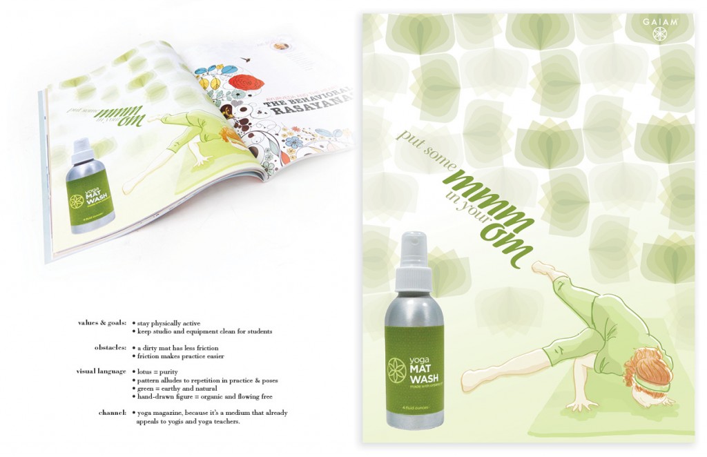
This full-page magazine ad for yoga mat cleaner ties in to yoga teachers’ values and goals of being physically active and keeping their studio clean for their students. A dirty mat can be an obstacle, as it does not provide sufficient friction for practicing yoga.

The lotus is a symbol of purity and transcendence, and the green color is earthy and natural to appeal to yogis’ sense of oneness with the earth. The hand-drawn yoga practitioner also feels organic and down to earth. She doesn’t mind having her face so close to the mat because the it smells great! It’s clean and fresh, thanks to Gaiam Yoga Mat Wash.

  Filed under: KCAI, Learning, User Experience
  Comments: Comments Off on Final Tailored Ad: Yoga Mat Cleaner


Yoga Mat Cleaner: Round 2

By Erika Goering,

  Filed under: KCAI, Learning, User Experience
  Comments: Comments Off on Yoga Mat Cleaner: Round 2