Blog Category: Learning


F+S: Packaging

By Erika Goering,

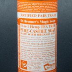
Dr. Bronner’s Magic Soap – Tea Tree
 
This product uses ethos, because it’s endorsed and created by a doctor, who the soap is named after. You can totally trust that guy with your hippie hygiene needs.
I picked this soap over the others nearby because I like the color-coded packages together on the shelf. Also, the sheer absurdity of the amount of text is amusing, and it makes me wonder what they were thinking. So that’s fun.
The part of the design that speaks to me first is, of course, the massive amount of text filling the entire label. Seriously. The entire thing. It doesn’t speak to me as much as it screams to me for help.
The first thing a customer does with this package after picking it up off the shelf is quickly shove it in their shopping basket because they don’t have much time for reading a novel on a soap bottle.
The package is usually handled very quickly. All of the vital information (brand name, product name, scent/variety) is front & center. The text everywhere else is so unnecessary, most people don’t even see it as text; it’s just a texture around the sides.
Dr. Bronner’s Magic Soap stands out on the shelf because of its use of color. Each version of the Magic Soap has its own little place in the Dr. Bronner’s rainbow, so they work well together while standing out from the minimalistic soap packages nearby.
Friends’ thoughts:
  • Dr. Bronner’s Magic Soap has “SO MUCH TEXT!”
  • “I don’t even know where to start if I wanted to read all of it.”
  • “I don’t want to read it in the store. I’ll wait until I get home and use it as reading material in the bathroom.”
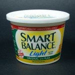
Smart Balance Light Buttery Spread
 
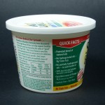
This one is totally logos. It’s full of information and facts and even has footnotes on the side to further support its claims.
I chose this over the others, not only because it’s vegan and I want to eat it, but also because it’s got some healthier-looking information on the label. (Flax is awesome.)
I was definitely drawn to the information on the package rather than the actual design of it. Because I think the design pretty well blends in with all the other margarines and butters in the aisle. The large text might also have something to do with it. It’s pretty huge.
The first thing I did when I picked up the package was actually read all of the quick facts on the side. It’s interesting stuff!
Of course, not everything is communicated on the front. It’s got the name of the product on the front, but the informative stuff is on the side.
In terms of shelf presentation, this package is pretty much your average margarine. It’s got happy primary colors and a rather light feel.
Friends’ thoughts:
  • “It’s all green and yellow. Like healthy butter.”
  • Big text, but a clean feel.
  • “Kind of trendy, new-ish look.”
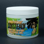
Knotty Boy Locksteady Dreadlock Tropical Tightening Gel
 
I think this one is pathos, because it’s got a scene of a carefree beach, with a carefree dude, sporting his carefree locks. It feels very relaxed, but fun.
I chose this package over the others in the ethnic hair care section because it was one of the few with an actual personality. Other packages looked bland and boring, while this one looked a bit more fun. However, the package does look a bit juvenile and cartoony compared to the more mature designs of other nearby packages.
The dreadlocked dude on the front /side sticks out to me because he makes eye contact with the purchaser. Also, the use of color is unlike a lot of the other products nearby, which are mostly yellow and pink or brown. More fleshy colors, while this one is beachy and blue/green.
The first thing I did after picking up the package was sniff it because the package says it’s got lime in it. Sure enough, it smells like a limeade. On the beach.
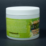
Not everything is communicated on the front. In fact, most of the relevant information is on the sides/back (I just realized all of my products are cylindrical and they don’t really have “sides,” but oh well). The paragraph (which could’ve easily been condensed to a few bullet-points) explains how the product works and what to expect from regular use.
Friends’ Thoughts:
  • “Lots of green!”
  • “Very beachy.”
  • Dreadlock boy looks playful
  • “Party atmosphere”
  • Fun!

  Filed under: Find&Share, KCAI, VisLang
  Comments: Comments Off on F+S: Packaging

Website Sketches

By Erika Goering,

Here’s a couple of digital sketches for my website. I’m kind of getting stuck in my design, mostly because I still want to hold on to the blog thing. I’m having trouble moving my blog to a secondary importance. That’s my biggest challenge in this class so far, and I’m going to probably have a hard time getting out of that rut.

But I’m trying.

I’m having trouble filling the page with content since my blog is now in the back seat. So I’m thinking all the art I have for sale should be on display. But I also need to find other content (maybe a full artist’s statement?) to put there as a backup.

  Filed under: KCAI, Online Presence for the Artist
  Comments: Comments Off on Website Sketches


Brand Your Meat with Moveable Type!

By Erika Goering,

This will satisfy my letterpress/bbq needs. Metal type and food are together at last! http://www.thinkgeek.com/homeoffice/kitchen/e91e/

Despite my vegan status, I’m seriously considering ordering one of these to brand my veggie burgers, sandwiches, and other foods that need some typographic love.

  Filed under: KCAI, Random, Typography3
  Comments: Comments Off on Brand Your Meat with Moveable Type!


Site Outlines & Descriptions

By Erika Goering,

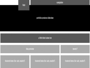
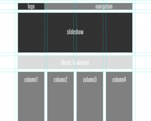
  • Logo is in a traditional, expected location.
  • Slideshow showcases previous clients and work. It rotates through images automatically, but there are controls for going forward/backward in the queue.
  • Blurb has a little bit of basic info about the artist/company, while being visually attractive yet out of the way.
  • Four columns of content; each with equal dominance.
  • Navigation is linear and eye-catching (so the user knows where to go), but unobtrusive as to not interfere with the overall composition.

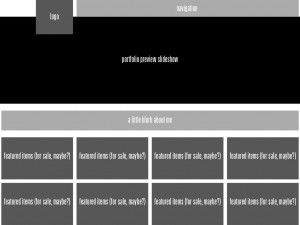
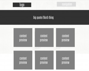
  •  Logo in the usual place.
  • Big quote area gives a very quick description of who they (the company) are.
  • 3-column grid has squares for content/project previews. Clicking on one of these takes the user to the project’s page.
  • Navigation is very small, light, and quiet, so the user is drawn towards other elements. However, once the user scrolls down, a new, more bold navigation bar sticks to the top of the browser window.

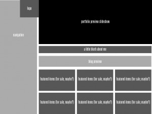
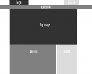
  •  Logo in the usual place.
  • Search bar is a tertiary element, where attention is given only when it is needed.
  • Big image gives a feel for the company’s goals and audience.
  • Large content area is for large blocks of body text.
  • Sidebar has secondary content that supplements or complements primary content.
Here’s the key to all my shades of gray and their meaning as far as hierarchy goes:

  Filed under: KCAI, Online Presence for the Artist
  Comments: 2


Grace Kelly Poster Digital Process: Saxophones & Sequins

By Erika Goering,

Round 1 of digital ideas:

[flickr id=”6149306328″ thumbnail=”thumbnail” overlay=”true” size=”medium” group=”” align=”none”] [flickr id=”6148756413″ thumbnail=”thumbnail” overlay=”true” size=”medium” group=”” align=”none”] [flickr id=”6149307560″ thumbnail=”thumbnail” overlay=”true” size=”medium” group=”” align=”none”] [flickr id=”6149308228″ thumbnail=”thumbnail” overlay=”true” size=”medium” group=”” align=”none”] [flickr id=”6148758587″ thumbnail=”thumbnail” overlay=”true” size=”medium” group=”” align=”none”] [flickr id=”6149310416″ thumbnail=”thumbnail” overlay=”true” size=”medium” group=”” align=”none”]

[flickr id=”6149311708″ thumbnail=”thumbnail” overlay=”true” size=”medium” group=”” align=”none”] [flickr id=”6149313902″ thumbnail=”thumbnail” overlay=”true” size=”medium” group=”” align=”none”] [flickr id=”6148764901″ thumbnail=”thumbnail” overlay=”true” size=”medium” group=”” align=”none”] [flickr id=”6148767079″ thumbnail=”thumbnail” overlay=”true” size=”medium” group=”” align=”none”] [flickr id=”6148768779″ thumbnail=”thumbnail” overlay=”true” size=”medium” group=”” align=”none”] [flickr id=”6148770503″ thumbnail=”thumbnail” overlay=”true” size=”medium” group=”” align=”none”]

Round 2: Focusing more on the idea of indexical objects (sax & sequins), but also using the sequins as a symbolic representation of Grace Kelly’s youth, energy, style, and sparkling talent. Also, the sunrise-esque color scheme alludes to a maturing, but new rising star.

[flickr id=”6148781975″ thumbnail=”thumbnail” overlay=”true” size=”medium” group=”” align=”none”] [flickr id=”6149331476″ thumbnail=”thumbnail” overlay=”true” size=”medium” group=”” align=”none”] [flickr id=”6149360504″ thumbnail=”thumbnail” overlay=”true” size=”medium” group=”” align=”none”] [flickr id=”6148808625″ thumbnail=”thumbnail” overlay=”true” size=”medium” group=”” align=”none”] [flickr id=”6149349536″ thumbnail=”thumbnail” overlay=”true” size=”medium” group=”” align=”none”] [flickr id=”6149358356″ thumbnail=”thumbnail” overlay=”true” size=”medium” group=”” align=”none”]

Round 3:

Refining the photograph idea, mostly playing with type and orientation. Grace Kelly = sequin side, and Phil Woods = classic, unobtrusive, black side.

[flickr id=”6163096967″ thumbnail=”thumbnail” overlay=”true” size=”medium” group=”” align=”none”] [flickr id=”6163632138″ thumbnail=”thumbnail” overlay=”true” size=”medium” group=”” align=”none”] [flickr id=”6163633140″ thumbnail=”thumbnail” overlay=”true” size=”medium” group=”” align=”none”] [flickr id=”6163633896″ thumbnail=”thumbnail” overlay=”true” size=”medium” group=”” align=”none”] [flickr id=”6163634906″ thumbnail=”thumbnail” overlay=”true” size=”medium” group=”” align=”none”] [flickr id=”6163101545″ thumbnail=”thumbnail” overlay=”true” size=”medium” group=”” align=”none”]


  Filed under: KCAI, VisLang
  Comments: Comments Off on Grace Kelly Poster Digital Process: Saxophones & Sequins


Final Gertrude Stein Videos

By Erika Goering,

Apple:

Apple plum, carpet steak, seed clam, colored wine, calm seen, cold cream, best shake, potato, potato and no no gold work with pet, a green seen is called bake and change sweet is bready, a little piece a little piece please. 

A little piece please. Cane again to the presupposed and ready eucalyptus tree, count out sherry and ripe plates and little corners of a kind of ham. This is use. 

Dirt and Not Copper:

Dirt and not copper makes a color darker. It makes the shape so heavy and makes no melody harder. 

It makes mercy and relaxation and even a strength to spread a table fuller. There are more places not empty. They see cover. 

My main focus is rhythm and the idea of pulling words out of her perpetual stream of consciousness. So I tried to convey that through animated type and transitions between phrases. In these videos, I wanted to make the text come together from the pool of thought in the background.

  Filed under: KCAI, Narrative/Sound&Motion
  Comments: 3


Revised Site Diagram

By Erika Goering,

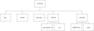
I hope this makes more sense.

As of right now, I’m undecided as to what I’m going to do with my blog (separate blogs for school process and work process, or not). But we’ll weigh those options later. Right now, it’s all about the rest of the site. Especially the portfolio.

  Filed under: KCAI, Online Presence for the Artist
  Comments: Comments Off on Revised Site Diagram


Website Inspiration: Texture and Grids

By Erika Goering,

What I’m drawn to in web design is breaking the boundaries of what it means to be digital. I like texture, gradients, non-rectangular shapes, and recognizable (real-world) imagery, like coffee cups and notepads. I don’t want the web to feel cold and sterile. I want it to feel like real life.
But I also want it to be organized and structured, with a classic grid-based layout.
  • http://www.spoongraphics.co.uk/
    • This site appeals to me because it’s got a tactile quality that I appreciate in web design. As I mentioned before, I like blurring the lines between digital and analog.
  • http://koffieverkeerd.be/
    • I like coffee.
    • Actually, I like showing evidence of interaction with coffee. It adds a uniquely imperfect human element to the design. It says, “Yes, I’m addicted to caffeine because I don’t get nearly enough sleep because I’m constantly working because I’m so dedicated. So hire me.” Although, that may be a bit removed from what most people probably see as just, “Hey. I like coffee.”
  • http://www.rga.com/
    • This one doesn’t have the same textural qualities as most of the others on this list, but it does have something the others don’t; a very strong grid on a fluid layout. I resized my browser window several times, and each time, the site sprung back to a perfect grid. Even the images resized automagically. Beautiful.
    • I almost never design a site to be fixed-width. I worry that people with giant hi-res screens will feel shortchanged and people with tiny low-res screens might end up scrolling sideways. So, I usually just make it all fluid and call it a day. Everyone gets a full-screen experience.
  • http://fuelbrandinc.com/#/about
    • Subtle gradients give this site a sense of depth that I like. None of that flat, boring website stuff.
    • The background color gracefully changes as you venture into different areas of the site.
    • Subtle highlights and shadows on navigational elements give it even more depth.
    • Yay, depth!
  • http://timvandamme.com/
    • This site gives a digital home to a familiar business card format. Pretty cool idea.
    • I like the idea of bringing analog ideas into web. (I know, I said that a few times already.)
  • http://www.interexpresso.pt/
    • I love when website textures aren’t just arbitrary and “cool.” They’re best when they have conceptual meaning and linkage. This one uses a woven coffee bulk-bag texture to advertise their coffee makers. Pretty sweet.
    • I love coffee.
  • http://www.brizk.com/
    • Depth & clarity. Two wonderful things.
    • There’s a nice simplicity about this one. Monochromatic, but visually interesting compositionally. Kind of whimsical with the clouds in the background and the flight path of the bird. (At least, that’s what I interpret that to be.)
  • http://www.cutler.it/
    • I’m just REALLY drawn to this layout. I like the slideshow at the top, and the grid-based layout everywhere else.
    • The black & white, high-contrast thing is nice. It separates the sections in a very clear way. The little breaks between sections kind of stitch the pieces together.
    • The only color on the site’s home page is from the projects being showcased. That makes the website itself kind of fade into the background while the work stands out on its own.
  • http://www.thisisbrandnew.com/
    • This wall & handwritten thing is what I have in mind for a new layout for my process blog. I want to make my process blog look like it’s pinned up for a critique. Because, like much of what I’m doing, it’s just another work in progress.
  • http://forabeautifulweb.com/
    • I’m digging the floral wallpaper. Again, analog ideas brought into a digital realm.
    • Pretty elegant, organized design.
  • http://secondandpark.com/
    • Grid, grid, grid! Yay, structure!
    • I also like the slab-serif typeface here. I’m pretty sure it’s Clarendon. I loves me some Clarendon. It’s strong, yet elegant.
  • http://www.amuki.blogspot.com/
    • Fixed-width isn’t my thing, but I do enjoy the bunch of things like paper, staples, paperclips, and drawn elements.
  • http://spoutcreative.com/
    • Texture and grid. Two wonderful things together.
    • The color scheme is both fun and sophisticated. Which is great for a designer. I think it shows versatility.
  • http://www.giblette.com/
    • This site definitely conveys a specific feel. Neo-retro kind of stuff. Nostalgic, in a way. It kind of reminds me of Hammerpress.
  • http://hammerpress.net/
    • Texture and grid. Yay!
  • http://www.skialpine.com/
    • This one has a pretty sweet navigation bar. It’s got texture so nice I can almost smell it.
  • http://www.deniseandrade.com/
    • This one has a very hippie feel, which appeals to me because I’m the daughter of an old hippie. And I have dreadlocks, so… Yeah. I’m a bit of a hippie too.
    • The paper roughness and the intricate, but subtle pattern, combined with a watercolor illustration in the header makes it feel very familiar and inviting.
  • http://doejo.com/
    • Taking a totally different approach is this site, with a very structured 4-column grid and fearless use of bright colors. Web design can be soft, loud, structured, or freeform. That’s why I love it so much.
  • http://www.kiluka.ch/#/portfolio
    • Holy crap. Amazing design.
    • It looks like it’s all Flash-based, though. But that doesn’t have to be a bad thing.
    • The user experience is nice. You click and drag back & forth between projects, and it uses the intensity of your dragging motion to determine the speed and resistance of the scrolling. You can even fling it a bit if you want to. Subtle detail, but much appreciated.
  • http://www.cherokeemills.com/
    • Another paper texture site. Nice tactile feel.
  • http://www.artflavours.com/
    • Lots of different textures here. And handwritten stuff. Because it’s real-world design. On the web. But it’s real. Mind-blowing.
  • http://www.prowseed.com/
    • This site is so sexy I want to dig my fingernails into it. And nibble on it for awhile. It’s delicious.
    • The wallpaper is dimensional and elegant. And the ribbons give it an even more decorative feel, while still being clean and simple.
  • http://www.narfstuff.co.uk/
    • I love the top of this website. It’s got analog elements and a  nice use of color.
    • However, when you scroll down past the exciting part, it all fades to white. BO-RING. And no fancy footer. They missed an opportunity here.
    • The top half of the website is nice.
  • http://www.organicsupermarket.ie/
    • I rarely come across a good grassy website. This one is pretty great. I feel like I’m in the environment, standing over a plot of land. I can almost smell the grass…
  • http://adaptd.com/
    • The texture here is more subtle than I usually care for, but it’s done very tastefully.
    • The color palette is modern and classic at the same time. Pretty timeless, I think.
  • http://www.electricpulp.com/
    • This one has a navigation bar that, when you scroll away from it, a mini version of it pops down from the top and sticks with you to guide you through your journey of the site. This is definitely useful for pages with lots of scrolling.
  • http://www.friskweb.pl/
    • The footer is pretty clever.
    • The contrast between the text and the background for the rest of the page isn’t great, though.
  • http://www.designsponge.com/
    • They recently re-designed their site. Their last version was okay, but this one is pretty wonderful. Lots of photographic, analog elements all over the place. I want to pick up those ribbons and play with them.
  • http://www.carbonica.org/
    • This site makes me want to recycle. It looks very recyclable and eco-conscious, which is what they’re going for.
  • http://www.helmy-bern.cz/
    • The rough torn cardboard is a very beautiful part of this site. It provides dimension and texture, and makes the site feel real.
  • http://henryjones.us/portfolio
    • Here’s a portfolio site with a leather and wood feel. Which is perfect for a classic portfolio.
    • It sets a mood for the whole thing; sophisticated and experienced.
  • http://www.rzmota.com/
    • Bird’s-eye view of a workspace. Nice. But a bit heavy on the Apple products.
  • http://www.thebrowncorporation.com/
    • Hand-drawn on a cardboard texture. And it’s hilarious to boot.
  • http://www.ernesthemingwaycollection.com/
    • Wood, paper, and coffee. Need I say more?
What I ultimately want my website to become is something balanced between clean and textured, digital and analog, design and fine art. I want it to show every aspect of who I am as a designer, artist, and geek.

  Filed under: KCAI, Online Presence for the Artist
  Comments: Comments Off on Website Inspiration: Texture and Grids