Blog Category: Learning


Letterpress Adventures

By Erika Goering,

After watching the film “Typeface,” I was pretty inspired and excited to do some letterpress work of my own. So I was pretty happy when I heard we were actually going to do it in class.

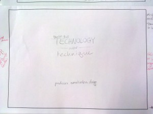
This week went by pretty fast. I went from pencil sketches to using the press in just a few days. During this week, I’ve learned a few tricks. For example: Always have a mirror handy. It’ll reveal typos that were invisible before. That one’s a lifesaver. I almost printed the word “technipue” instead of technique. Letters are hard.

The week in review:

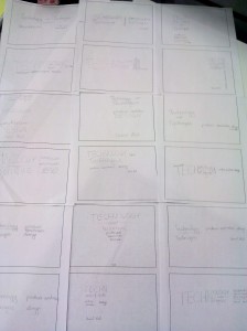
Pencil sketches
(All of them in one spot.)

(The best two of those, revised.)

Pencil and digital side by side
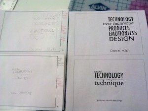
(Digital versions of those two.)

(Sexy digital closeup. Ooh, baby.)

Real-life metal, almost ready for printing! The suspense grows!
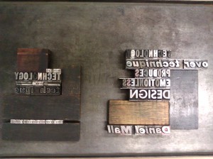
(Kind of figuring things out as I’m going along.)

To my surprise, using the letterpress wasn’t as difficult as it seemed. After the agony of searching for a rogue lowercase n (which I eventually found!) and swapping out my backwards q, everything after that was pretty peachy. A bunch of other people had way more issues than I did, and I’m very grateful that I paid close attention to their mistakes before printing my own work. It really helped a lot.

  Filed under: KCAI, Typography2
  Comments: Comments Off on Letterpress Adventures

Values & Artifacts: DIY Hacker and Blue Collar

By Erika Goering,

DIY Hacker

  • Values
    • Pride in making a device or software better than it was before.
    • Exploit vulnerabilities or draw attention to flaws so they can be fixed.
    • Push the limits to what technology can do.
    • Open-source philosophy: Everyone should have access to view and change software (and even hardware) in the community. (Linux is a good example of this.)
    • Explore the possibilities of devices and networks by infiltrating commonly-used framework. (Like phreakers, who manipulate and explore the telephone system.)
    • Piracy (breaking copy protection and providing free copies of software or media to the community, with the philosophy that everything should be free and open.)
  • Artifacts
    • hard drive or solid-state drive
    • RAM
    • soldering iron (for hardware hacks)
    • server
    • keyboard
    • removable disk drive
    • CD, Floppy disk (removable media)
    • ethernet (cable or port)
    • USB (cable or port)
    • monitor (LCD? CRT??)
    • serial (cable, port)
    • firewire (cable, port)
    • Linux install disk

Blue Collar

  • Values
    • Appreciation and respect for hard work.
    • Good work ethic (get things done on time, and do them well.)
    • Providing for family.
    • Use what you have, and make the most of it. (Be resourceful.)
    • Don’t ever forget where you came from. (If you climb the corporate ladder, don’t forget that hard work and struggle made it happen.)
  • Artifacts
    • coffee
    • hard hat
    • tools
    • beer cans
    • country music (tangible format, like an album, tape, or CD)
    • construction site
    • factory
    • cement/concrete
    • GED, high school diploma, technical school diploma
    • overalls, denim work clothes
    • thick boots
    • pick-up truck

  Filed under: KCAI, VisCom2
  Comments: Comments Off on Values & Artifacts: DIY Hacker and Blue Collar


Daniel Mall

By Erika Goering,

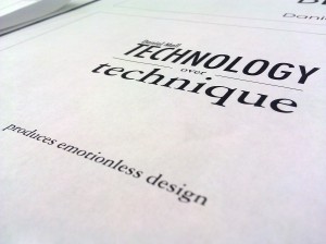
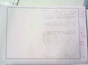
Technology over technique produces emotionless design.

At first glance, this quote feels like it came from the mind of a jaded veteran of 1960s design. Honestly, before I researched who Daniel Mall was, I figured he was some grumpy old man who already passed his prime. But, nope. He’s a young, contemporary dude who actually specializes in interactive media. Mostly digital. Mostly websites. (At least that’s what his portfolio shows.) Naturally, I find it interesting that such a quote could come from such a young guy who works so heavily in high-tech media. But what makes his work so well-made is not the fact that he’s using certain technologies and media. It’s well-made because he’s using basic elements of design. And he’s using them coherently. He’s putting design first and media second. It’s his wisdom and experience that makes it seem like he’s much older than he actually is.

His work focuses on clean, cohesive design, with elements of hierarchy, alignment, and the overall user experience. His projects are very easy to navigate and explore. He believes that every aspect of every project should be carefully conceptualized. And that’s what design is. It’s the practice of being careful and creative with presenting content to a viewer.

You can find out what makes Dan Mall tick at the following places:

I specifically chose a quote about technology because I wanted the medium itself to have meaning in relation to the quote. I want to show that postcards can be well-designed without being high-tech.

As I’ve said before, I greatly appreciate my time at KCAI because we’re not constantly glued to computer screens. We have to step out of our comfort zones and work with our hands from time to time. It’s the aspects of design that are span from one medium to another that really stick in my mind.

  Filed under: KCAI, Typography2
  Comments: 4


Haiku Flash Video

By Erika Goering,

After many revisions and a lot of fiddling around with type placement, transitions, and keeping true to the concept of the poem, I’ve settled on a final version.

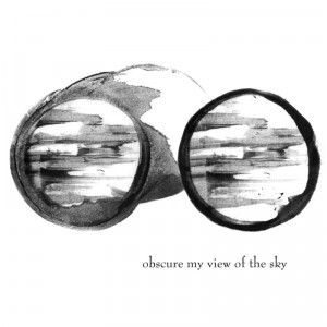
Since posting my original shapes & text, I’ve moved the “obscure my view of the sky” text to fit better with the shape of my “smudgy sky goggles,” as I call them. Before, the type was awkwardly placed below the shape and it wasn’t really aligned with anything. Now it’s aligned with the right side of the shape, and it’s interacting with the little curve that comes off the top. I feel like it belongs there now.

Since my last flash iteration, I’ve given my shapes a little bit of movement at all times. This makes them feel more alive, like they are telling you their lines of the haiku. I think it’s a really good addition to the video.

Technical issue: I tried adding music, but when the video looped back to the beginning, the music would keep going like it was just one long movie. And then another iteration of that song would start playing when the video restarted. So I ended up with layers of music playing together after looping through the video a couple of times. I never figured out how to fix it. So I took it out at the last minute.

I’m proud of myself for accomplishing this and not encountering too many problems, aside from the music thing. I never really worked with Flash before this project, and I’m glad I caught on quickly.

  Filed under: KCAI, VisCom1
  Comments: Comments Off on Haiku Flash Video


Past Project Critique: VisCom

By Erika Goering,

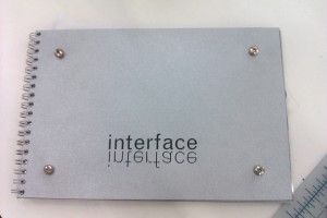
I chose to critique my dot book. I’ve come a long way since then.

The cover isn’t so bad… except that the paper on either side of the matboard started peeling off almost as soon as I put it on. Rubber cement isn’t the greatest adhesive for me. More of it gets on me than on the project. And spraymount ends up messy too. That’s why I’ve switched to a glue runner. Repositionable, permanent, perfect straight line, no mess. Perfect for a slob like myself. *thumbs up*

My main issues with this book are technical/craft-related. I remember working in the studio until 3am the day it was due. The studio was crazy that night. Everyone was running around in a panic. I got my book bound just before the studio closed. Because of my fatigue, my craft suffered heavily. The all-nighter happened because I was still putting my job before school, and my afternoons were spent going to work downtown rather than working at school. I’ve learned better since then. I’ve learned that I get my homework done better and sooner if I just take a couple days off work. (Luckily, I have a job where every employee is a student, so they’re really flexible and understanding about taking time off for school.) With more time to work on my projects, I have more time to fix my craft problems and take my time so that most of those problems never happen.

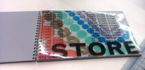
The worst page of my book (craft-wise) is this one:

I don’t like to call a piece of work “bad,” but this page is pretty crappy. I piled colored dots on top of each other to create blends of colors. Great idea! However, the top layer started to pucker and curl as the rubber cement between the layers dried. So I was left with wrinkly dots in the middle of this page (those brown-ish ones there). I discovered this issue the day the project was due, and I didn’t have time to fix it. Again, if I had given myself more time to work on this book, I would’ve discovered the puckering issue sooner and had some time to fix it and try something different.

My concept was nice. Technology/computers/robots. It’s something I have a genuine interest in, and I had a lot of fun with it. So it kept my interest and attention throughout the whole duration of the project.

The best thing I learned from this was that I need to give myself enough time to fix my screwups. So now I do a little trick that forces me to give myself enough time. I change the due dates of projects in my notes. When a project is really due on Friday, I lie to myself and say it’s due on Wednesday. So if I see something wrong with the final product, I’ve given myself all of Thursday to fix it. (And if I get it fixed in a decent amount of time, I can still go to work that afternoon! Hooray!)

This project was a good lesson in time management and controlling my craft. And I’ve been improving ever since.

  Filed under: KCAI, VisCom1
  Comments: Comments Off on Past Project Critique: VisCom


Semester Reflection: VisCom

By Erika Goering,

The singlemost important thing I’ve learned in these 16 short weeks is that, despite what I initially think, success is possible. I can reach it. And we’re all in this together. It’s not a competition. And students make great teachers. When you’re surrounded by 20 different people with 20 different views & opinions, you get varied, comprehensive feedback and a new outlook on a project that you might not have thought about before.

There are things I didn’t know I knew until I came here. I feel like my mind is unlocking and things are becoming more evident. I will forever view life as dot compositions and line studies.

The objectives that spanned project to project in VisCom were:

  • create innovative work that conveyed an idea
  • display an understanding of the subject matter
  • have an increasingly improving process
  • produce many iterations of one idea to see what works the best
  • communicate an idea with visual tools (it is a Visual Communication class, after all.)
  • explore relationship between concept and form
  • explore relationships between forms within a project
  • determine what makes a good composition
  • work with what you have (restrictions and materials) to make something creative
    • find a way to make it work despite restrictions
  • work well with a partner
  • work well as an individual
  • work well as a team (ask classmates for feedback, and provide feedback to classmates)

The things that will really stick with me are things like the realization that I will never escape line studies and dot compositions, no matter how hard I try. They’re everywhere! Sometimes both together!

Other things that will stick with me:

  • The importance of process. Making sure that each step in the process is an improvement over the last.
  • Keeping composition and legibility in mind. Design is all about problem-solving. The problem is that an idea needs to be conveyed to an audience. My job is to solve that problem by giving the audience a clear and understandable piece of work.
  • Visual communication is one of the most important aspects of the world that we take for granted unless we’re designers. “Normal” people never think about “oh, that’s hard to understand because the composition doesn’t make sense.” They just glance at it, shrug, and walk away. But subconsciously, it makes an impact. They know when they see good design, and they remember it. It’s my job to make a nonchalant glance into an appreciative stare.

I entered this semester both afraid and excited about what was expected of me, and I’m very proud of myself for coming out the other side a much stronger artist and designer. And person. I’ve become a better person for learning how to manage my time and handle my stress.

I’m happy with how things have turned out so far, and I’m excited (and a bit nervous) for next semester.

  Filed under: KCAI, VisCom1
  Comments: 1


Paul Rand & Stefan Bucher

By Erika Goering,

Paul Rand links art and design by their common uses of form and content. Without form, there’s no content, and without content, there’s no form.

This video is great because it illustrates what Rand is talking about by using the most basic, simple forms composed in very careful ways (much like our dot compositions from earlier in the semester). Rand says that the elements of design are the language of form, and I think that’s very true. Form doesn’t have a voice unless you give it something to talk about and a way to say it.

A blue circle is just a blue circle, until you make it sit a certain way in a frame or multiply it a thousand times and use scale changes to give a sense of depth. Then you’ve got bubbles in water. You’ve set a scene for a story.

Just like markmaking is just markmaking until you put marks together and give them context. They don’t mean anything until there’s a use for them. And that’s what design is. It’s purpose.

Stefan Bucher is a professional markmaker. He turns marks into drawings, and those drawings turn into characters. Then the characters adopt personalities of their own. He starts with a type of fractal ink blot that creates a framework for his creatures.

Both of these artists are using basic elements of art and design to create compounded elements that start to take their own shape. This is exactly what I am doing with my haiku shapes. I took marks, put them together to make compound marks, then I turned them into a flash video, with movement and dimension.

  Filed under: Find&Share, KCAI, Read&Respond, VisCom1
  Comments: Comments Off on Paul Rand & Stefan Bucher


Revised Haiku Shapes

By Erika Goering,

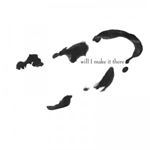
I made my final shape more horizontal, to follow the look and feel of the other two.

  Filed under: KCAI, VisCom1
  Comments: 1


Haiku Text Options

By Erika Goering,

Haiku Type Options

I chose to experiment with serif and sans-serif typefaces, as well as varied positioning of the type in relation to the image. I’m not totally sure what direction I want to pursue, so I’m trying out different things to see what works the best.

  Filed under: KCAI, VisCom1
  Comments: Comments Off on Haiku Text Options


Haiku Motifs

By Erika Goering,

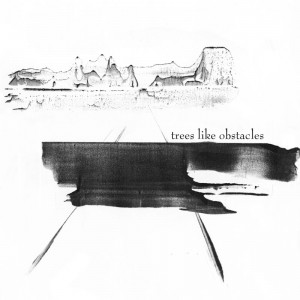
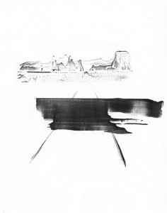
Trees Like Obstacles Trees like obstacles

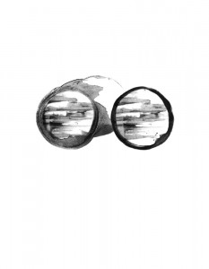
Obscure My View of the Sky Obscure my view of the sky

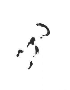
Will I Make it There? Will I make it there?

  Filed under: KCAI, VisCom1
  Comments: Comments Off on Haiku Motifs