Blog Category: Learning


interface

By Erika Goering,

This week, I learned about sacrifice.


I’ve had intense classes and projects before, but it always seemed to magically work around my schedule at my job. I’d get everything finished while still making some money. Not this time. For the first time ever, I had to take the whole week off work to devote extra time to this project. It breaks my heart that I wasn’t there with my young artists. But in the end, it was well worth it. I’m very proud of myself for making this book happen.


Behold, the fruits of my labor!


Here’s what each page shows:
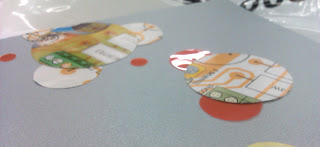
  • Process: proximity and correspondence. The pieces of my compound shapes are identified by how close together they are, as well as the color they share.
  • Calculate: proximity. I show three groups of objects that relate to each other but are still separate.
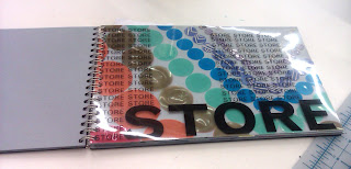
  • Store: continuation and correspondence. The pieces correspond to each other in rows of similar sizes and colors.
  • Evolve: continuation. I imply a path of movement and growth between shapes, while leading the viewer off the page to where an imaginary following shape might be.
  • Protect: proximity, asymmetry. The defending shapes surround the vulnerable larger shape on one side.
  • Network: continuation. Implied cords or lasers (or whatever the connecting force may be) between shapes show a connection and communication.
  • Monitor: scale. The surveillance shape is much larger and more dominating than the poor little shapes at the bottom.
  • Infect: repitition. I repeat shapes to show a sense of monotony and order, until I break it with the offending virus shape.
  • Alienate: proximity, correspondence, framing. The colored dots that are clustered together are imposing on the faded, gray figure at the bottom of the page.

  Filed under: KCAI, Typography1, VisCom1
  Comments: 1


Layers & Transparency

By Erika Goering,

In the chaos of this week, it was good for me to just sit down and read for a moment. So, what did I read about? Well, graphic design, of course. Specifically the role that layers and transparency play in design.

In Graphic Design: The New Basics, Ellen Lupton writes about how layers can transform a composition. Layers added and removed can show the versatility of the work. Objects can be obscured or enhanced by objects on top of them, thus changing the way the composition looks and feels.

Lupton also talks about transparency and how it works. Transparency happens when you can see multiple layers at once through each other. This can create a window to the focal point.

Transparency and layers are related, because you don’t notice transparency in an object until it interacts with another object on a different plane.

So, I got to thinking, how can I apply my newfound insight to my current project?
Well, I haven’t quite gotten to the point of overlaying the type with the imagery yet (as I’m still refining that side of the project), but I’ve been playing with layers in other ways. My compound shapes are made up of layers that have been carefully composed to look dimensional and spatial. I also use layers to hide flaws and accentuate moments that work really well.

As far as transparency goes, even though I haven’t put my typography in front of my imagery yet, I’m still working with transparency with my dots. Some of my materials are transparent. I have some plastic sheets that I’m using for dots. They are very glossy and I only use them in very specific places. But sometimes they interact with other dots. And when they overlap, the colored plastic shows the image underneath, but in the hue of the plastic. This gives a whole new feel to the imagery.

  Filed under: KCAI, Read&Respond, VisCom1
  Comments: Comments Off on Layers & Transparency


Saul Bass and the other guys

By Erika Goering,

Saul Bass was a ninja.
He designed a lot of logos that are still in use today, in their original form or slightly updated. And that says a lot about his genius. If you do something right the first time, there’s no way to improve it; only tweak it for the changing times.

Bass (1920-1996) lived a life of creation. He was a prominent designer who made logos, film posters, and more. His work changed the way the world looked at commercial art. Bass used angled lines and unusual typography in his work. People don’t realize that when they think of 1960’s logo design, they’re thinking of Saul Bass.

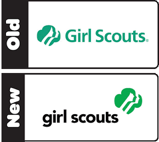
There’s an unwritten rule in the design world that you don’t mess with a Saul Bass logo. That’s why when designers are hired to redesign one of his creations, they hesitate. So when OCD (Original Champions of Design) were hired to update the Girl Scouts logo, they made very small updates to maintain the integrity of the original masterpiece.

The current Girl Scouts logo combines the badge-like shape of past logos with profiles of young girls looking toward the future. The shift in negative and positive space shows the individuality of each of the girls. None of that ever changed. The changes the OCD made were subtle, but meaningful. The girls are more youthful, and the image is stronger, possibly to signify the change in society since the original, dainty logo’s time. (The original was designed in 1978.)

Since I mentioned Saul Bass, I have to mention the Original Champions of Design. (After all, I used their version of the logo for my project.) They seem relatively new to the design world. Their portfolio is very typographical in nature, and their work is very clean and straightforward. I personally hope they don’t fall victim to some of the trendy crap that rolls around every now and then.

Overall, I think OCD did a good job with Saul Bass’s logo. The united, feminine feeling is the same, only stronger and younger. This is one case in which messing around with a Saul Bass logo went pretty well.

Sources:
http://www.underconsideration.com/brandnew/archives/this_is_not_your_moms_girl_scouts.php
http://www.gswise.org/About-Us/News/Whats-New.aspx
http://saulbass.tv/
http://originalchampionsofdesign.com/index.php

  Filed under: ColorForm, KCAI
  Comments: Comments Off on Saul Bass and the other guys


New title

By Erika Goering,

I’ve decided that I will change my book’s title to Interface.

I think it better alludes to the relationship between humans and technology (or robots, as is the case with my book).

  Filed under: KCAI, Typography1, VisCom1
  Comments: Comments Off on New title


“Stitch” Warmup

By Erika Goering,

My first real taste of “cut & paste”analog typography a few days ago:

My word was obviously stitch. To illustrate the word, I wanted to show elements of it weaving together. The straight lines come together for a cross-hatching jam session. However, the bold T doesn’t really help. It’s unnecessary and doesn’t make much sense. I think I was trying too hard to get my point across. This is what I have the most trouble with; being too in-your-face about information. I need to pull it back a bit and let the image do the talking without me saying, “Hey! Lookie here! I made it bold for you in case you didn’t get it the first time!”

Aside from that tender morsel of wisdom, the most important thing I learned: Don’t be too rough with laser paper. The toner will flake off and ruin your life. And your craftsmanship. But mostly your life.

  Filed under: KCAI, Typography1
  Comments: Comments Off on “Stitch” Warmup


“Techtonic” Words Come to Life

By Erika Goering,

Here’s a look at the typographical side of my dual-class project:

I must say, I didn’t very much like the idea of analog typography before this. But now I think it’s really cool. It’s nice to be that intimate with the letterforms.
My only regret is that, because I worked into the wee hours of the morning, my craftsmanship suffered quite a bit.
Word of advice: Shaky, caffeinated hands do not help the creative process.

  Filed under: KCAI, Typography1
  Comments: Comments Off on “Techtonic” Words Come to Life


“Growth” in the Wild!

By Erika Goering,

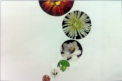
On a trip to Powell Gardens a couple of weeks ago, with dots and circles fresh in my mind, I stumbled upon a composition based on (you guessed it!) circles!

It’s almost the exact idea I had for my group’s version of “Growth”.

It’s nice to know I’m on the right track with my ideas. It makes me feel like I know what I’m doing.

  Filed under: Find&Share, KCAI, Random, VisCom1
  Comments: 1


Color Harmonies

By Erika Goering,

I’ve known a bit about color since I was very, very young. My dad, who is an artist, taught me about really basic color theory (primaries, secondaries, and compliments) when I was a small child.
So I’ve always had a pretty good grasp on the concept of color relationships.

I’ve been taught basic color harmonies over and over since grade school, so it’s all review for me so far. Although, I could always use some more practice with it.

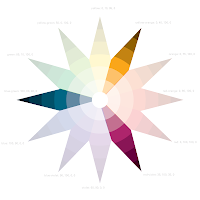
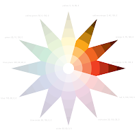
Speaking of practice, here’s my color star (a la Itten):

Pretty nifty, huh?

Here are some different color relationships I can show through this model:

Complimentary (polar opposites on the diagram create a sense of balance and equality)
Split-Complimentary (one color and the colors on either side of its compliment
create a balance without such a direct contrast)
Triadic (three evenly-spaced colors show a varied palette)
Square (four evenly-spaced colors that show two colors with their respective compliments;
a diverse set of colors showing a broad spectrum)
Rectangle (also two colors with their compliments, but not evenly spaced on the diagram;
a more sophisticated, unpredictable harmony than the square)
Analogous (colors next to each other; subtle changes in hue are less dramatic than other harmonies)

I’ll leave you with this tender morsel of wisdom:
Don’t use contrasting colors for text!!
Feel that headache? Yeah. Think of me every time you think that’s a good idea.

  Filed under: ColorForm, KCAI
  Comments: Comments Off on Color Harmonies


Words and Title for My Dots and Circles

By Erika Goering,

My final words for my computer-related project are:

  • Process
  • Calculate
  • Store
  • Evolve
  • Protect
  • Connect Network
  • Monitor
  • Infect
  • Alienate
My final title is Techtonic.
I’m feeling pretty good about it all.
I hope this good feeling lasts awhile. It makes all my hard work worth it.

  Filed under: KCAI, Typography1, VisCom1
  Comments: Comments Off on Words and Title for My Dots and Circles