Blog Category: Learning


Themes

By Erika Goering,

I started off with Family as my word to work from.
It somehow turned into something completely different.
Here’s what I have now:

Family -> Support -> Balance -> Weight -> Gravity -> Science
Under science, I have:
  • observe
  • discover
  • knowledge
  • wisdom
  • trial
  • error
  • failure
  • momentum/speed
  • projection
  • justice (from scientific law, in case you were wondering where it came from)
  • obey (also from law)
  • authority/subordinate (not sure which one I like better)

Family->Tree->Branches->Network->Internet->Computers
For Computer-related things, I have:
  • virus
    • infection
    • illness
    • death
      • ending
      • mourning
      • inevitable
      • upcoming
  • virtual
    • intangible
    • abstract (vs. concrete)
    • imaginary
    • concept
    • idea

  Filed under: KCAI, VisCom1
  Comments: Comments Off on Themes

Find & Share

By Erika Goering,

For my find & share exercise, I chose to talk about an artist whom I know personally.
My mentor and friend, Ben Timpson.


Ben was the Lead Artist in the graphic design studio at MyARTS for the first couple of years that I worked there. He’s incredibly talented and pretty damn fearless. He literally puts himself into his work (he sometimes uses his blood as a material in his work). It’s that kind of commitment and sacrifice that I admire.

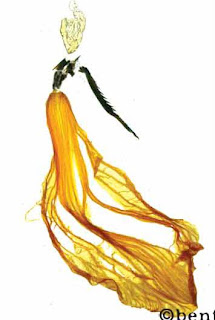
This is Ben’s “Centerfold,” made from a lily and part of a cockroach. Yes, you read that right.
The asymmetry in this piece shows a sense of movement and elegance in the figure. She seems like she’s dancing and floating around that space. The heavier, darker part of her skirt on the right side of the image balances out the rest of the figure on the other side.

There is a bit of continuation used with the implied connection between the figure’s head and her body. It’s totally disconnected, but it feels like it’s not.

The materials used also make a statement about the piece. A beautiful lily and a creepy bug. The contrast between the two materials describes the complexity of the figure. She is wearing a long, flowing, beautiful flowery skirt, but her upper body is made of this exoskeleton of armor.
She’s strong and beautiful, protected and vulnerable, feminine and rugged.
I think the asymmetry helps accentuate that as well.

  Filed under: Find&Share, KCAI, VisCom1
  Comments: 1


Response

By Erika Goering,

In response to this post, I have to say that the readings and video expanded my idea of what graphic design really is.

I work in an environment where what we do as designers is greatly limited to what will sell to our clients. We really only get to do “personal work” twice a year at our art show in the fall and auction/fundraiser in the spring.
After awhile, I got myself into a bit of a rut with my design work. Same ol’ stuff day after day, mostly. (I mean, I love logos, t-shirt designs, and websites to death, but I realize there’s so much more than that. Especially since watching that video. Man, I wanna be more awesome than ever now!)

My definition of graphic design before seeing the video was very limited and narrow. Because I don’t do much design work outside the realm of what my job requires.
But I want to change that. (That’s why I’m in school; to rediscover my creativity that got me here in the first place.)

I think everyone in the graphic design world has a somewhat loose idea of what to say when people ask “so, what do you do?”
I just kinda rattle off all the tasks I do at work because “graphic design” isn’t a sufficient answer for most people. They usually just reply with “so… you make signs and stuff?”
That’s where I say “Yeah. But mostly the ‘and stuff’ part.”

The video and reading from the aforementioned post gave me a bit more to pull from when I want to put a definition to the words graphic design.
Stefan Sagmeister sums it up pretty well when he shows his work in the video and on his website. He has done lots of analog, tangible stuff, by the way – not the purely digital comfort zone that I’m familiar with.
The tangible aspect of his definition of graphic design is what changes the game for me.
Tangible.
Touch it.
Taste it.
Feel it.
Be it.

That’s what it is.
Graphic design is an experience.

No matter how broad or precise my definition is of graphic design, it’s still damn near impossible to explain to my mom what graphic design actually is. (Yes, mom, I do computer stuff, but that’s not all…)

  Filed under: KCAI, Read&Respond, VisCom1
  Comments: 1


Why Graphic Design?

By Erika Goering,

I’ve always wanted to be an artist.

Seeing how passionate my dad is as an artist made me want to see if I had the same passion about art.
And I do.


I’ve always been exposed to art. I literally grew up around it. I have memories of being a small child and the house being full canvasses and paint.
When I was old enough to hold a crayon (maybe two or three years old), I drew everywhere. My dad said that I once took a green crayon and drew on the front door the outline of a group of trees across the street.
That’s when he knew. He was certain I was going to be an artist no matter what.


I knew I wanted to be an artist, but I wasn’t quite sure what I wanted to do for a living.
I wanted to be an artist like my dad, but I wanted to pay my bills, too.


When I was in high school, my favorite art teacher gave me a flyer advertising a new art program downtown called MyARTS. It would start off as an unpaid apprenticeship and end up paying minimum wage.
I went for it. (An art job that made money?! Heck yeah!!!) I knew it was a rare opportunity, so I signed up for it right away.
I had originally signed up to be in their photography department. But I didn’t get in, and graphic design was my second choice.
I got into the graphic design department, and I was ecstatic. I knew this program was going to change my life.
It was at MyARTS that I discovered my love of graphic design.
I had a very passionate mentor who taught me everything he knew.


4 years later, I’m still working at MyARTS. I’ve moved up the ladder from apprentice to “young artist” to “lead artist assistant.” I am grateful for every day that I’m there. I’m now helping to mentor high school kids the way I was mentored.
And, yes, it changed my life.


I know graphic design is what I need to do because of how it makes me feel. Nothing else makes me this happy. When I create something I feel like like it created me.
That’s how I know this is what I need to do.

  Filed under: KCAI, VisCom1
  Comments: Comments Off on Why Graphic Design?


Anyone Else Suddenly Craving Thin Mints?

By Erika Goering,

One of my favorite design blogs is BrandNew. Basically, its purpose is to show recent logo redesigns/tweaks.
I find it very interesting because I love to see what people do to update and modernize pre-existing logos.


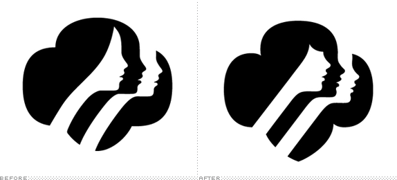
Lately, my favorite revised logo is the Girl Scouts logo. That’s why I was so eager to use it for my Color/Form class logo project.

The revision was more of an update than a full-on redesign. The silhouettes are all still there, but the hairstyle of the first girl is more contemporary and the girls have all received facelifts (more perky lips and noses) to make them look younger. The trefoil now comes down to a point at the bottom (a throwback to the first few Girl Scouts logos).


Given the choice between the two above versions of this logo, I chose the new one.


I think this was a good exercise to get me familiar with Adobe CS5. There are some things that have been moved around since CS4, so this kind of activity helps get me reacquainted with the Creative Suite.

Top: Trace with pen tool


Center: Live trace
(not too bad for default settings)


Bottom: Live trace with some manual tweaks
(I corrected some weirdness in the facial features.)


Saul Bass was the mastermind behind the original design. It’s an unwritten rule that you just don’t mess with a Saul Bass logo. He was the pimp of logo design, and we are his hoes. That’s just how it is. Deal with it.


So, when word got out that OCD did some tweaks, some people were offended at the abomination that had been committed.
But I like the new look. They’re younger girls with a bit of attitude. They look more current (albeit a bit trendy), and they capture the spirit of today’s girl scouts.


…Man, I want some cookies.

  Filed under: ColorForm, KCAI
  Comments: Comments Off on Anyone Else Suddenly Craving Thin Mints?


This Blog is Brought to You by the Letter A

By Erika Goering,

One problem I always have with blogging is I never quite know what to say.
Well, I know what I want to say… I just don’t know exactly how to put it together in a coherent manner.

But I guess I’m doing an okay job so far…

Well, a little bit about me…
As some of you may know, I am a veteran KCAI student (and I even get alumni newsletters sometimes).
My first stint at KCAI was extremely short-lived. I attended classes for one day, and, being the nervous wreck I used to be, I left KCAI with my tail between my legs and ventured into the exciting world of community college. (…yay…)

Biggest mistake of my life.

After getting an Associate of Arts (that’s liberal arts, not fine arts… bleh.) degree, I put on my big girl pants and returned to KCAI in 2008. In the time that I was away from KCAI, I had gotten a job as, you guessed it, a graphic design apprentice. (Okay, maybe you didn’t guess it. But it’s still awesome.)
Between 2006 and 2008, I got a job at an art program, got promoted in my department, had artwork in three art shows, and discovered I was absolutely in love with graphic design.

2008 was the year that I decided I needed to be back where I belonged. KCAI.
Fall semester of Foundation went well. No problems at all.

After that first semester, I had to take two semesters off for financial reasons.

I finally returned for good last semester, and I’ve been enthusiastic and grateful ever since.
I hope the next three years are exciting and fulfilling.

Now, I’ll leave you with some lovely drawings of a lowercase “a.”

  Filed under: KCAI, Typography1
  Comments: Comments Off on This Blog is Brought to You by the Letter A