Blog Category: Learning


Designing With the Environmental Impact in Mind

By Erika Goering,

Cradle to Cradle made a good point about the origins and life cycles of materials and how we should take them into consideration when designing.

One thing I took away from the reading—and I’m sure this was intentional—was the fact that our industry is really wasteful by nature. We sketch, we throw paper away, we print off mockups, and throw them away, and we use endless amounts of ink and toner on everything. I feel pretty guilty about the amount of waste I produce as a designer, and the amount of thought I haven’t put into my methods. I’m as guilty as the consumers, if not more so.

Question: Is it possible for a designer to be 100% environmentally neutral? I don’t think it is. But we can try,

  Filed under: KCAI, Learning, Read&Respond, Visual Advocacy
  Comments: Comments Off on Designing With the Environmental Impact in Mind


Animal Welfare

By Erika Goering,

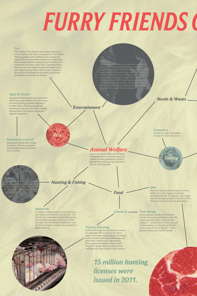
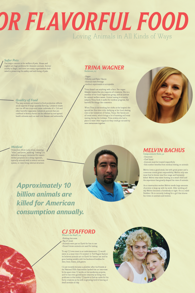
MX: Animal Welfare: Wireframes

3 Devices:

  • iPhone software
  • Website
  • Hub (displayed on-site at partner locations)


Community: People who care about the use of animals in their lives.

How the online system is improving an offline activity: The online system facilitates communication between people within the community. It helps to create a dialog between people of varied mindsets and continues a dialog between those of similar mindsets. It also helps to keep track of what the users are doing on their iPhones, aggregating their information and displaying it for other users to see.

  Filed under: KCAI, Learning, Multimedia Experience
  Comments: Comments Off on Animal Welfare


Tangential Reflection

By Erika Goering,

I seem to have gotten myself into a bit of a tangent. Like, a whole blog post’s worth.

When I saw the line in Human Dignity & Human Rights that said, “I believe we all recognized the significant transformation of the old design theme of ‘form and function’ into the new theme of ‘form and content,'” I had an elusive “a-ha” moment. (Now that I think about it, this also applies to the Are Humanitarian Designers Imperialists? article as well.)

You really need all three. Especially in a multimedia, information architecture-based field. Form, function, and content are all dependent on each other.

Like Maslow’s hierarchy, or the old-school food guide pyramid (not the weird, new one), there’s a foundation, some intermediates, and the nice-to-haves at the top. Content is near the base of design. Function depends on that content to have any reason for existing, and form is driven by that function.

So, the Goering Hierarchy of Design looks something like this (with the least important/urgent aspect on the top):

[ aesthetics ] (elements of art, prettification & polish)
[ form ] (UI comes into play here. This is where sketches and wireframes happen. This is all based on the function, content, and needs, and gives the user a means to come into contact with the function.)
[ function ] (This is where channels come in. This is how and why we communicate. UX also goes here.)
[ content ] (This is the stuff that we gather from researching the needs and wants. This is what we design around.)
[ needs & wants ] (This is the research, which influences the content and provides the whole reason for designing in the first place.)

If your design misses any of these elements, you’ve failed. Probably not on an epic level (depending on your area of discrepancy), but on a level detectable by other worthwhile designers.

As with the obesity epidemic (relating to the food guide pyramid) and our egotistical/ignorant/jackass culture (relating to Maslow’s Hierarchy), our priorities tend to lie on the wrong end of the pyramid. We live at the top and over-indulge as a way to replace the foundations that we lack. The same goes for shitty designers. This is why places like CrappyDesign exist. People are too worried about making things flashy instead of being genuinely concerned with communicating a message, and the results are less than satisfactory, to say the least.

It’s our duty as designers (here’s where the advocacy thing ties in) to enforce that the users/clients/communities have their needs met, first and foremost.

  Filed under: KCAI, Learning, Read&Respond, Visual Advocacy
  Comments: Comments Off on Tangential Reflection


Resources for Spatial Psychology

By Erika Goering,

Clever Cafeteria Layout Changes Can Transform Children’s Nutrition

“So-called “smart cafeterias” would feature low or no-cost changes in design, food presentation and layout, in an effort to tap “the natural psychology of choice” as youths consider their mealtime options.”


Is Psychology the Key to Better School Nutrition?

“Many children and teenagers resist well-intentioned lunch line interventions. Will these new strategies help reduce the childhood obesity problems If they are incorporated?”

  Filed under: KCAI, Learning, Visual Advocacy
  Comments: Comments Off on Resources for Spatial Psychology


Taking Visual Advocacy Into Your Own Hands

By Erika Goering,

Sometimes to make a point, and to make it well, you have to literally make a mark on your environment. When traditional channels don’t fill the needs, you’ve got to take it into your own hands. There’s no doubt that a guerrilla-style campaign can be immensely effective. As an artist and a designer, you can reach your audience on a much more immersive level, and penetrate their lives in a way that will “stick” like other methods can’t.

The issue then becomes whether it’s actually ethical or not to vandalize property for the sake of social awareness or improvement. Is the trade-off worth it? Is the good of humanity heavier on your conscious than a few brick walls or light posts? Is potential property damage truly worth the message you send? Is it worth the risk of jail?

I think, a lot of times, it may not be ethical, but it may very well be necessary. If the issue is important enough, and you’re passionate enough, it’s worth whatever the cost.

  Filed under: KCAI, Learning, Read&Respond, Visual Advocacy
  Comments: Comments Off on Taking Visual Advocacy Into Your Own Hands


Branding Phase 1

By Erika Goering,

Technology is evolving at a very rapid pace. Luckily, humans are able to adapt to this change because we drive it forward. We use technology to enhance our lives and we improve what it can do for us. This symbiotic relationship between us and our tools is becoming very interesting. It is paving the way for innovations that we’ve never thought possible before. We are starting to merge with our machines.

There’s a middle ground between reality and digital space, where more and more of our lives are starting to take place. This happy medium is a blurred, amorphous realm with infinite possibilities. At the moment, one of the greatest uses of this realm is augmented reality, where reality is overlaid with supplementary content and information to enhance the user’s experience. This window into the “middle ground” is a vital step forward in innovation.

With technology being an ever-changing medium, nothing stays the same for very long. A dynamic environment calls for an adaptive brand, focused on technology-enhanced humanity and blurring what it means to be “real.”


Design Systems: Phase 1

  Filed under: Design Systems, KCAI, Learning
  Comments: Comments Off on Branding Phase 1


The First Step is Giving a Shit, Then You Do the Hokey-Pokey

By Erika Goering,

Design with Intent

User-centered design is a method of designing for function and ease-of-use before anything else. The problem with this is that the designers involved are encouraged to not impose their biases onto the design process. This ties in with what we’ve already been talking about in class, which is whether it’s appropriate or even necessary for a designer to be an advocate for what he/she does. I think it actually boils down to whether a designer is passionate about design or not. A designer should always be an advocate on some level; design is problem-solving, and to solve a problem well, you must first give a shit. My point is that user-centered design is supposed to integrate seamlessly with the user’s needs and lifestyle. That’s something to advocate for, even if you leave your other personal biases out of it.

So then, is neutrality even possible as a designer? Can a designer truly be neutral? We’re always advocating for something; whether it’s “big” or “small.” I would argue that the only way to be truly neutral is to be apathetic. To be a designer is to give a shit about something, from the smallest aesthetic element to the largest conceptual project.


The Designer as Producer

The power of the future lies in the hands of designers who are also entrepreneurs. They can change the market. Hell, they can change the fucking world. I’ve always believed that straddling the line between design and, really, anything else is the key to success. For me, I try to keep one foot in design, while the other foot hops between development/programming and entrepreneurship (I do the hokey-pokey). This cross-discipline dance brings some new perspectives and innovation in each field I’ve stepped in. (That’s what it’s all about.)


Graphic Authorship

An author is a creator with a voice. Which, yet again, ties into our semester-long conversation on design as an involved activity, rather than a passive, apathetic experience.

Authorship implies ownership, and ownership leads to a feeling of pride for one’s work. As the reading said so well, author = authority.

Another take on graphic authorship is the literal author who writes about design. In which case, all of us hold this position. (I mean, we all have blogs, do we not?)

  Filed under: KCAI, Learning, Read&Respond, Visual Advocacy
  Comments: Comments Off on The First Step is Giving a Shit, Then You Do the Hokey-Pokey


Rosedale Middle School Audience

By Erika Goering,

Problem/Question:

How can we lower the obesity rate among Rosedale Middle School students?

Audience:

  • Middle-school-age kids (from 11–13 years old) in Rosedale.
  • They know the basic facts of nutrition and exercise, but they are not ready to implement the knowledge they have been given.

Facts:

  • 51% of kids in Rosedale are obese.
  • Average income is $37,000
  • 89% of kids are on the free lunch program.
  • Kids who eat school lunch are 29% more likely to be overweight.

Social Behavior We Want to Change:

We want to change the eating habits of middle school kids by exposing them to healthier choices.

How We’ll Measure the Results:

We’ll be able to see whether the obesity rate lowers.

  Filed under: KCAI, Learning, Visual Advocacy
  Comments: Comments Off on Rosedale Middle School Audience