Blog Category: Working


Technology Transhumanized: Future-Proofing the Save Icon

By Erika Goering,

In an abridged history of human life, we went from engaging in daily face-to-face contact, where people looked each other in the eyes and relished in the subtleties of communication, to inventing computers and sitting hunched over an 8-bit screen of code, to looking down into our palms for the lastest news on our friends’ so-called lives. Well, it’s time to look up. We desperately need to look straight into each others’ eyes again and see through technology. Gone are the days when technology required our assistance. Now it’s our turn. Technology is here to assist us. But it doesn’t need to be in our way.

Twenty years ago, when the vast majority of users were first becoming acquainted with personal computers and their GUIs, the desktop metaphor had its place. It provided a comfortable transition between what users already knew and what they were starting to learn. However, the UI metaphors we all have been accustomed to are becoming increasingly irrelevant to contemporary life. The desktop, files, and folders of yesteryear’s computer operating systems are more reminiscent of a secretary’s office than the pile of bits and bytes they really are. While skeuomorphic design gave us a window into our computers by way of well-known and comfortable faux textures and materials to create a tactile experience beneath a glossy surface, the flat design movement uses the same concept but different execution to bring technology closer to the senses, closer to humanity, in a very transhumanist kind of way.

Now that we have been users for at least a generation (with today’s pre-teens never knowing anything other than an internet-connected, hi-res, pocket-sized life), skeuomorphic design is no longer needed. We no longer need to fake real life. Technology doesn’t need to hide behind leather-bound pixels anymore. We are no longer scared of code or error messages. We know what we’re doing. It’s second nature.

We need to strip information architecture down to the raw information we seek to communicate. We don’t need buttresses on our data. It stands perfectly fine on its own. We’re not afraid of being informed. We don’t need falsely ornate façades on it. Information should be beautiful for what it is; not what’s painted on top of it.

As a result of all this pondering and subsequent rambling, I’ve challenged myself with solving a problem that has bothered me for years–the ubiquitous floppy disk save icon. The problem is that the floppy disk in particular is so obsolete and so irrelevant that it shouldn’t be a standard representation of saving a file to a disk. Even the act of saving to a disk is becoming increasingly obsolete. Physical media is dissolving, paving the way for cloud storage and high-tech magic.

So, how do you design for that? How do you redefine the save icon? How do you future-proof what the act of saving a file looks like? How do you make a dent in the current obsolete conventions?

You think forward. You think at the absolute boundary of reality, and then you multiply it. You go Google on that motherfucker. You think so far ahead, no one sees it coming. You pull an Apple and become ubiquitous with a simple solution to a problem you didn’t realize you had until it was already solved.

I think a good start to my app designopment business will be to come up with our own forward-thinking standards. Maybe we don’t need metaphors to represent common computer actions at all.

But if not that, then what?

That’s what I’m going to find out.

  Filed under: Living, Working
  Comments: Comments Off on Technology Transhumanized: Future-Proofing the Save Icon

HTML & CSS for Clients

By Erika Goering,

Since I’m building websites for clients, and they want to learn how to maintain their own content, I should teach them some basic HTML so they don’t have to come to me with every little update request.

Problem is, I’ve never really taught HTML to anyone before. I don’t really know where to start. I’ve got lots of information in my head, but no real order to it. I have to figure out how to organize my thoughts in a somewhat linear manner for novices to understand.

So, I’m writing a book!

It’ll help me learn how to teach, it’ll help my clients figure out how their websites work, and the people in my studio will be able to learn some basic HTML.

My goal is to make it simple and lighthearted; not scary or “nerdy.” I don’t want to alienate anyone with cold, emotionless pages of code. I want to create a friendly way to isolate each element, and break it down to its most basic components in a visual way, instead of just explaining that “this is what an anchor tag does.”

I want to cater to designers and visually-thinking people, and not to the tech-savvy. So, my Design Challenge here is to make text visually understandable and usable. And non-threatening.

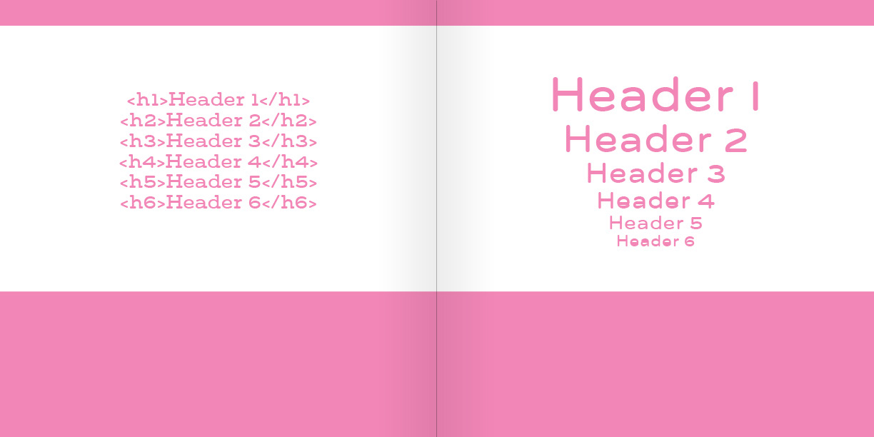
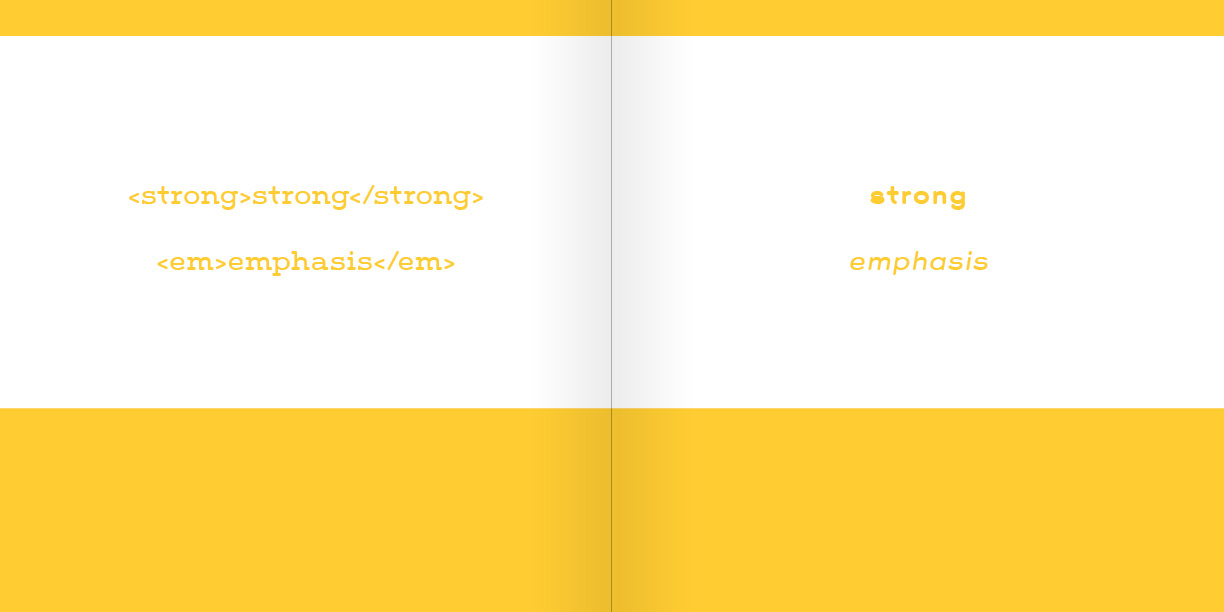
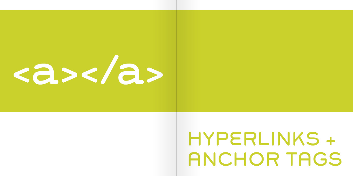
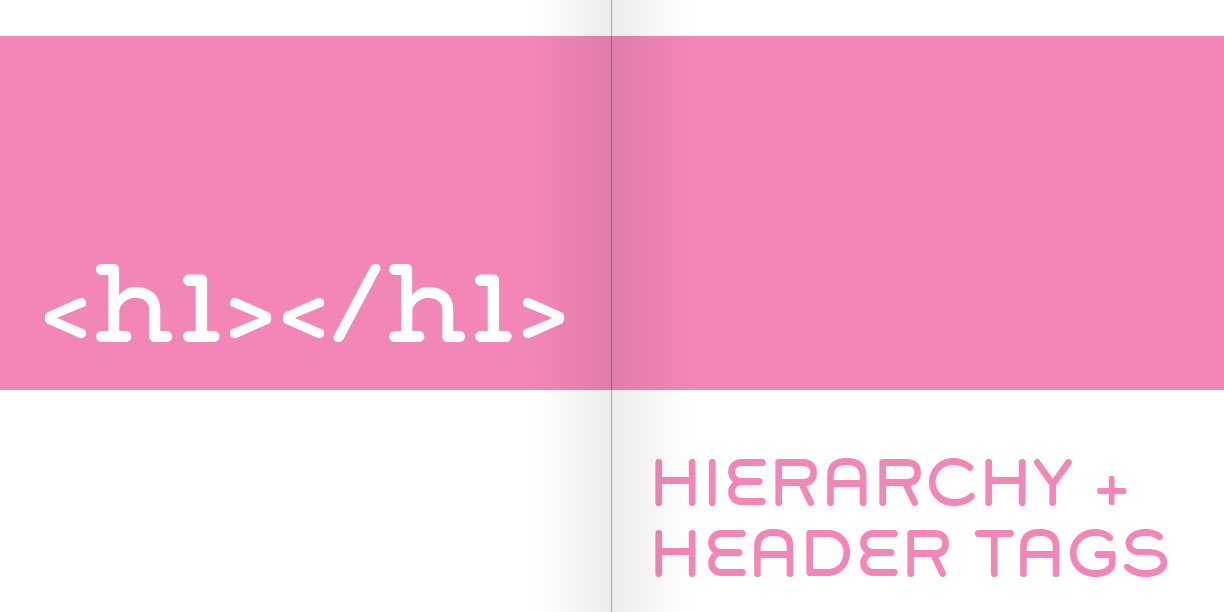
Here’s what it looks like so far. Colors are probably going to change, and I haven’t added any actual copy to it yet, but I think it’s starting to come along pretty well. This is a pretty quick project, with the first round of “near-final” spreads done by this time next week. I’ll probably keep refining it after that, though. And maybe even self-publish! That’d be cool.

  Filed under: MyARTS, Working
  Comments: Comments Off on HTML & CSS for Clients


Read E-Books LLC: Final Logo

By Erika Goering,

This logo combines a speech bubble with an e-book reader, showing that language is evolving to include technology. I used simplified forms to make the logo easy to recognize, and to appeal to all audiences, young and old.

logo-01.jpg
… Continue reading

  Filed under: MyARTS, Working
  Comments: Comments Off on Read E-Books LLC: Final Logo


“Merge”

By Erika Goering,

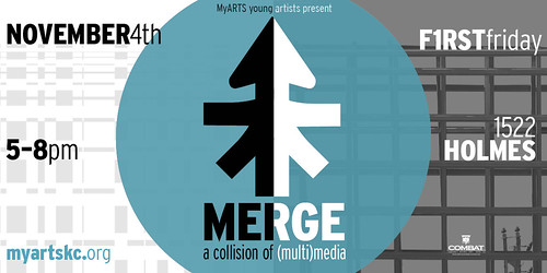
Come to my show. Support local art. Yadda yadda. You know the drill.

merge-web-flyer-2-with-combat.jpg

  Filed under: MyARTS, Working
  Comments: Comments Off on “Merge”


Baby’s First Mind Map!

By Erika Goering,

Today was the first day of getting un-stuck from a rut we were in. We’re designing a logo for an e-book reader company, and my high-schoolers all kept coming up with logos that looked like books with a big shiny E.

Boring!

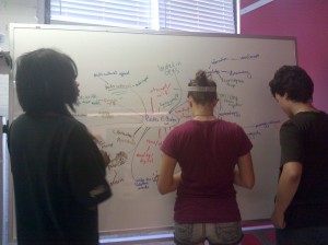
So, at my own desk, I was mind-mapping and sketching, and I thought, “Why the heck am I doing this alone?” So I got up and went over to the whiteboard, grabbed some markers, and handed them to the kids. They weren’t excited at all about getting away from the computers, but I told them that this would get them to a better place with their logo designs, so they obliged.

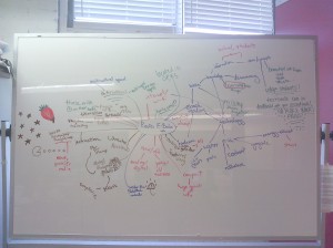
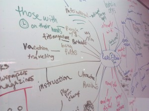
I started things off with my blue marker (everyone had a different color so I could see who was adding things and who wasn’t), writing the company’s name in the center and branching a few things from it. I was explaining the connections between all the things I was writing, and a pretty good discussion soon followed. They uncapped their markers and, like magic, we all ended up with a board full of ideas and chatting about concepts that were far from just plain ol’ books.

IT’S WORKING! THEY GET IT! YES!!


I feel like we’re finally becoming the graphic design studio I always wanted us to be.

I was so happy that my little high-schoolers were developing interesting ideas that, as soon as the workday was over, I sped home and jumped around all excited for awhile.

It’s been a good day.

  Filed under: MyARTS, Working
  Comments: 1


New School Year, New Designer

By Erika Goering,

I had a breakthrough over the summer.

Backstory: For those who don’t know (or just haven’t heard about it enough yet), I’m an assistant mentor for high school students at an after-school art program called MyARTS (where I used to be a mentored high school student myself). So, in addition to taking classes at KCAI, I’m also learning from a MyARTS mentor (and on-the-job experience from various client jobs), and in turn, mentoring/teaching the high school kids who are also part of the program. Pretty sweet gig.

So, as I learn from various sources about how to be an awesome designer, I’m teaching everything I know to these high school students. So, everything I do at school, I immediately try to apply it to whatever we’re working on at MyARTS. It helps me solidify what I’ve just learned, and kind of validate myself as an artist and designer too.

Since the curriculum at MyARTS is very open, I have a lot of freedom if something comes up and I want to have a whole day dedicated to it. Best job ever.

So, anyway, over the summer, our studio did its yearly turnover, where I lose my older kids because they’re leaving for college, and the new freshmen haven’t come into the program yet. So there’s a short time where I have a nearly empty studio and I’m just working on client jobs and random other boring things like inventory until I can get some more people in my studio. During that time, I talked with my supervisor/mentor about starting a “real” graphic design curriculum for the apprentices who are visiting each studio before they are officially hired. I used everything I learned my sophomore year to create a more structured, logical series of exercises (as many as I can fit in a 3-hour slot) and, I put it to the test when the first apprentice came through my studio.

I set up 3 mini-projects (that should take about an hour each); one for Photoshop, one for Illustrator, and one for InDesign. The Photoshop project is an exercise in basic photomanipulation and super-simple typography (finding the right typeface for a mood conveyed in a photo). The Illustrator project teaches how to use the scanner, how to trace an image with the pen tool, and how various other tools work together to create a simple vector illustration. We then take that illustration into InDesign and use it (along with more typography) to create a business card for the student! Hooray!

This little 3-hour curriculum was a pretty awesome success. (Although I’m starting to think I need to incorporate Photoshop better into the business card project…)

But that’s not even the best part. My newfound leadership and ability to apply what I’m learning in college to a high-school-age group is starting to seriously boost my confidence. Yay!

As a result, I’m not holding back, and I’m starting to also create a more structured design process for our young designers.

We just happened to get a new client job at the end of the summer. We need to design a logo for an e-book reader company. With previous jobs, we would have a chat with the client about what they wanted, and then run over to the computers and start cranking out whatever came to mind. We came up with crap most of the time.

So now, applying what I’ve learned in school about developing ideas (which is something I continue to struggle with), I decided that we needed to have critiques every couple of days to see how things were going. That went okay, but it still left us stuck. So, today, I ended up making them do some serious idea-developing, and we came up with some pretty cool outside-the-box stuff. IT’S REALLY WORKING! The project is starting to go where it needs to.

So, back to the point. The big breakthrough was that my brain started to make connections about applying what I’ve learned to the real world. AND IT’S WORKING! And my new faith in myself is starting to translate into my schoolwork (the little bit that I’ve done this first week of school). I’m not so shy and intimidated anymore now.

I’m very excited about my future in design.

  Filed under: KCAI, MyARTS, Working
  Comments: Comments Off on New School Year, New Designer