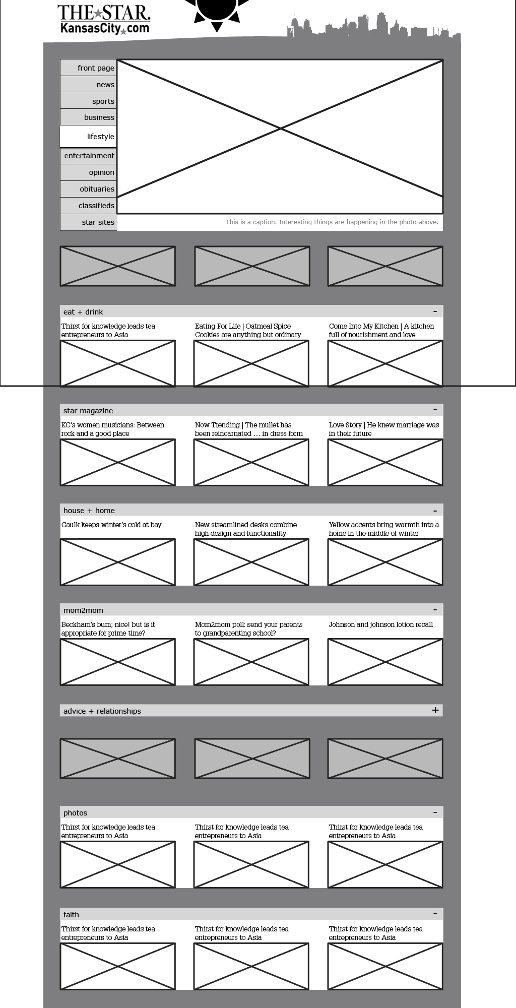
Digital Wireframes, Round 1 & 2
By Erika Goering,
Filed under: Information Architecture, KCAI, Learning
Comments: Comments Off on Digital Wireframes, Round 1 & 2
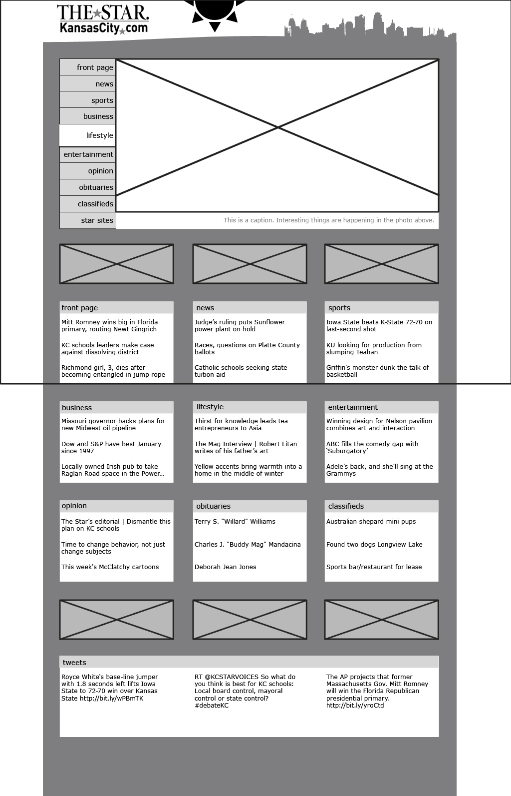
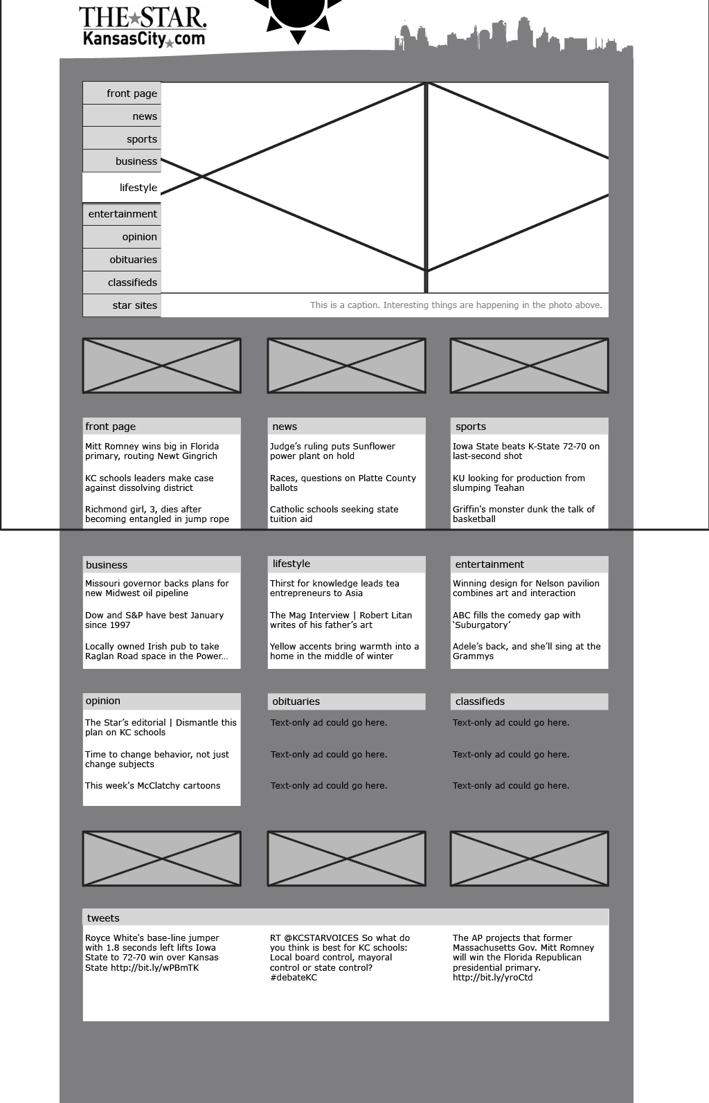
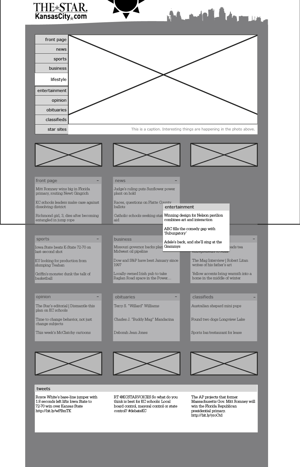
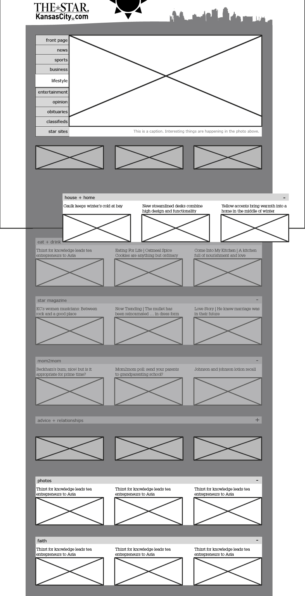
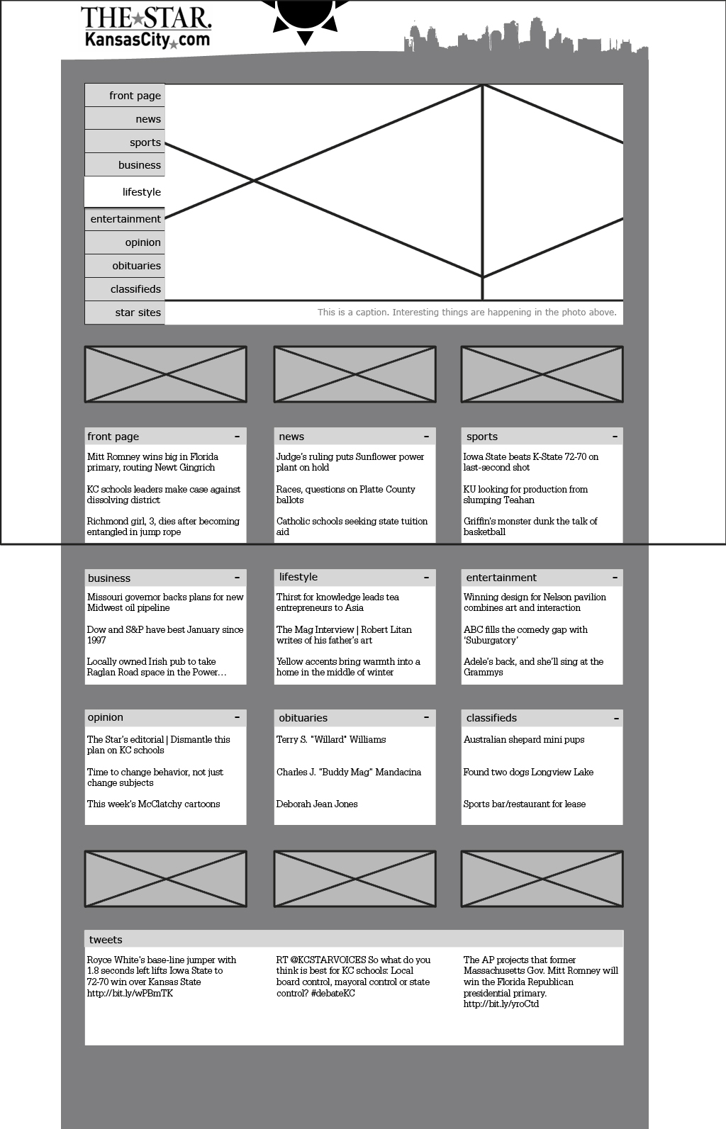
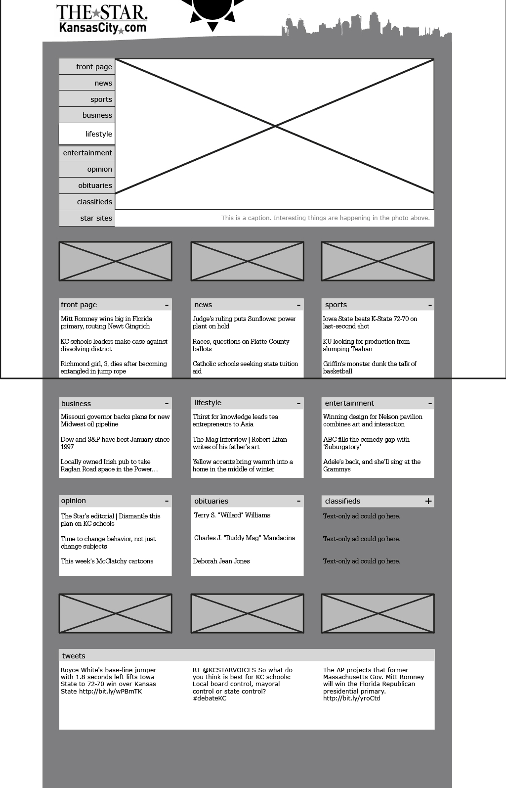
My idea for the KC Star website revolves around users being able to have control over what they see on the front page and where they see their favorite categories. In the header is a weather indicator, where users can get a basic weather report at a glance. The site would match the conditions outside, perhaps even with a darker night mode. If that kind of thing is too annoying, there could be an “on/off switch” for that level of information.
Round one of my digital wireframes:
I learned from these wireframes that I didn’t quite understand what I was supposed to do. But I think I remedied that with my new wireframes below.
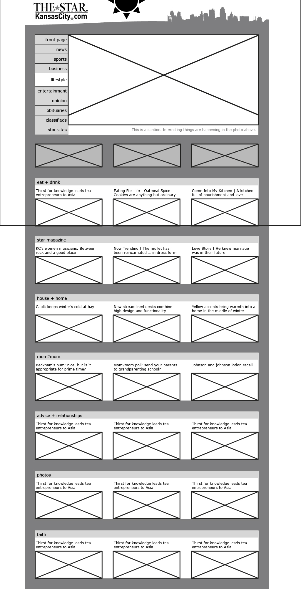
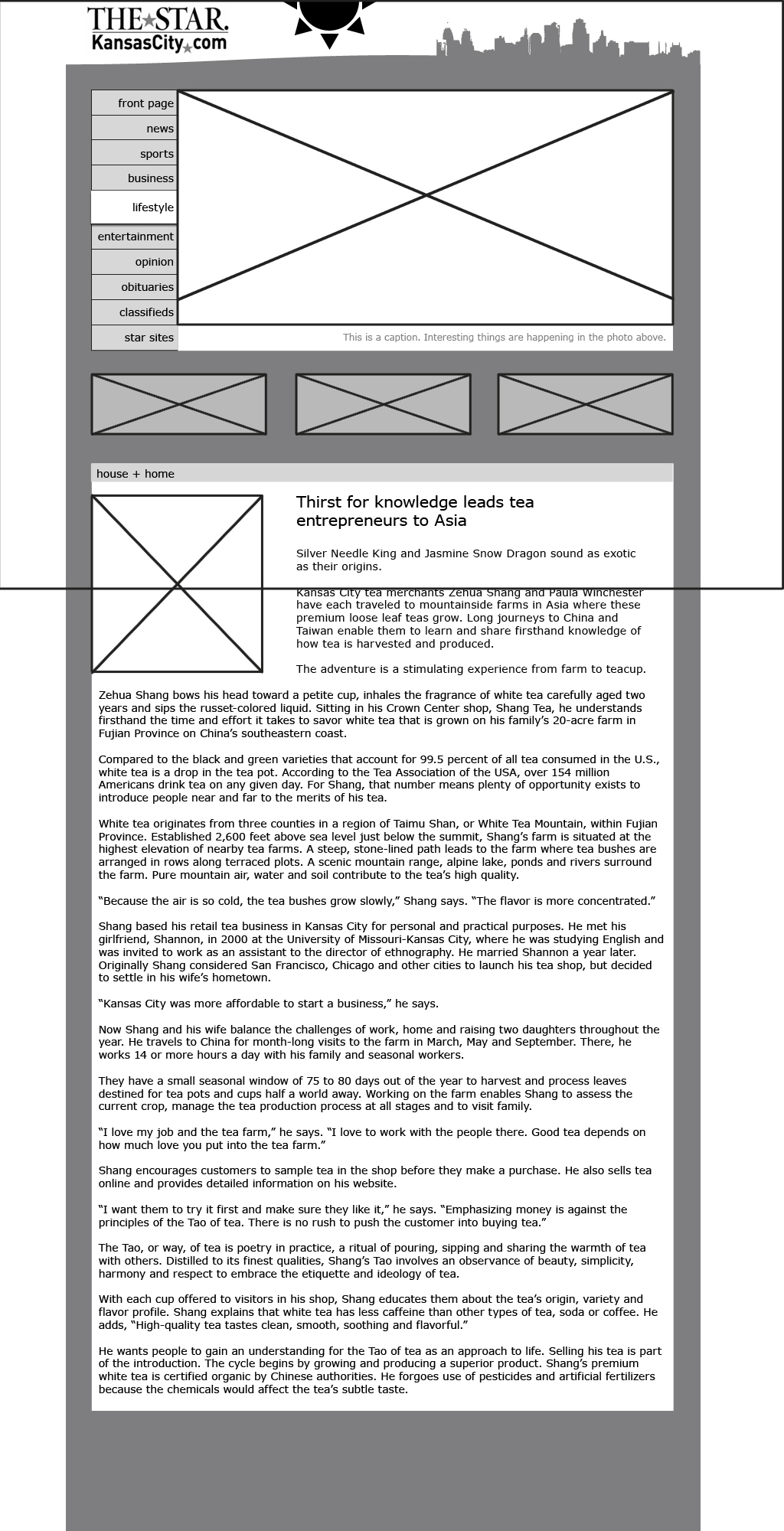
Digital wireframes, round 2:
I think I’m finally getting the hang of this. After years of making websites without real wireframes or deep consideration of usability, I’ve developed some bad habits. It’s gonna take some work, but I think I can switch out my bad habits for some good ones in this class.
