Compare & Contrast: Dan Mall & Erika Goering
By Erika Goering,
Filed under: KCAI, Random, Typography2
Comments: Comments Off on Compare & Contrast: Dan Mall & Erika Goering
I’ve recently stumbled upon the original slideshow in which Dan Mall states that technology over technique produces emotionless design. (Slide 13 is where that happens.)
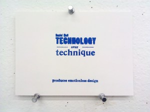
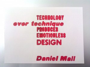
And for comparison, here’s what I did with his quote (this is before I ever saw his slideshow, by the way):
What struck me as interesting is that we each approached the communication and composition of this statement in a completely different way. The hierarchy has a totally different feel from one composition to the next. In my blue composition, I have “technology over technique” as an eye-catching, “I wonder what this is about” kind of moment, with “produces emotionless design” as a quiet, passive, cautionary message at the bottom. My red composition aims (but ultimately fails, because of an insufficient hierarchy) to send a message of “technology produces emotionless design” before elaborating that it’s in contrast to technique. Daniel Mall has the hierarchy set up so that “emotionless design” is the large, menacing warning in all-caps, with “technology over technique” as the explanation.
It’s amazing how different typographical hierarchy can show different aspects and dimensions of the same statement.
Design is awesome.

