Final Logo Build: Occupy KC
By Erika Goering,
Filed under: KCAI, Narrative/Sound&Motion
Comments: Comments Off on Final Logo Build: Occupy KC
Power to the people!
Concept (for those who haven’t heard):
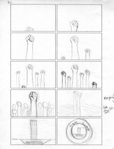
I chose the most obscure of the Occupy KC logos, using Liberty Memorial as a metaphor for the strength of the organization. Formally, I loved how similar Liberty Memorial is to a raised “power fist,” so I played up that aspect. The glowy, energy orb stuff intensifies as the crowd grows larger and more powerful.
What I Learned:
- I learned how to enhance a brand by adding sound and motion to its identity. That’s kind of a big one.
- I learned how to morph stuff! That was pretty painless, actually. At least it was the way I did it. I figured out a way to put points on a layer and warp those points around. So that was cool.
- I also learned that 5 seconds of video equals about a bajillion hours of work. But that’s what happens when you’re still figuring out how to make things move in a believable way. Oh well.
- TIME MANAGEMENT. A constant lesson.
- And I learned some motion tracking! YAY! Although, since that was a whole in-class demo, that’s a thing that everyone learned. So that’s a given.
- I also learned that storyboarding is super-important. I know it probably sounds silly, but it really kept me on track.
Speaking of storyboards…
