Find & Share: The Nitty Griddy
By Erika Goering,
Filed under: Find&Share, KCAI, Typography1
Comments: Comments Off on Find & Share: The Nitty Griddy
In the spirit of my shiny new WordPress blog, I thought I’d share some website/online grids with you, my lovely reader.
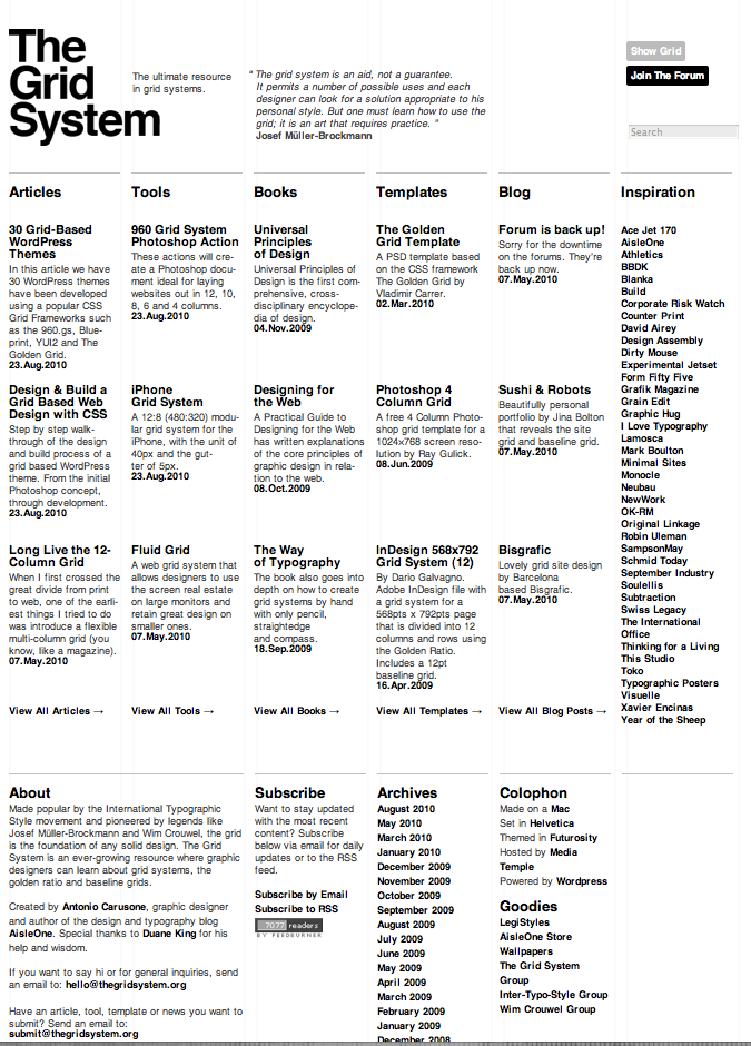
The appropriately named thegridsystem.org is a website that is completely dedicated to the grid structure in design. Their homepage is very minimal, focusing only on the basic elements of design to support their message of loyalty to simple, clean design. They don’t do anything flashy or trendy. Just a clear, beautiful grid. Their carefully sparse use color further emphasizes the importance of the grid (rather than color relationships or imagery). Their website even has a toggle switch where you can turn the underlying grid on or off to see the framework of their website.
TheGridSystem.org acts as a hub for information on using grids in digital design. Everything about this site is based on grids. The design, the name, the content. Even the websites that TheGridSystem links to are grid-based! They don’t mess around. That’s proof that grids aren’t confined to physical, tangible print media. Websites can look good with grids, too. In fact, I might take some cues from TheGridSystem and make my own site more grid-friendly. (At the moment, it’s very boxy but not based on any kind of grid or ratio.)
You might have to access a cached version of their site, as it went down as I was writing this post. *sigh* But when it’s back up, I suggest taking a spin for yourself. It’s a nice web experience.
