F+S: Packaging
By Erika Goering,
Filed under: Find&Share, KCAI, VisLang
Comments: Comments Off on F+S: Packaging
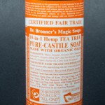
Dr. Bronner’s Magic Soap – Tea Tree
This product uses ethos, because it’s endorsed and created by a doctor, who the soap is named after. You can totally trust that guy with your hippie hygiene needs.
I picked this soap over the others nearby because I like the color-coded packages together on the shelf. Also, the sheer absurdity of the amount of text is amusing, and it makes me wonder what they were thinking. So that’s fun.
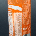
The part of the design that speaks to me first is, of course, the massive amount of text filling the entire label. Seriously. The entire thing. It doesn’t speak to me as much as it screams to me for help.
The first thing a customer does with this package after picking it up off the shelf is quickly shove it in their shopping basket because they don’t have much time for reading a novel on a soap bottle.
The package is usually handled very quickly. All of the vital information (brand name, product name, scent/variety) is front & center. The text everywhere else is so unnecessary, most people don’t even see it as text; it’s just a texture around the sides.
Dr. Bronner’s Magic Soap stands out on the shelf because of its use of color. Each version of the Magic Soap has its own little place in the Dr. Bronner’s rainbow, so they work well together while standing out from the minimalistic soap packages nearby.
Friends’ thoughts:
- Dr. Bronner’s Magic Soap has “SO MUCH TEXT!”
- “I don’t even know where to start if I wanted to read all of it.”
- “I don’t want to read it in the store. I’ll wait until I get home and use it as reading material in the bathroom.”
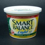
Smart Balance Light Buttery Spread
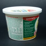
This one is totally logos. It’s full of information and facts and even has footnotes on the side to further support its claims.
I chose this over the others, not only because it’s vegan and I want to eat it, but also because it’s got some healthier-looking information on the label. (Flax is awesome.)
I was definitely drawn to the information on the package rather than the actual design of it. Because I think the design pretty well blends in with all the other margarines and butters in the aisle. The large text might also have something to do with it. It’s pretty huge.
The first thing I did when I picked up the package was actually read all of the quick facts on the side. It’s interesting stuff!
Of course, not everything is communicated on the front. It’s got the name of the product on the front, but the informative stuff is on the side.
In terms of shelf presentation, this package is pretty much your average margarine. It’s got happy primary colors and a rather light feel.
Friends’ thoughts:
- “It’s all green and yellow. Like healthy butter.”
- Big text, but a clean feel.
- “Kind of trendy, new-ish look.”
Knotty Boy Locksteady Dreadlock Tropical Tightening Gel
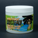
I think this one is pathos, because it’s got a scene of a carefree beach, with a carefree dude, sporting his carefree locks. It feels very relaxed, but fun.
I chose this package over the others in the ethnic hair care section because it was one of the few with an actual personality. Other packages looked bland and boring, while this one looked a bit more fun. However, the package does look a bit juvenile and cartoony compared to the more mature designs of other nearby packages.
The dreadlocked dude on the front /side sticks out to me because he makes eye contact with the purchaser. Also, the use of color is unlike a lot of the other products nearby, which are mostly yellow and pink or brown. More fleshy colors, while this one is beachy and blue/green.
The first thing I did after picking up the package was sniff it because the package says it’s got lime in it. Sure enough, it smells like a limeade. On the beach.
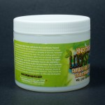
Not everything is communicated on the front. In fact, most of the relevant information is on the sides/back (I just realized all of my products are cylindrical and they don’t really have “sides,” but oh well). The paragraph (which could’ve easily been condensed to a few bullet-points) explains how the product works and what to expect from regular use.
Friends’ Thoughts:
- “Lots of green!”
- “Very beachy.”
- Dreadlock boy looks playful
- “Party atmosphere”
- Fun!
