iPad Magazine!
By Erika Goering,
Filed under: KCAI, Typography2
Comments: Comments Off on iPad Magazine!
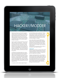
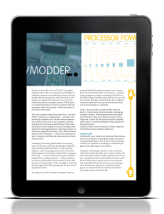
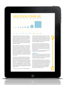
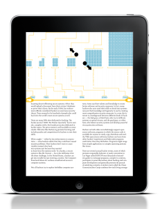
Idea #1: Scrollbar/indicator on the right side of the screen, which scrolls through the article text separately from the images on top. The user would scroll through pages of the article by swiping the text up or down, and scroll through the images by swiping the image area left or right. I left some room on the side of my infographic for a reason. This would be where a popup window would show up when the user clicks in an active area of the infographic. Supplemental information for the selected area of the infographic would show up in that area. For example, if a user tapped the name of a processor, more information about that processor would come up in the space to the right of the infographic.
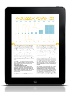
Idea #2: Scrollbar/indicator is the separator between the image and text, and shows where the user is in the slideshow (as opposed to the top example, which indicates where the user is in the article). The user can zoom in on the images or infographics by using the pinch gesture. This allows the user to clearly see the details of the infographics and images, without zooming in on the article body text.
While I’m still here editing this post, here’s the verdict from my critique:
I should use the proportions from the second layout idea (where infographics/images take up half the screen), but keep the vertical scrollbar of the top group. This will keep my infographics large enough to read. And I’ll also keep the functionality of the top group. That makes the whole experience more interesting to the user.
Also, I need to make my text bigger. What I thought was pretty big is actually not. Darn technology messing with my type size.
