iPad Magazines: Now with Landscape Mode!
By Erika Goering,
Filed under: KCAI, Typography2
Comments: Comments Off on iPad Magazines: Now with Landscape Mode!
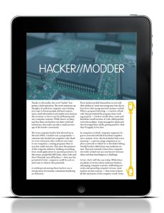
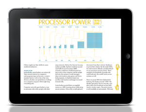
Here’s the next round of iPad mockups. I’m showing all of the user interaction I can think of right now. If I come up with anything else, I’ll be sure to add it later.
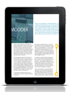
Here, the user would be swiping the top half over to see more information in the next frame:
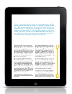
Swiping text up to read another page (notice the scrollbar indicator thingy changes to let you know where you are in the document):
Something I noticed when I was playing with the class iPad was that the orientation of the device influenced the number of columns in the layout. So I decided to show mine doing the same thing. My layout switches from two-column to 3-column when you switch from portrait to landscape.
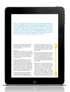
Scrolling through pages of text:
Pinch & zoom makes image frame larger, and it can even take over the entire screen to make viewing images and infographics easier.
