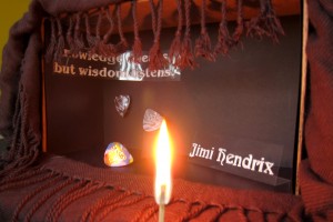
Jimi Hendrix poster in progress
By Erika Goering,
Filed under: ImageMaking, KCAI
Comments: 1
The quote says “Knowledge speaks, but wisdom listens.”
I need to reshoot for a multitude of reasons:
- transparencies are shiny (darn reflection!)
- fire is hard to photograph
- placement of the quote is hard to read with the curtain/scarf in the way.
- maybe I need to add some more stuff? Like a microphone or something? Or a pill bottle?

tyler
February 13, 2011 at 3:40 pm
erika, you are correct in your ideas on re-shooting. the composition needs a lot of work. things seem to be too small and scattered around the space without any sense of interaction — just trying to fill a huge void. maybe the space needs to be smaller.
more objects would be helpful also. i understand the fire — because of his passion and impact, but also that one song he did. i understand the guitar picks, but can’t really see the tie-die patterning very well. the typeface choice is good but the typography itself (arrangement, color, scale, etc) isn’t doing anything for me. i maybe get the fringe-y stuff in terms of his ornamental fashion sense, but that’s about it.
tell me more important things about his life. the pills could be good. musical influences? woodstock? home/personal/family life? what should people know about him?