Koenig: More Dynamic!
By Erika Goering,
Filed under: KCAI, Typography3
Comments: Comments Off on Koenig: More Dynamic!
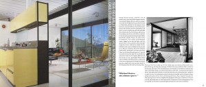
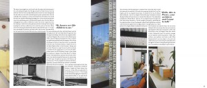
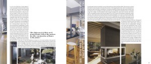
Due to the ho-hum feedback I got, and my own general unhappiness with my book, I decided to completely redo this layout. It’s a lot better now. Yay, progress!
While playing around with my layout, I stumbled upon what I like to call a reverse indent, where I start a new paragraph column in the space in the last line of the previous paragraph. This creates a nice transition between paragraphs when you’re reading, while still establishing that a new paragraph has been started.
My concept is still the same: Koenig-style, angular, architectural qualities assigned to typography and layout structure. But I feel like this time around, it’s better executed. It feels like a Koenig book. Or at least it’s starting to.
One thing I’m a bit worried about is the stair-step pattern that’s starting to emerge from the nature of my paragraph alignment. I’m worried it’s become too much of a predictable thing. And that’s not how Koenig’s work is at all. It’s varied and diverse; not one-note and predictable.
Luckily, I’m playing around with the stair-step pattern, changing column width and height and using images and pullquotes as design elements.
I’m pretty excited about this book now. I wasn’t before, but now that I have a more engaging layout, I’ve got something to look forward to working on.


