Magazine Layout Revision
By Erika Goering,
Filed under: KCAI, Typography2
Comments: Comments Off on Magazine Layout Revision
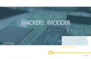
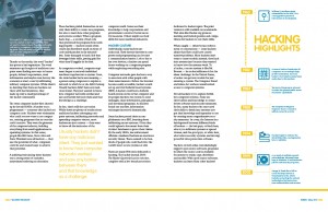
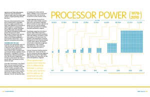
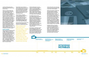
In this round, I’ve added captions to my photos, and tried to fix my rag. Although I think I might’ve overdone the rag, though. Too much variation between lines, I think. The rag just feels stiff and robotic to me, which, come to think of it, might be a good thing, considering my topic. We’ll see how it goes over. But I think for the reader’s sake, maybe it should be more fluid and relaxed to be a bit easier on the eyes.
Or then again, I could be over thinking it, as I sometimes do.
Here’s how it all looks as of now. Keep in mind it looks better printed than on the screen. Must be those pesky serifs cramping my style. Or just the fact that pixels suck sometimes.


