Revised Magazine Article
By Erika Goering,
Filed under: KCAI, Typography2
Comments: Comments Off on Revised Magazine Article
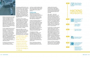
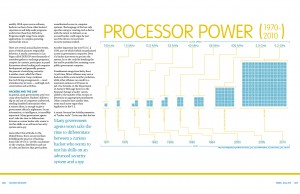
I’m overall pretty happy with the progress on this one. It’s going well.
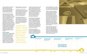
But I’m having issues with color yet again. That yellowish color does not want to print consistently. It looks fine on my infographics, but it’s greenish on my small text, even though there’s no cyan in there at all. Bah! Maybe getting rid of the little bit of black in that color will fix it…
And my rag is all weird and stuff. That’ll get fixed soon.
There’s a bunch of other tiny issues that will be resolved soon. (Image color & cropping, author name placement, page number placement, etc.)
But yeah, overall, it’s going well. I haven’t had to stress out too much over this. Which is nice, because I’ve got enough stress in my other classes to make up for it. Har har har.
…Oh, and I’m getting rid of all that Univers in my infographics. I don’t use it anywhere in my article. So now the typeface count is down to two. Chaparral for body text and VAG Rounded for headers, infographics titles, and all the other display-ish stuff. No more, no less.
Boo-yah.


