Smithsonian Exhibit Ideas
By Erika Goering,
Filed under: KCAI, VisCom2
Comments: Comments Off on Smithsonian Exhibit Ideas
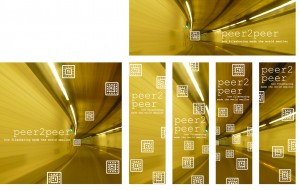
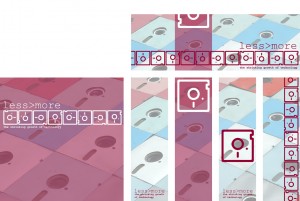
As far as aesthetics go, I like the top one. Although, it looks a little bit like an album cover from the ’90s. Conceptually, I like the top and bottom ones. The middle one is just using the floppy disk icon as a stand-in for the real thing. And that’s not very exciting, is it?
This whole anchorage & relay thing is still really hard for me to fully grasp. But I think I’m starting to get it. There’s a glimmer of hope for me after all.


