Spreads: Sturdy, But Static
By Erika Goering,
Filed under: KCAI, Typography3
Comments: Comments Off on Spreads: Sturdy, But Static
Self-critique:
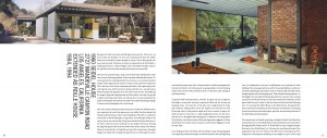
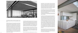
I definitely feel like it’s coming along. Yay, progress! It’s got the sturdy, architectural and modular qualities that I want to convey, but the layout in general is kind of boring and static. It needs that good old-fashioned Koenig dynamism. So that’s what we talked about in critique this morning. We discussed how to give it more personality and character by treating the type like an image, where it has depth and vibrance.
I almost wanted to completely start over halfway through and change my whole layout at the last minute. It feels that boring to me right now. So I’m making it my goal to bring some excitement to this book so not only the reader will enjoy reading it, but I will enjoy making it as well.
Some specific things that I’ll change: I’ll use my grid as more of guidelines than rules, and I’ll play around with column width too. I’ll also start thinking of my pullquotes as design elements, where I can do whatever I want to their placement and size, within the constraints of my grid. I’ll also include the footnotes in the Introduction section, which will add to my hierarchy. And I’m thinking about creating a “title page” of sorts for each section. And I’ll have some image-only pages/spreads for variety.
I think the main thing I need to play with is variety. Everything is so plain and default right now. I just need to spice it up.

