Union Station: Zooming in Forever!
By Erika Goering,
Filed under: KCAI, Narrative/Sound&Motion
Comments: Comments Off on Union Station: Zooming in Forever!
One of the things I love about interactive media is the virtually unlimited possibilities. You’re not confined to a 2D plane or a static image. There’s the potential for depth, animation, sound, and user-influenced behavior.
My partner and I have been focusing on depth and layers as our main way of categorizing information and isolating the important points from other information.
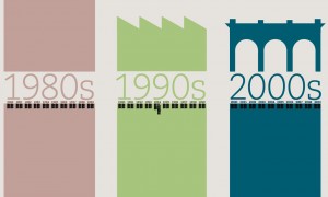
Below is an idea where the user zooms in to go deeper and see more detailed content. It literally narrows in on the events that happened during that time. The color represents the state of Union Station in each decade, where the ’80s were drab and boring, and the ’90s were a time of growth and renewed hope for Union Station. It was a fresh start. I’m still playing around with color and shapes for them and the other decades, and I’ll be introducing some texture soon, so that’ll be one of the next things I explore.
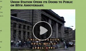
To navigate, the user would use pinch gestures to zoom in, and the content would increase in size until the text is legible and the video reaches full-screen (yay, vectors!). The user could also swipe left or right to jump between events, years, or decades, depending on how zoomed in they are.
zoomed out enough to see the adjacent decades
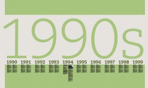
zoomed in to see just the ’90s.
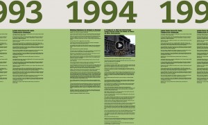
1994′s highlights include two newspaper articles and a video.
zoomed-in video closeup


