Updated Infograph(ic)s.
By Erika Goering,
Filed under: KCAI, VisCom2
Comments: Comments Off on Updated Infograph(ic)s.
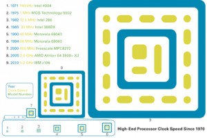
Here is the previous round of infograph(ic)s I did. I fixed a lot of issues since I did these guys.
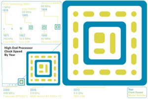
Here are my newest ones. I decided to stop using black and that weird green color, and just keep it to the original blue and yellowish. I think I’m using my colors a lot better now. Although I could darken my yellow a bit. It ends up printing really light.
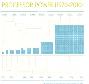
Some people had difficulty linking processor power to the scale of my icons (they thought that maybe the size of the icons were the size of the processors themselves, which is not the case), so I ended up using repetition instead of scale to illustrate the difference in power. It comes across much easier now. More icons = more power. No one’s confused anymore.
My use of lines to link information to image reflect the way circuits look in a circuit board. They also easily direct the viewer’s eye along a path through groups of information.
The timelines look a lot cleaner now. I still need to make some changes, but they’re well on their way to being awesome.


