Week 10: Final UI Refinements
By Erika Goering,
Filed under: Degree Project, KCAI, Learning
Comments: Comments Off on Week 10: Final UI Refinements
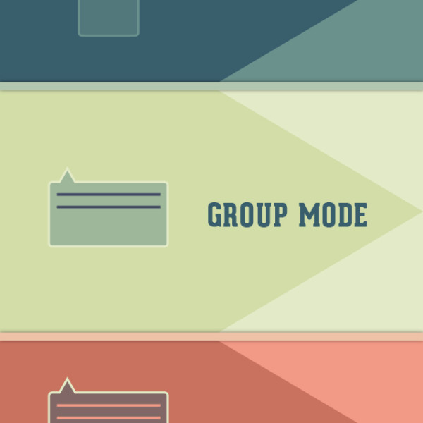
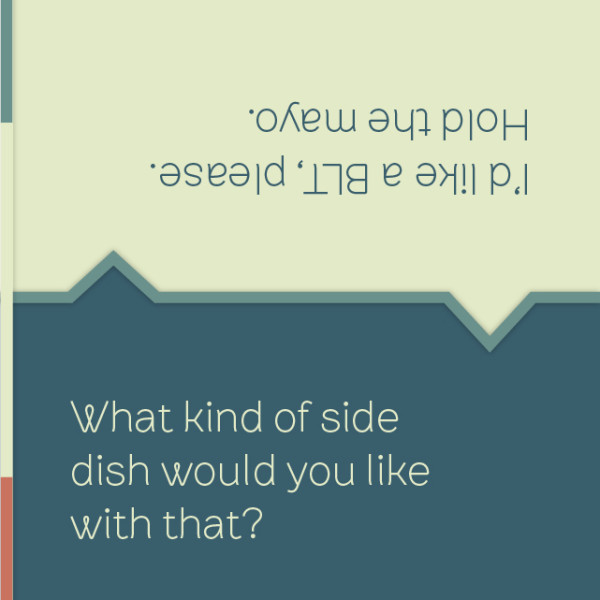
Responding to the feedback from Monday, I spent some time exploring the colors and typefaces, with the intent to make everything feel more utilitarian and to give the whole thing more of a balance between masculine and feminine qualities. (The logotype was pretty darn feminine on its own, so I had to do something to offset that and make it less “cute.”)
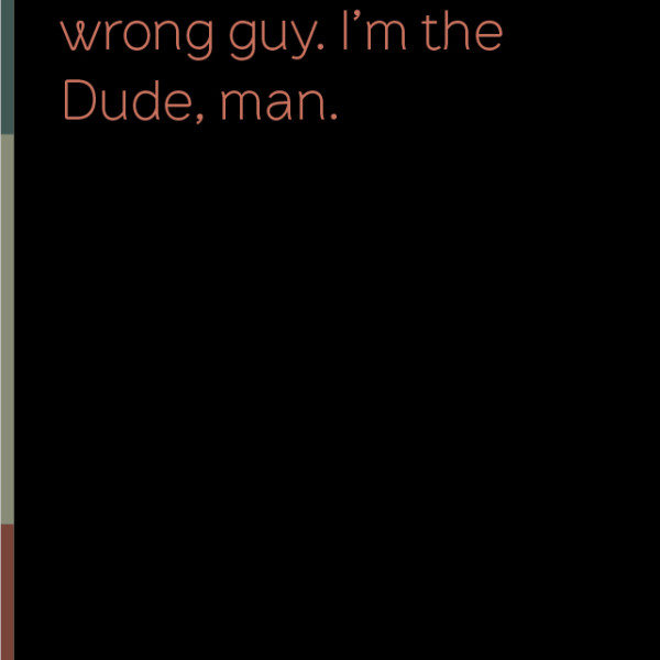
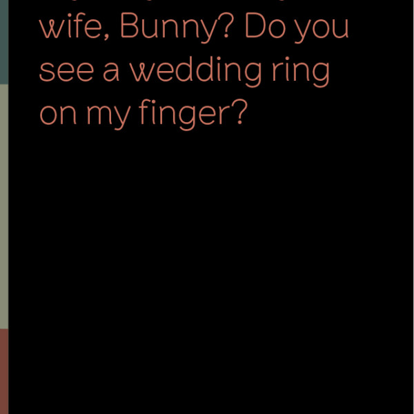
I added a slideout menu on the side (that’s what those colored bars are), which will just slide the main menu screen on top of the current screen. That way, there’s no need for a back button of any kind (for any device; iOS or Android).
I also added the ability to scroll through movie captions, so users can go back and catch something they might have missed. This is particularly handy if the user is lipreading, and someone onscreen mumbles or covers their mouth (or is facing away from the camera, etc.).
And the peripherals have been updated to match the current style.
Next steps:
- acquire someone’s iPhone and take some context shots!
- start putting together some awesome Keynote animations!
- start thinking about (and working on) the big poster
