Week 3: Sketches and Presentation
By Erika Goering,
Filed under: Degree Project, KCAI, Learning
Comments: Comments Off on Week 3: Sketches and Presentation
I summed up my previous couple of weeks’ progress in the form of a presentation. Some feedback I received includes:
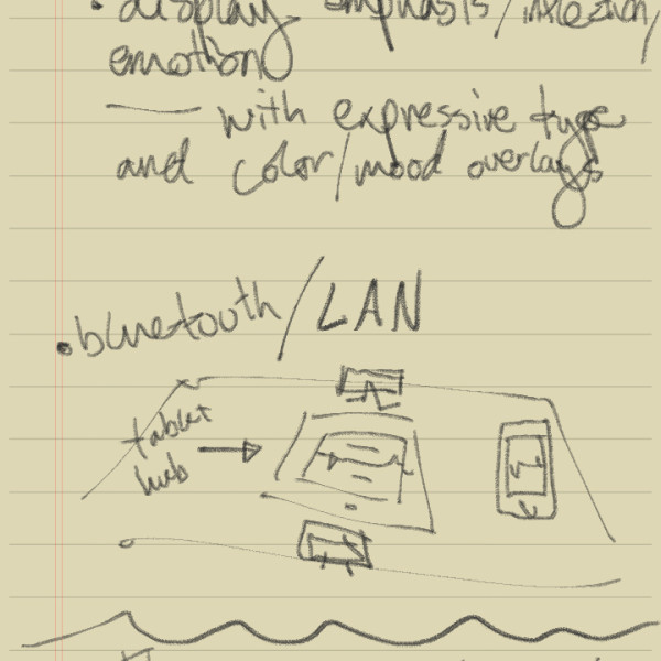
- Be careful about turning this project into a cold, sterile, pragmatic, primarily geeky endeavor. Remember that these are people I am designing for. (On of my solutions to this is to make conveying emotion and inflection a priority in the UI.)
- Maybe instead of the phone/tablet-based solution seen in the sketches below, I should pursue a different type of technology, such as an ASL-detecting peripheral (hello, MX!). However, the biggest problem there would be the same issue with just plain texting; aspects of natural language, such as emotion and inflection are lost, not in translation, but in the capturing of the content. So maybe I find a way to capture facial expression too?
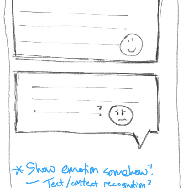
- Show emotion, emphasis, and subtext formally, through various “designery” things, such as expressive typography, color/gradients in the messages themselves, or icons/emoticons.
- Preliminary idea, where a tablet acts as the output device and phones are the input.
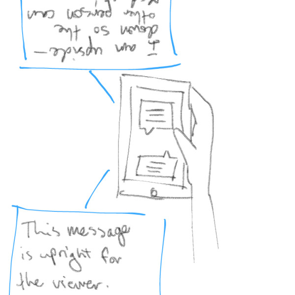
- Handheld or tabletop view on one device shows a bi-directional conversation. This is for close conversation between two people who normally wouldn’t understand each other.
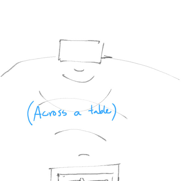
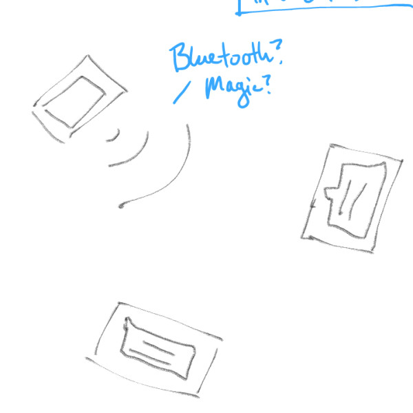
- For conversations that take place further away, each device will take input and give output, as well as transmit the message to the other person.
- Conversations with multiple people can happen at once.
- Preliminary UI idea: Showing emotion through the conversation text by way of emoticons and possible color overlay and typographical emphasis.
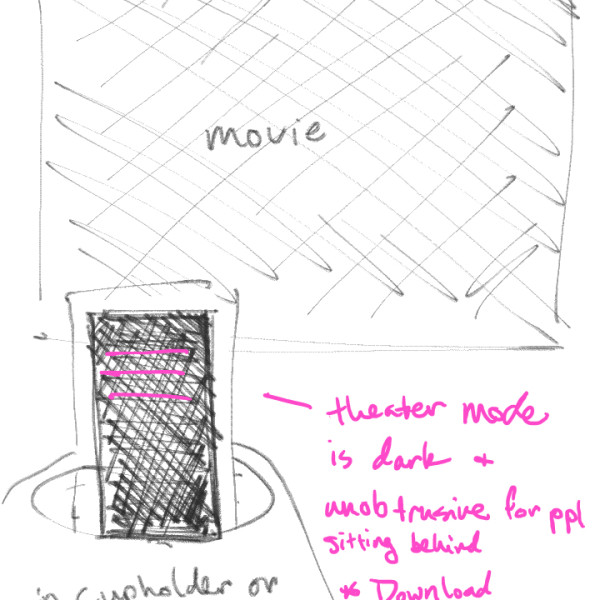
- Movie mode: A darkened screen can show movie dialog without disturbing people behind the user. Caption/subtitle files can be downloaded beforehand or “live-captioned.”
Next steps:
- Sketch some possible visual UX/UI directions for the app as a whole.
- Develop scenarios for each aspect of the app.
- In-depth sketches/wireframes of each scenario (a few directions).
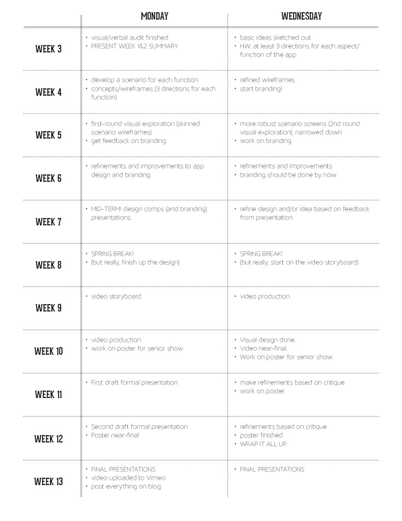
And here’s an updated schedule/timeline for this project:
