Week 6: Wireframes & Visual Exploration
By Erika Goering,
Filed under: Degree Project, KCAI, Learning
Comments: Comments Off on Week 6: Wireframes & Visual Exploration
Wireframes
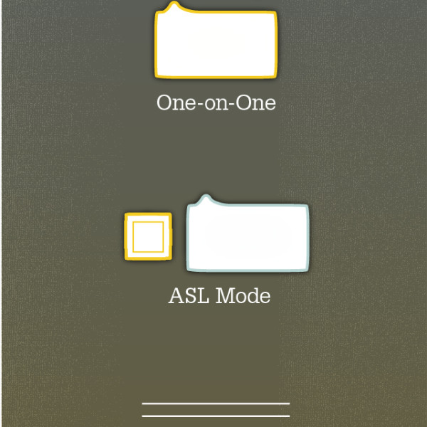
- On the home screen, one-on-one mode is selected*
- prompt and explanation of the app for the hearing user
- a conversation is started
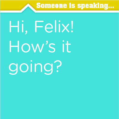
- the two users are able to communicate without difficulty
One-on-one mode can utilize both speech and ASL input from the Deaf/HoH user.
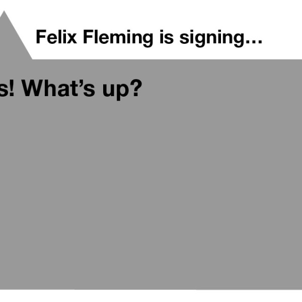
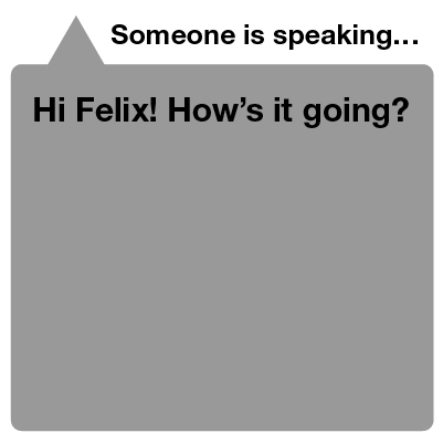
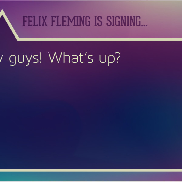
- At the home screen, group mode is selected and Felix puts his phone where everyone can see it.
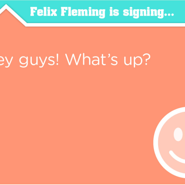
- Felix starts to sign, and the translated English text appears on his phone.
- One of his hearing friends replies, and Felix can glance at his watch to read what was spoken.
Group mode can also be used in a one-on-one conversation from afar, like across a long table in a conference room, for example.
- At the home screen, the user selects movie mode.
- The user searches for the movie in the captions database.
- After finding the desired movie, the user selects it and waits for the movie to start.
- When the movie begins, the user clicks the sync button and places the phone (which has now gone dark to avoid disturbing others) in an easy-to-see location.
Visual Exploration
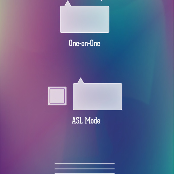
- home screen
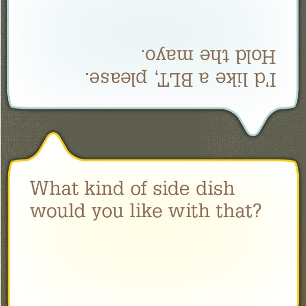
- one-on-one conversation
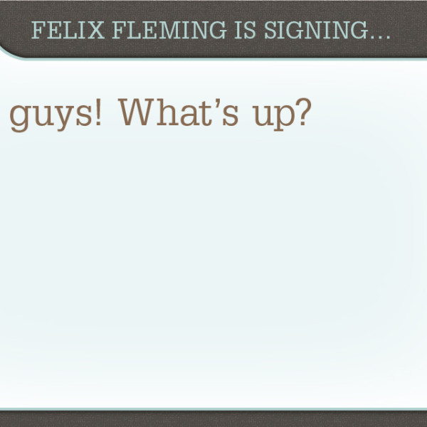
- group mode on phone
- movie mode
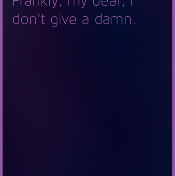
This is a textured look that isn’t necessarily skeuomorphic, but it still gives a sense of depth and tactility.
- home screen
- one-on-one conversation
- group mode on phone
- movie mode
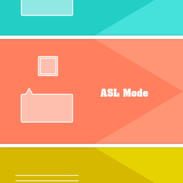
I was going for a whimsical look here, but it didn’t really work out the way I had hoped. Oh well. It doesn’t feel right for this project anyway.
- home screen
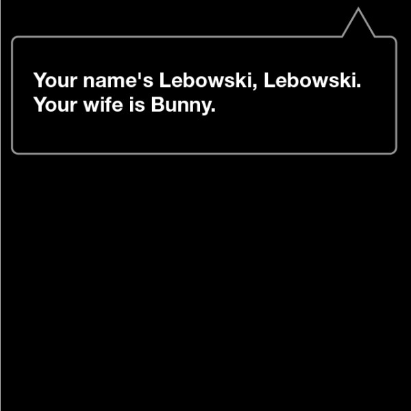
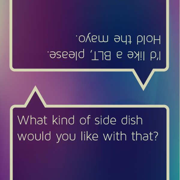
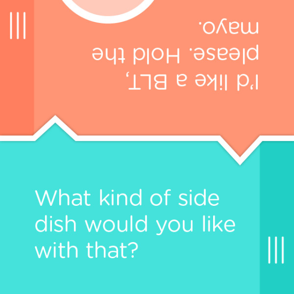
- A one-on-one conversation. The drawers on the sides contain an emoticon menu (complete with the always-necessary sarcasm button)!
- group mode on phone
- group mode on watch
- movie mode
As I passionately talked about in a previous post, flat UI design is the way to go. It’s honest and true to digital media. It’s the practical, “no BS” approach, and it just plain feels right.
Next steps:
- Branding!
- Refine visual design
- In-context shots (to show people what’s been in my head this whole time)
