Week 9: Wrapping Up the Brand & UI
By Erika Goering,
Filed under: Degree Project, KCAI, Learning
Comments: Comments Off on Week 9: Wrapping Up the Brand & UI
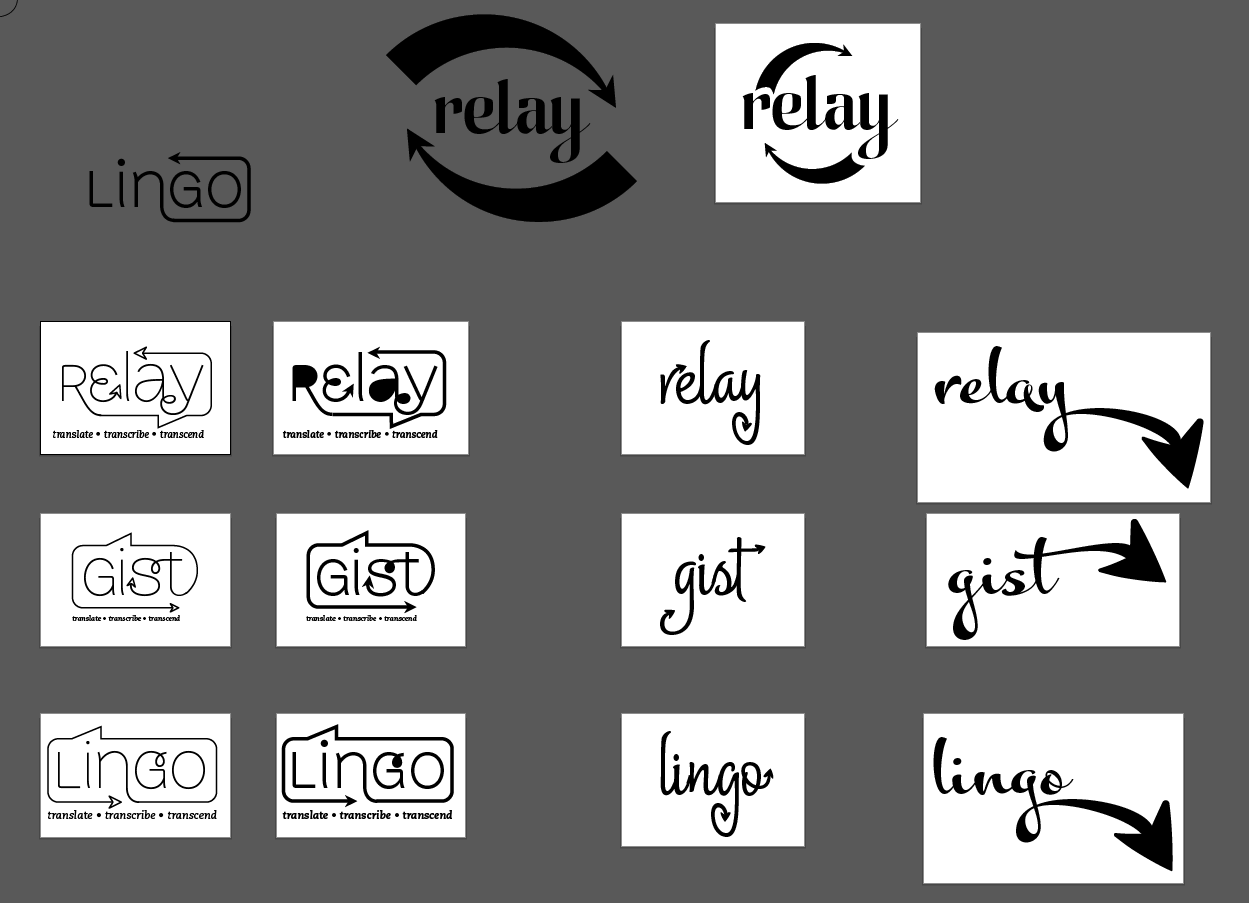
With my branding/naming adventure, I decided to replace my Sign•ify idea with the name Relay, simply because it makes more sense. As Jessi mentioned awhile ago (she was a HUGE help in naming my app), Sign•ify sounds like I’m making an app that converts speech into sign language, and not the other way around. So I dropped that idea and Relay was born.
Relay is my favorite choice because it embodies the idea of the back-and-forth nature of a conversation, as well as the act of translating back and forth between languages. Also, as the Deaf community knows, a relay service is one that involves a third party to translate/interpret telephone conversations between text and speech for Deaf or HoH people and the hearing people they talk to. My app idea is like a relay service for real life, without the extra person.
Here’s some of the directions I explored:
Gist was another favorite of mine, because there is no way to directly translate between ASL and English. Some things will inevitably be lost in translation, but the important thing is that it gets the point across. (I also toyed with the idea of referring to the gesture-based armband as the Gisture band… but that started to get a bit silly, I think.)
Lingo was another idea that had some potential. It conveyed the idea of language, obviously, but it also conveyed portability and ease (thus the arrows and the “go” part of the word). This idea wasn’t the strongest, by far, so I flip-flopped between Relay and Gist for awhile. I think Relay has the most amount of meaning of the three, so that’s what I’m going with.
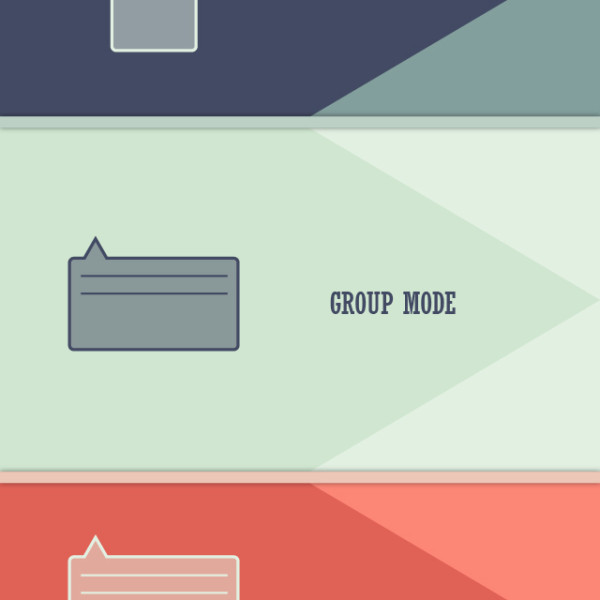
Along with my new branding, I’ve changed the colors I’m using. Goodbye, trendy design colors. Hello, tasteful complementary colors!
- Oh look! A splash screen!
- Just in case you need it, the sarcasm button is still available.
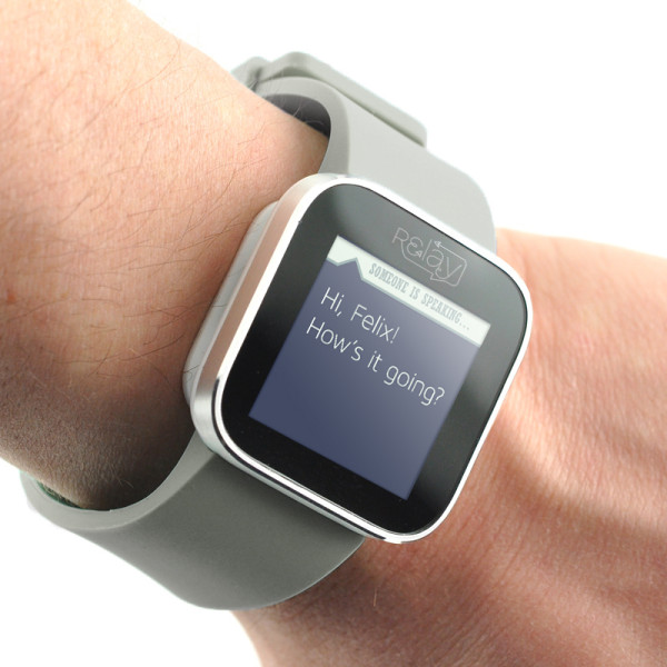
In other news, I’ve decided to bring back the watch peripheral for a couple of reasons:
- The armband for gesture-based ASL recognition needs to be higher up the arm, to detect elbow movement as well as muscle flexing. This will make it difficult to include a display directly on the armband in a comfortable and usable location. (Who wants to look at their elbow all day?)
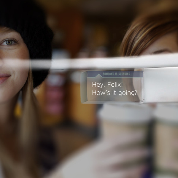
- I’ve decided to make the watch peripheral optional, because I’m also adding Google Glass (or another head-mounted display) support. This way, the user can use whichever peripheral he or she is more comfortable with to view the translated messages. A head-mounted display also allows the user to maintain eye contact during the conversation, without looking down at a watch every time someone speaks.
Here’s what the two peripherals look like:
Next steps:
- Start working on presenting this stuff! (in a poster and Keynote)
- More context shots!
